
Creating an eCommerce Dashboard in Google Data Studio
Looker Studio Masterclass, my advanced & premium course, is now publicly available. 100% for free!
No signups, upsell funnels, order bumps, or nonsense!
Access here >>

Ahmad Kanani
Introduction
Google Data Studio is a practical reporting tool from Google that offers a lot of useful features for free. It allows you to connect to and pull data from many data sources like Google Analytics, Google Ads, Facebook Ads, or even Google Sheets so you can easily create visual reports to share with your clients, stakeholders and team members.
Google has made considerable improvements on the platform over the past few years and is releasing new features and updates every couple of weeks. In this tutorial, I am going to take you through the most important features of this platform and show you, step-by-step, how to create a simple eCommerce dashboard and share them with others.
1. Creating a New Report
First, open Google Data Studio to see an overview of its user interface. If we have already created some reports, they can be seen in the middle of the page. At the top, we can start with a ready template or create a blank report.

Let’s start by creating a blank report.
The first thing we need to do is to connect our report to a data source. We can do it by clicking on CREATE NEW DATA SOURCE.

Google Data Studio can connect to many data sources using free data connectors provided by Google.
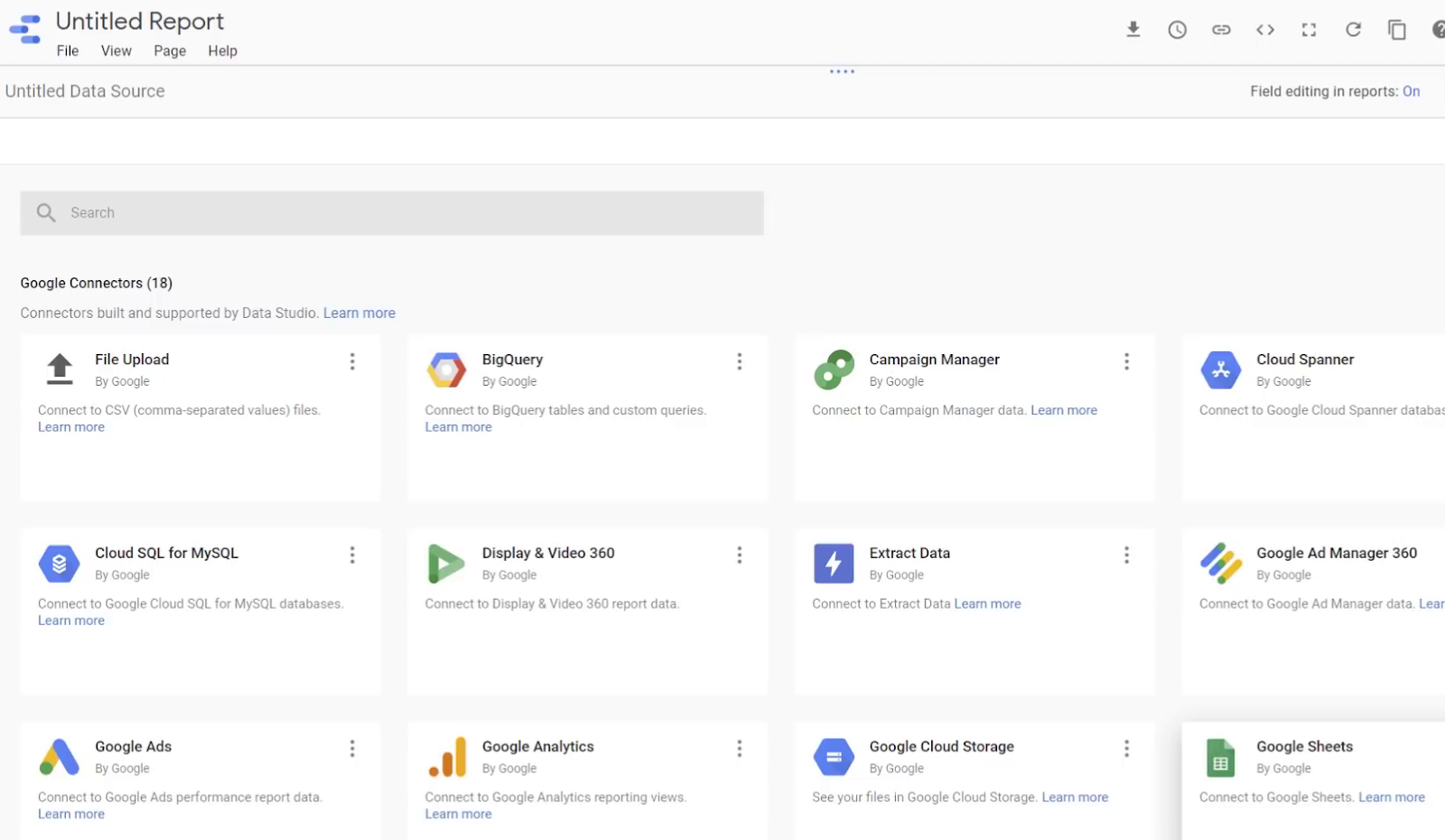
And there are also Partner Connectors that allow us to connect to even more data sources like Bing, Facebook, Instagram, Adroll, Amazon Ads, etc.

For this tutorial, we won’t use any of these connectors, instead, we use the Sample Google Analytics Data provided by Google.

After choosing [Sample] Google Analytics Data from the list, click ADD TO REPORT.

2. Initial Settings and Adding Scorecards
First of all, let’s give a name to our report.

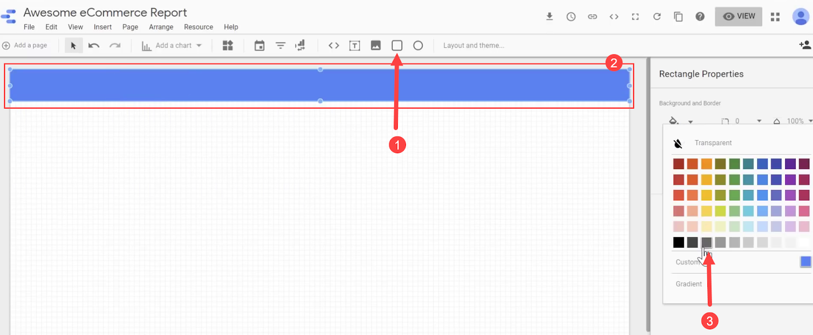
Next, let’s add a header to our report and customize it. Here I have resized it to fit the top of my report and changed the color to gray.
Now let’s give our report a title. You can change the color, size, font, and position of the title as you prefer under the Text Properties section on the sidebar.

We can add numbers to our reports by adding Scorecards. Scorecards are good options for showing metrics and KPIs.
Click Add a chart and then click Scorecard.


You can customize the appearance of the scorecard by modifying the variables such as color, border, etc. in the STYLE tab, while the scorecard is selected on the report canvas.
Then, let’s head over to the DATA tab and click on the Comparison date range to choose our desired data range to compare this metric to.


Now that our Scorecard is ready, we can duplicate it and create more. To do this, right click and select Duplicate or simply copy and paste the scorecard. Doing so will retain the styling and configuration.
For the new Scorecard, the only thing we need to do is change its metric. For this, let’s search for Transactions in the Available Fields and drag it onto the Metric.

We can continue this process to make more scorecards for Product Detail Views, Revenue, Average Order Value, and Ecommerce Conversion Rate. You can change the view of any scorecard to show compact numbers if you like.


For arranging the Scorecards and moving them in different directions, we can use keyboard arrow keys as well.
3. Reporting Revenue per Country
In order to view from which countries do we receive our revenue, we can add a Geo Map widget to the report.

Each shade on the map represents the number of sessions, but let’s replace it with revenue. So similar to the previous step, add Revenue as the Metric.

To make it clear for the end-user what metric is being represented by this graph, we can add a title to the map and call it Revenue by Country.

4. Adding Timeline Charts to Show Trends
Next, let's see some trends by adding a time series chart to our report.

Just like the Scorecards above, we can personalize the appearance of Time Series charts such as border, color, and other details via the STYLE tab.

Head over to the Data tab and search for the preferred metrics. We can add multiple values as we need.
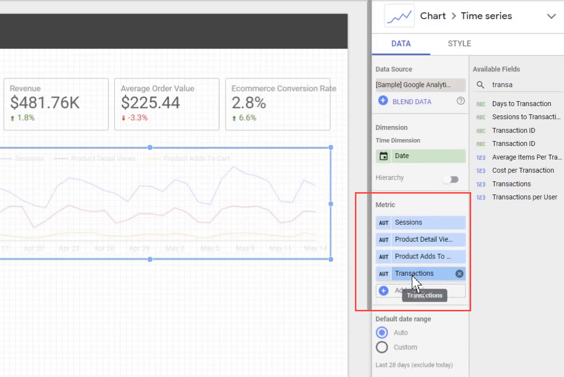
We can likewise duplicate the Timeseries chart and assign new metrics to the new one.

Don’t forget that you can change the way your values are shown on the chart. For example, here I have selected the Cumulative option for my Revenue chart.

Let’s duplicate the chart to make a new one show the Ecommerce Conversion Rate. For this one, however, we don't want it to be cumulative. So let’s uncheck this from the STYLE tab. Also, in the same section, let’s apply a Polynomial trendline to this chart.

5. Adding a Pie Chart to Show Gender Distribution
Now let's add a pie chart to see the distribution between male and female users.

Choose Gender as the dimension for this pie chart, and leave the metric to be the number of sessions. You can also change its appearance from the STYLE menu.

6. Reporting Top Cities by Revenue
Now let's create another chart and see which cities are we getting the most revenue from. For this purpose, let's create a horizontal bar chart.
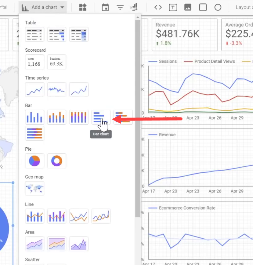
Let’s change the metric to Revenue and change the dimension to City.

Our Ecommerce report is almost finished, but there is a little problem: It is static and the end-user cannot interact with it.
7. Adding a Dynamic Date Range Selector
To make this report interactive, first, add a date control filter to allow the end-user to change the time period of the report. This can be done similarly to what we did for the headers and we can customize its appearance, too

Now, the viewer of the report can easily choose the timeframe for which they want to look at this report.


8. Adding Filter Controls
Now let's add some more cool features to our report. First, we're going to add a drop-down menu that allows users to filter the report to take a look at traffic from different sources and mediums. This can be done by adding a Filter Control widget to the report.

We need to change the dimension to Source / Medium.

We can duplicate this Filter Control to make another one for Device Category that allows users to narrow down the report to only see data for visits from desktops, mobiles or tablets. Similarly, we can make another filter for User Type, which allows us to filter based on whether a user is a new user or returning user.
Now let's review our report again and see how it looks.

End-users can now filter this report based on any of these criteria. For example, they can choose to only look at desktop traffic from organic Google search (google / organic).
9. Sharing the Report With Others
Now that our report is ready, let's take a look at different sharing options that we have access to in Google Data Studio.
The first option is to download the report as a PDF file. We can even choose to protect it with a password.

The next option is to set up automatic delivery of the report via email.

We can also create a link to this report to directly share it with others.

Or we can share it with other people via their email, just like any other Google Drive document.

Additionally, you can make a copy of the report inside your own Google Data Studio account.

As you can see, there are lots of options for you to share a report with the people who need to use it.
Congratulations! We are all done. You just learned how to use Google Data Studio to connect to Google Analytics and create a beautiful, interactive and fully-functional Ecommerce report and share it with others.
Join Newsletter
Community
Tools
Learn Analytics & CRO


