
The Most Important Charts in Google Data Studio
Looker Studio Masterclass, my advanced & premium course, is now publicly available. 100% for free!
No signups, upsell funnels, order bumps, or nonsense!
Access here >>

Ahmad Kanani
Introduction
Google Data Studio is a practical tool that provides you with professional features beyond the Google Analytics dashboard. This reporting solution allows for transforming data into appealing reports suitable for your audience.
In this tutorial, I am going to introduce you to the most important chart types within this tool and share some useful tricks for building more effective dashboards in Data Studio.
We will be going through step-by-step instructions for creating a simple dashboard together.
First of all, we need to create a new blank Data Studio report.

Then, select a data source for the project. In this tutorial, we use Google Analytics and connected our report to the Google Analytics demo account.

Choose Master View and click on the blue-colored "connect" button.

After a few seconds, the data source will become ready, and we can click on the Add to Report button.


And we are good to go.
1. Scorecard
The scorecard is the first data visualization type we are going to create. It is the best tool to show KPIs or key performance indicators.

Using the mouse cursor, we can resize it for the appropriate dimensions and then place it on our canvas.

On the right side of the page, Data Studio has chosen a metric by default. We can change it to a different metric, such as sessions.
We can drag and drop sessions over page views for it to change.
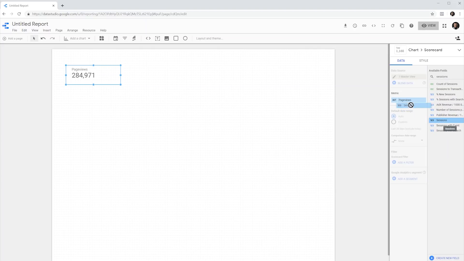
And then, we can set the date range for this metric.

In this case, it shows the number of sessions over the last 28 days.
We can likewise make a comparison between this data and the information for the last year, previous period, or a custom time as we like.

For instance, I chose the previous period and hit apply.
We can also filter the scorecard. By clicking on the Add Filter button, we can see the variables to choose from.

For this example, I choose the US country, with the condition equal to and then enter the US for the final value.


In the end, I click on the Save button to apply changes.
Now the information reloads to reflect the number of sessions from the users of the United States.
We can also change the name and title of the metric to the US only sessions.


It's clear what number is this scorecard supposed to represent.
For now, let’s revert it to default and remove the filter. Because in the next paragraphs, I'm going to show you a neat trick and a new feature of Data Studio that is more useful in these cases.
The scorecard right now is pretty basic. So next, we need to apply a bit of styling. To do so, we can go to the Style tab and choose a background, border, and border-radius.

For the background, we can use a solid color, or a gradient from top left to bottom right.
I chose a gradient from white to a light gray, changed the border-radius to four pixels, and added a bright gray border as well.
This is how it looks.

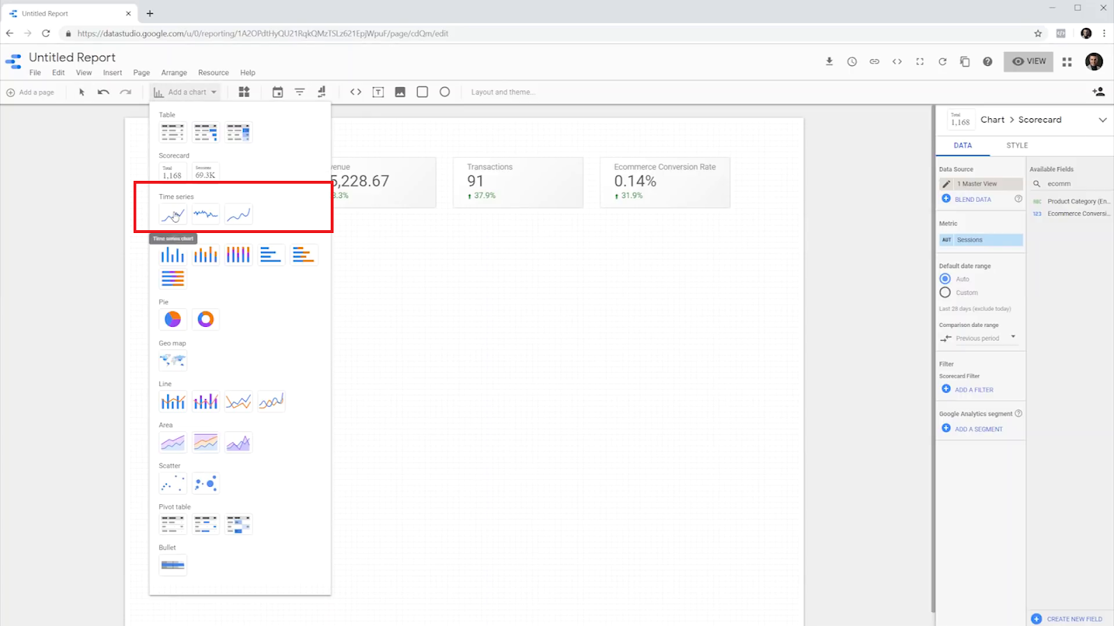
Now we’re going to make three copies to create new scorecards. Similar to previous steps, lets define revenue, transactions, and E-commerce conversion rate values for the new scorecards.

2. Time Series
Now, let's assume we want to see the trend of sessions over the last 28 days. What we currently see is only the total number. But if we're going to see the trend, we can use another data visualization chart, which is a trend line.
We can add a trend line or Time Series chart directly from the menu.
But since we want to keep the styling, we can use a trick. Similar to what we did to create the three new scoreboards, we can copy and paste it again and make it larger. Note that the metrics and other information will stay the same.
Then we can click on the top right of the side-menu and change the type of the chart from a scorecard to a time series chart.
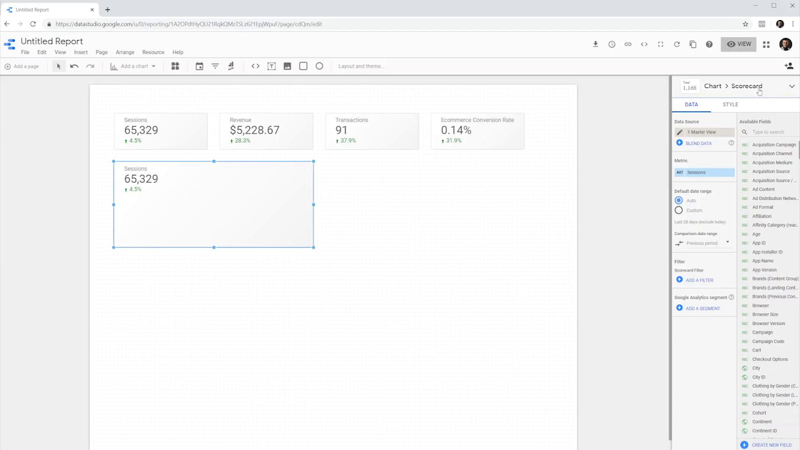

That's it! We have our time series chart and it's already showing sessions during the last 28 days.
3. Bar Chart
Now let's create another type of visualization that shows us the top five acquisition channels that send traffic to this website during the same time period. Since we want to keep the styling, we should copy and paste the scoreboard again. But this time let’s change the charts type from time series to a horizontal bar chart.

For the dimension, let’s use default channel grouping, which is the acquisition channel for these sessions.

We should also change the sorting to "sessions," like what we did in previous sections, and then select 5 bars from the style tab to show only the top five channels.
It is done! Now that we know the number of sessions, we can see the trend of sessions over time, and also see the top channels that have been sending these users to our website.
4. Geo Map
Now let's consider that we want to know the geographical location of the countries that are sending traffic to this website.
Just like before, let’s make another copy of the scorecard and resize it. Then, change the type to a geo map.

The dimension automatically changes to show the country, and it shows the number of sessions per country through different shades of blue color. The darker the country, the more sessions we had from it.
5. Area Chart
Next, we’re going to create an area chart. This chart helps us to see both the channel contribution to the traffic and the trend of users over time.
Same as before, we can start by making another copy of the scorecard in an attempt to retain its styles. Otherwise, we can add an area chart quite easily from the menu, as shown below.

Let’s choose the area style for the newly copied scorecard from the right menu.

Now, let’s set the time dimension as "date" and choose the "default channel" for the breakdown dimension.
For this one, we can also go to the Style tab and change the number of series to five, because we want it to be the same as the previous chart.
The result shows both the trend of sessions over time and the distribution of the default channel grouping per date.

6. Pie Chart
To show some demographic information, we’re going to use a pie chart to show the ratio of male and female users on this website.
Let’s make a copy of the bar chart and change it either to a pie chart or a donut chart. Both are the same, but they look a bit different.

In data, we need to choose Gender as the dimension of this pie chart.
We can also change the position of the legend from the style tab.

Our dashboard is now ready.

Once ready, we can preview our project or share it with others from the options above the page.
If the viewer of the report hovers on any piece of the pie, or bar, or any data into the top online, or any country, they can see the actual number of sessions or any other metrics that.

However, don’t forget that it's a static report, and viewers cannot interact with it. If they click on them, nothing happens, and the report stays the same.
Chart Interactions
Now I am going to share with you a quick method to make the dashboard more interactive.
For instance, Let’s choose the pie chart and click on the Apply Filter at the bottom of the Data tab.

Now that we have enabled the interactions for this pie chart, if the viewer hovers and clicks on any piece of the pie, every other widget in the dashboard will get updated to show the data for the selected segment only.

Clicking again on the chart resets it back to default. We can enable interactions for the rest of the widgets like the map, area chart, and the timeline to have a fully interactive report dashboard.

We can also apply two or more filters at the same time. For example, to see see the female users from the United States.
Filtering the Reports
We have two methods of filtering a report in Data Studio using chart interactions. The first method is clicking on a segment on a graph to filter the rest of the widgets.
The second method is called brushing, which is the selection of time on a chart like time series or an area chart to update the rest of the widgets in the same document to only represent the data for that time period.

We can select the date or any period that suits us the best.
Summary
In this tutorial, we learned about the six most useful charts of Google Data Studio and the way we can use them to create a simple report dashboard that looks good as well.
We used scorecards, time series, bar charts, area charts, a map, and a pie chart. Next, we learned how to make our dashboard interactive for the end-user.
Now it's your turn, let’s make some cool dashboards, and share the links in the comments section.
Join Newsletter
Community
Tools
Learn Analytics & CRO


