Google Data Studio Essentials [Free Video Course]
Looker Studio Masterclass, my advanced & premium course, is now publicly available. 100% for free!
No signups, upsell funnels, order bumps, or nonsense!
Access here >>

Ahmad Kanani
This Google Data Studio course has originally been published by MeasureSchool on their YouTube channel.
Introduction
Google Data Studio is a free tool and is part of Google Marketing Platform.
It enables marketers to extract data from different tools and data sources, visualize data using charts and graphs to create automated and interactive reports, and share the dashboards with other people with different levels of security. In this Data Studio tutorial, I am going to take you through a step-by-step guide to learn the essentials of Data Studio.
Section 1: Getting Started with Data Studio
In this section, we will learn how to get started with Google Data Studio and create our first report. We’ll connect to Google Analytics demo account to extract data from it and then we’ll learn how to add different charts and components to our report and finally, how to share the report with others.
1.1. Creating a Data Studio Account
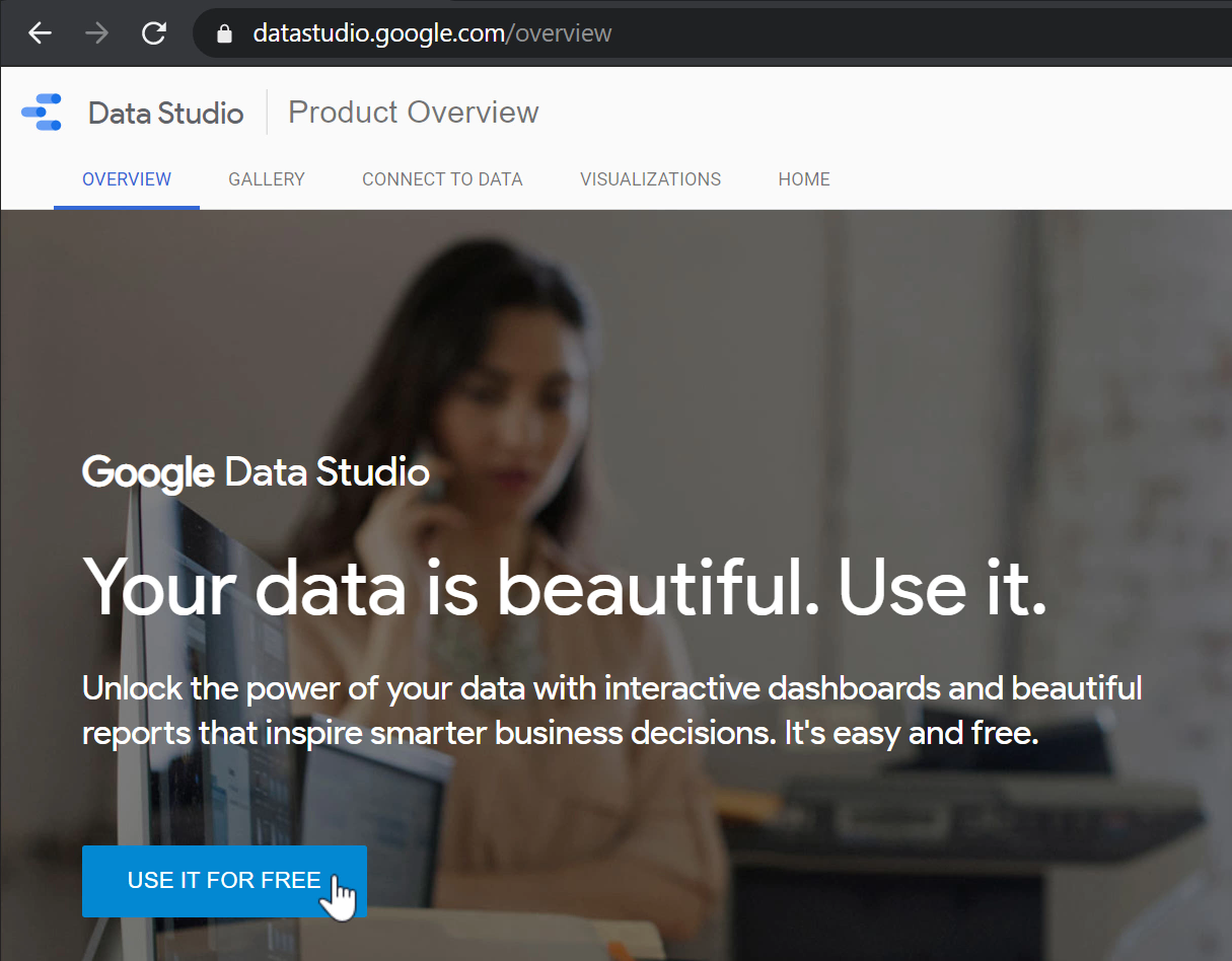
If this is your first time using Google Data Studio, you need to create an account. To do so, go to datastudio.google.com and click USE IT FOR FREE.
Now log in using your Google account and follow the steps to create your free Data Studio account.
1.2. The Main User Interface
Google Data Studio has two main components; Reports and Data sources.
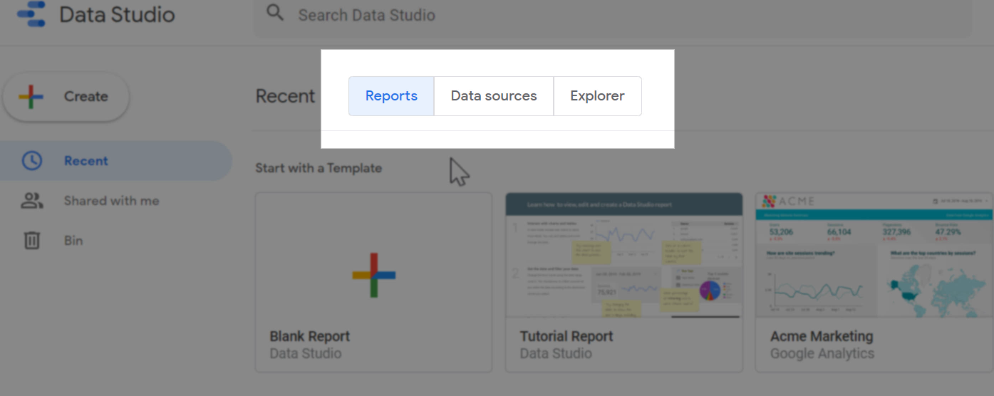
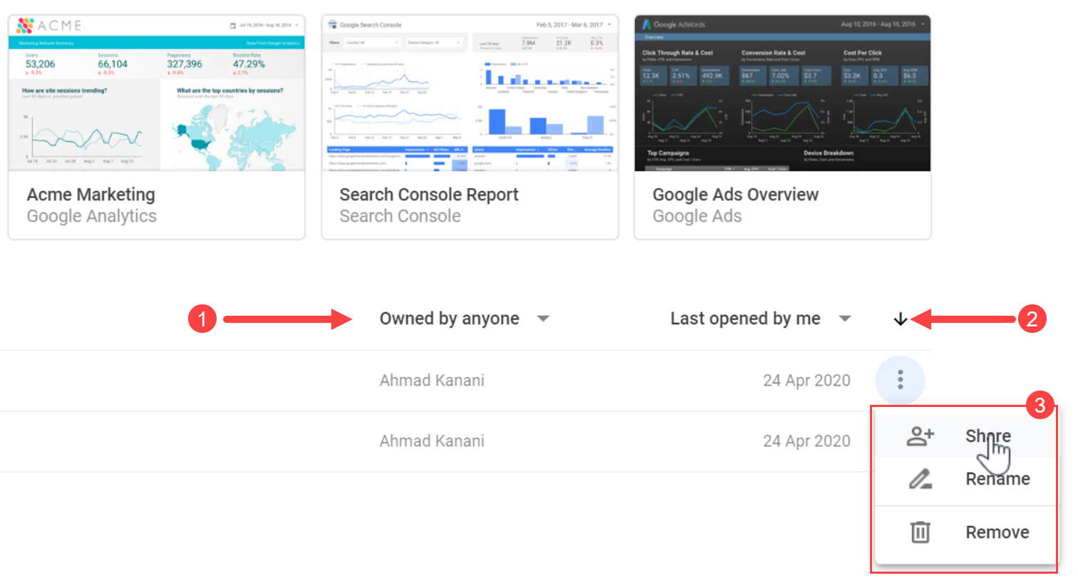
From this homepage, we can access every report or data source we have created so far or the ones shared with us. We can search for reports from the top of the page, too.

Here we can also sort the reports based on various criteria and Share, Rename, or Remove them.
Similarly, all the created or shared data sources can be accessed through the Data sources tab.

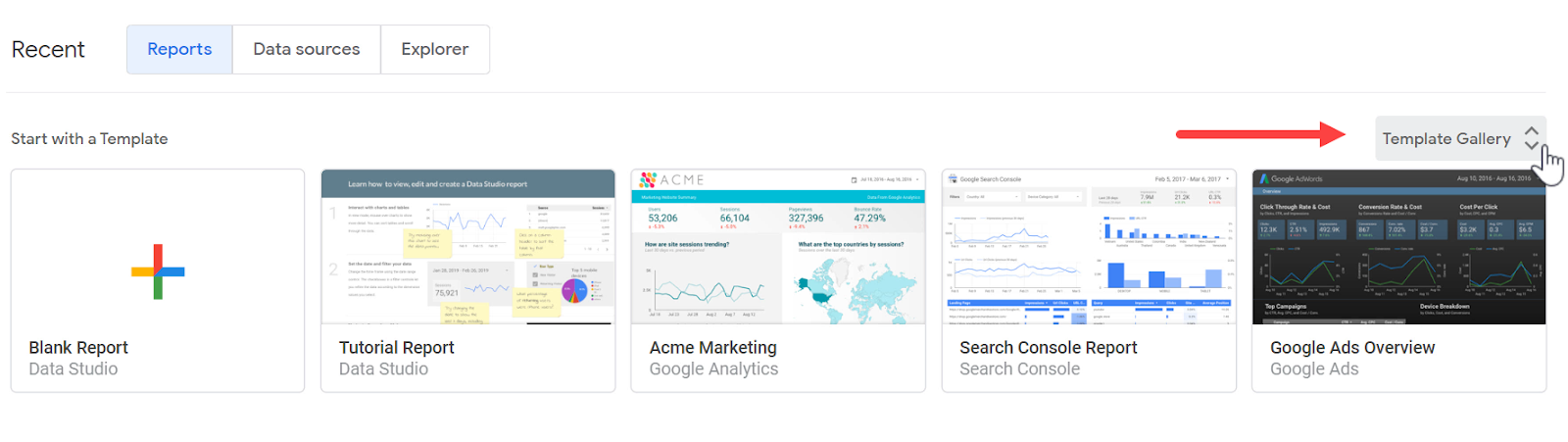
Additionally, in the Reports tab, we can click Template Gallery to find a list of pre-made templates to get started with or start with a Blank Report.
1.3. Creating a New Report
Immediately after creating a new blank report, the Add data to report window appears from which we should select a data source to connect to.
A data connector is required to extract the data from a dataset, such as a marketing or analytics tool, a SQL database, BigQuery, or even a Google Sheets document.
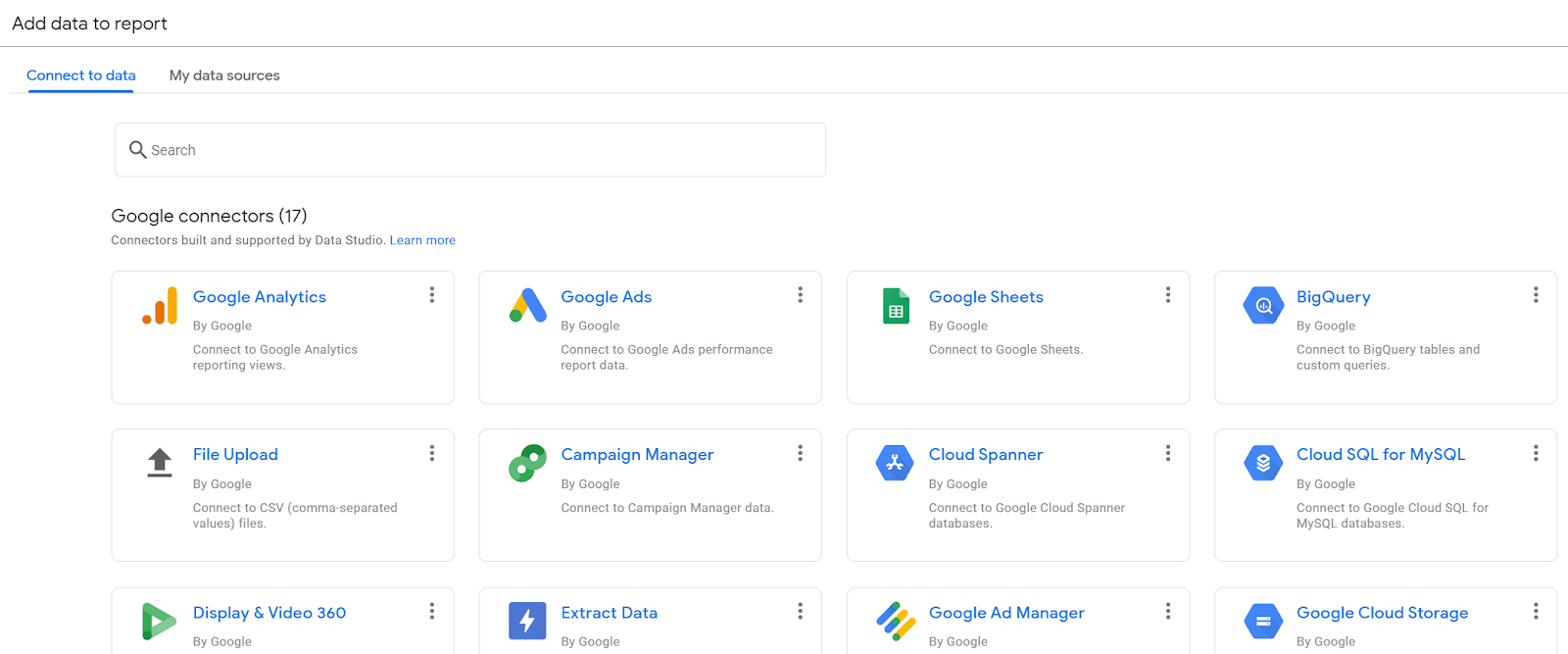
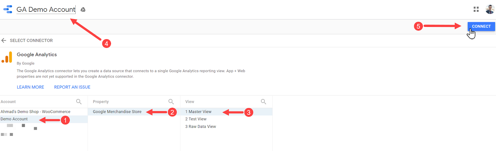
We should select a data connector from the list and connect it to our data set to make that data available in our report. To begin, click Google Analytics.
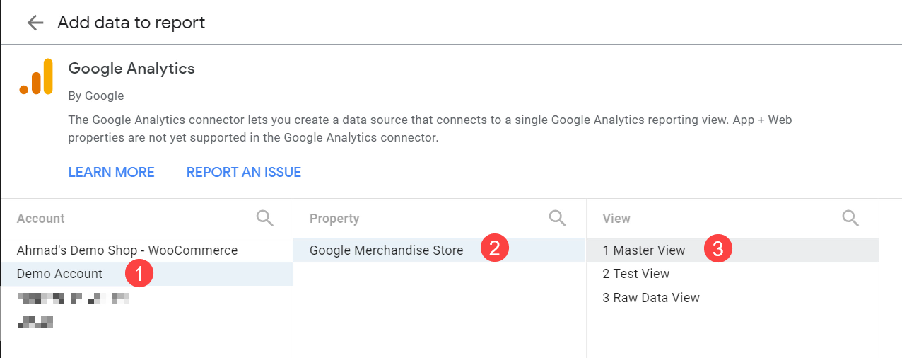
Next, it shows a list of all the available Google Analytics accounts that you have access to. Click Demo Account > Google Merchandise Store > Master View.
Note: If you don’t have access to the Google Analytics Demo account, see the next section.
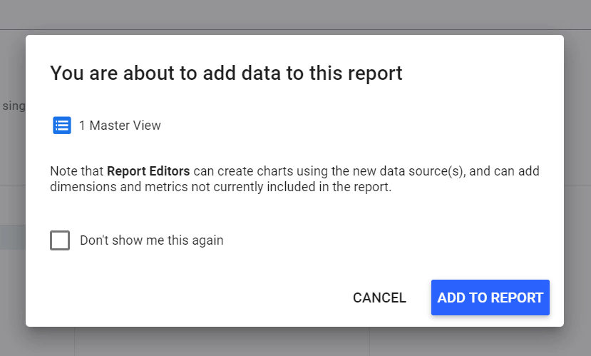
When done, click Add > ADD TO REPORT.
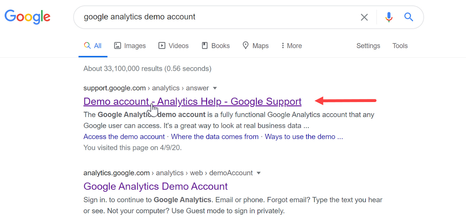
1.4. Getting Access to the Google Analytics Demo Account
If you don’t already have access to the Google Analytics demo account, follow the next steps. Simply search for google analytics demo account on Google and click Demo Account - Analytics Help - Google Support (it’s usually the first result).
Scroll down and click ACCESS DEMO ACCOUNT.
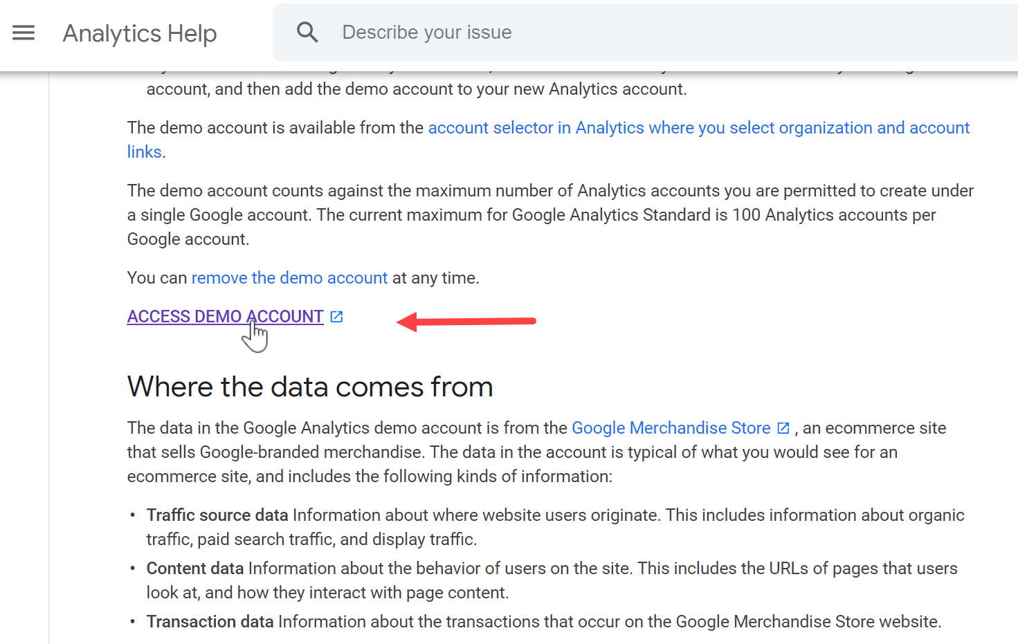
Next, you will be redirected to the Google Analytics in which you should agree with the terms to get access to the demo account.
1.5. Google Data Studio’s Editing Interface
Now that we have connected our report to a data source (The GA Demo account), we can see the Data Studio’s editing interface.
At the top of the page, we have the report title. We can rename the report title by clicking on it.
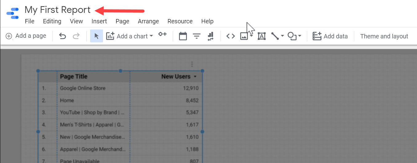
In the middle, we have the blank workspace that is called the Report Canvas.
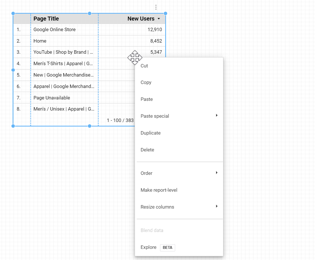
We currently have a table that was added automatically when we connected our report to the data source. Right-clicking on this table, or any other chart, allows us to quickly access the menu items related to that specific chart or component.
On the right side, there is a sidebar.
When there is nothing selected on the canvas, the sidebar gives us access to the general properties of the report.

When a chart or component is selected on the report, the content of the sidebar changes to show the properties related to that element. For a chart, we can view and control the data from the DATA tab, and we can change its appearance from the STYLE tab.


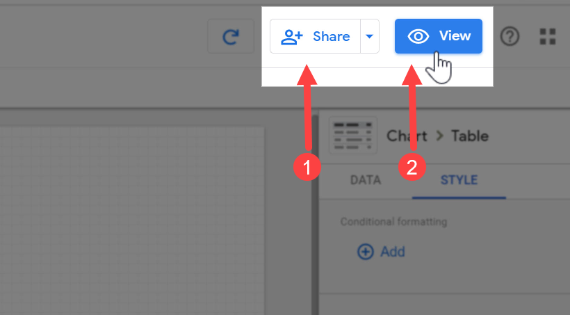
At the top right, there is the Share button that gives us access to the share options in Google Data Studio, and also the View button that toggles between the Edit Mode and the View Modes.
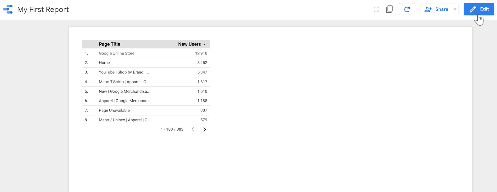
Below we can see the report in the view mode. This is the layout that appears to other people whom you share the report with.
1.6. Creating Charts and Components
A Google Data Studio report is created by placing charts, graphs, and other components on the report canvas.
Let’s add a few charts to the current report: Click Add a chart > Scorecard.
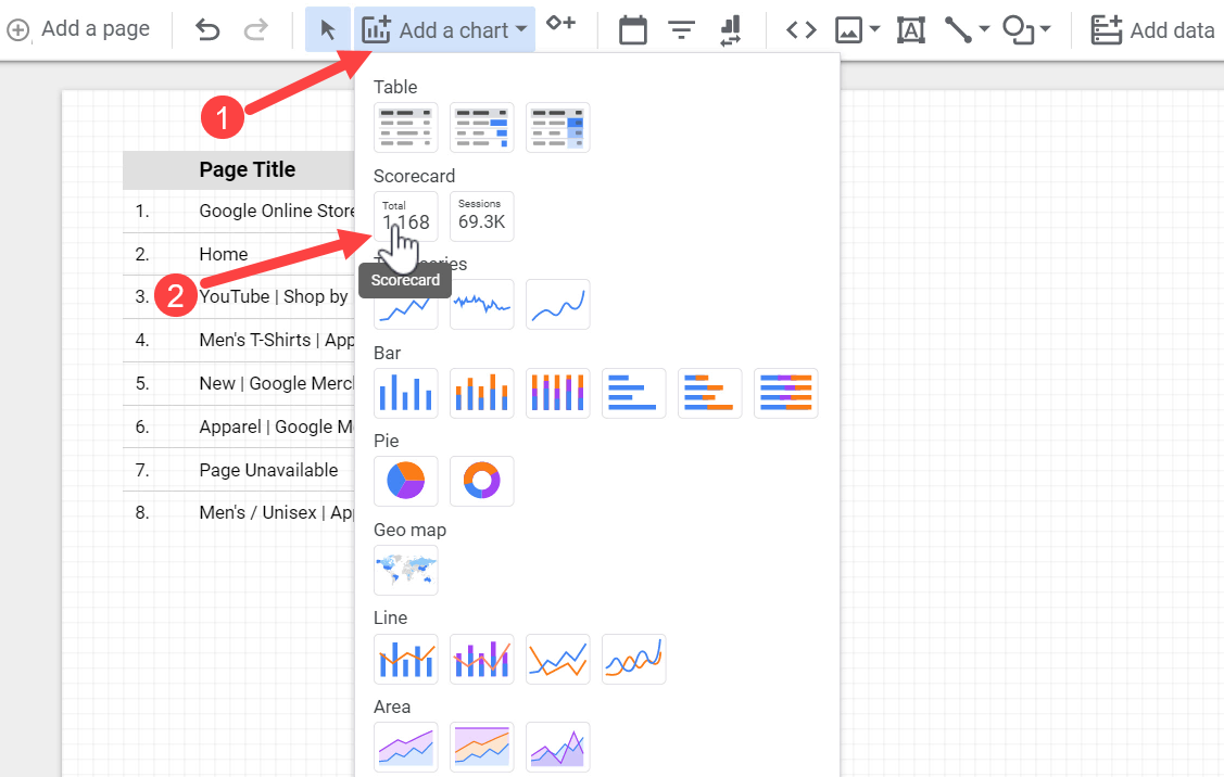
Continue the process and add a Time Series Chart, a Bar Chart, a Geo map, and a Pie Chart.
We can select a chart by clicking on it and then move, resize, copy & paste, or remove it.

At the top right, click the View button to see how your report appears.

1.7. Sharing Data Studio Reports
Sharing Google Data Studio reports is similar to sharing a Google Doc or Google Sheet.
Clicking the Share button shows us the available sharing options.
We can easily share the report with other people by entering their email address.

Also, we can click Manage access to create a link to the report. In both cases, we can decide to either let the people only view the report or be able to edit it as well.

There are a few other ways to share a Google Data Studio report with others.

Instead of sharing the access to the report or creating a public link for it, we can directly download a PDF version of the report to our computer, or schedule a PDF delivery of the report by email by selecting Schedule email delivery.
We can customize the setting as per our preferences, such as setting the intervals for repeating the email delivery, or the email body and its subject line.

Now, let’s learn more about the process of creating new data sources and the different types of data connectors.
Section 2: Data Sources & Data Connectors
In Google Data Studio, each chart or graph gets its data from a Data Source. To create a data source, we need to use a Data Connector to connect to an external tool or data set (Such as Google Analytics, Google Ads, Facebook Ads etc.) and extract data from it.
In this section, we’re going to learn how to create data sources and see what kinds of data connectors are available in Google Data Studio for us to use.
2.1. Creating a New Data Source
To create a new Data Source, click Create > Data source.


The first step is to select a data connector. Here we can see a list of available connectors in Google Data Studio.
2.2. Data Connectors
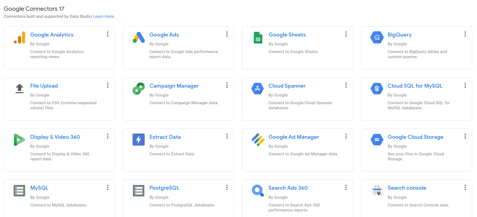
Generally, there are two types of connectors available; Google Connectors and Partner Connectors.
Google connectors are free, and allow us to connect to different Google Products such as Google Analytics, Search Console, Google Ads, Big Query, and Google Sheets.
We can also connect to MySQL databases or upload CSV files.
Partner connectors, on the other hand, are created and maintained by third-parties and usually require a paid subscription.
They allow us to connect to lots of different tools like Facebook Ads, Adobe Analytics, Microsoft Ads, SalesForce, AdRoll, etc.
One of the main companies that creates high-quality and reliable data connectors for many marketing tools is Supermetrics, others like Funnel.io also offer access to more than 500 marketing data sources.

For the purpose of this lesson, let’s use the Google Analytics connector and connect to the GA demo account.
Rename it to GA Demo Account, and click CONNECT.
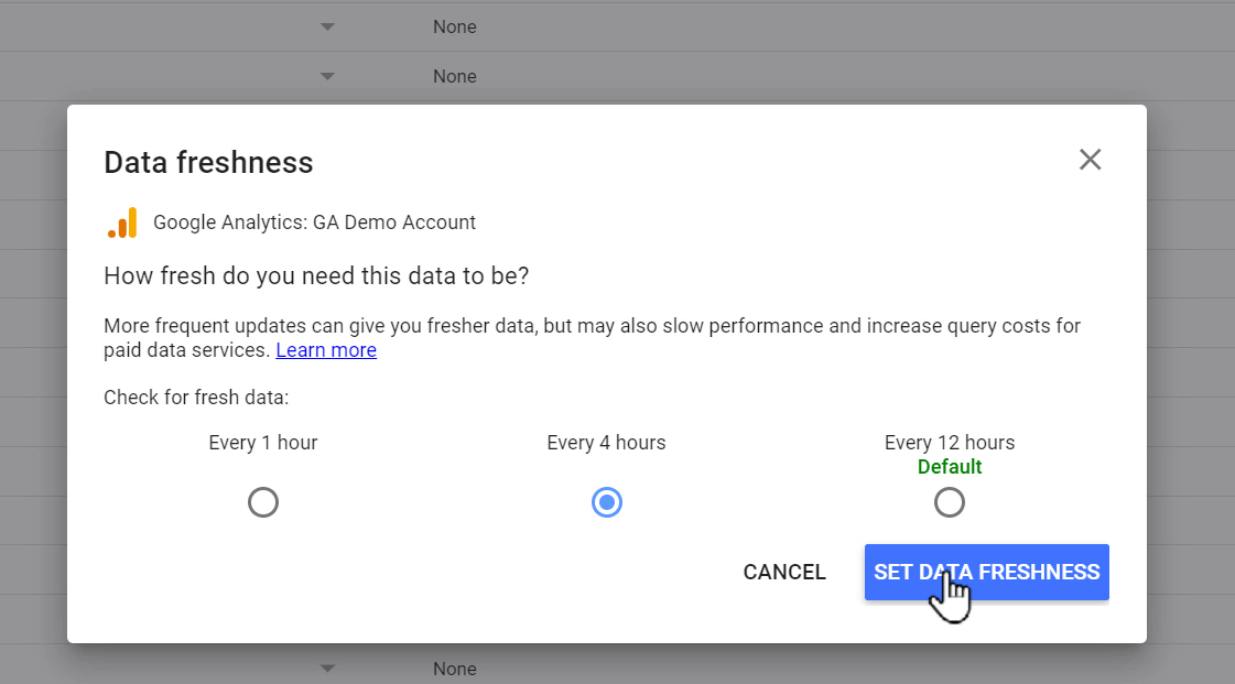
The data connector will now make a direct connection to the Google Analytics demo account through the API to create a new data source.
The data gets updated based on the frequency that we set for Data freshness.

We can change the interval and click SET DATA FRESHNESS in the end to save changes.
2.3. Fields in a Data Source
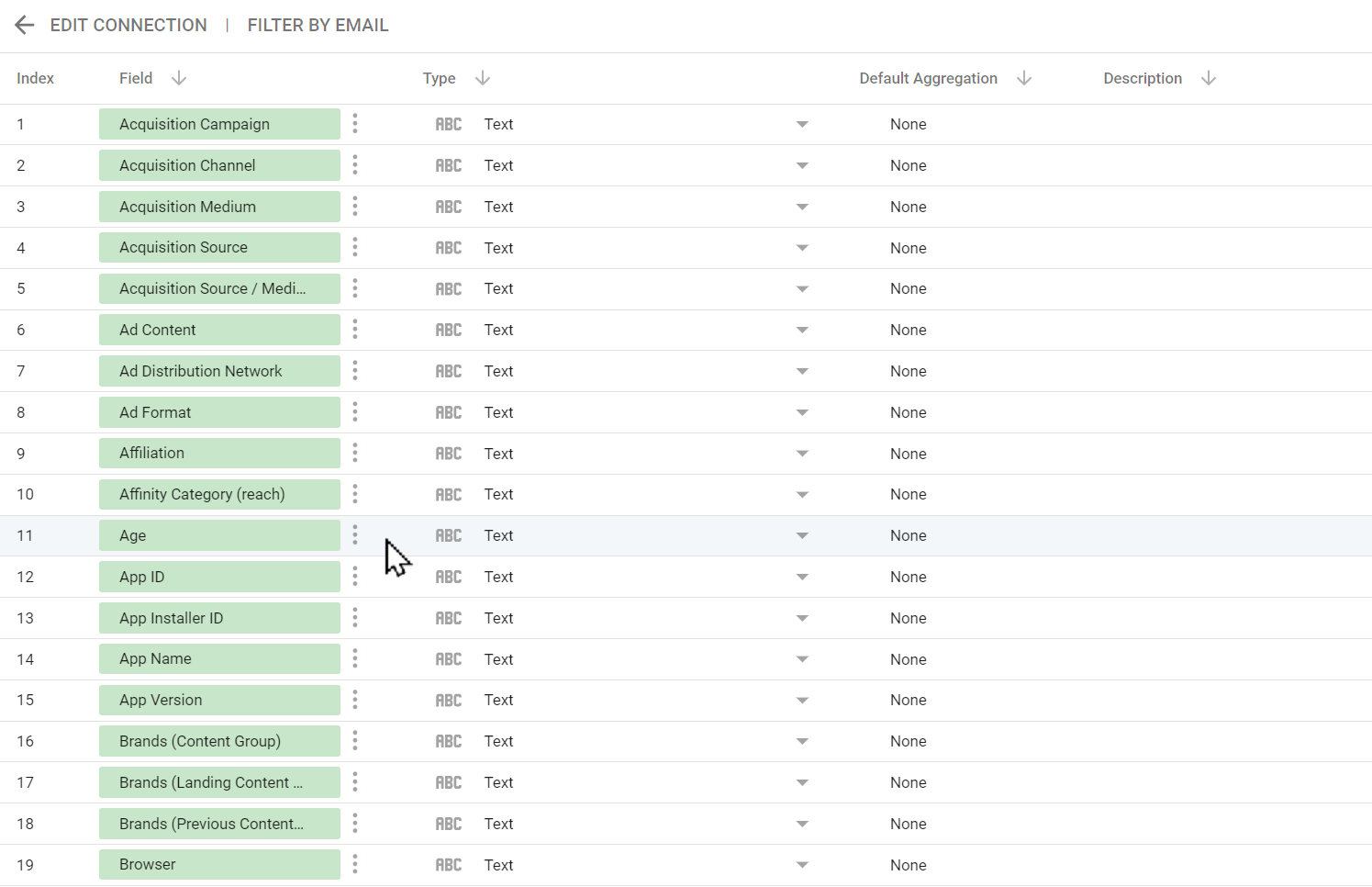
A data source can have many fields, and these fields are either Dimensions or Metrics.
Dimensions
Dimensions are properties of something, and the values within them are the titles or names of a category. For instance, age is a dimension. Similarly, browser, city, campaign name, country, and page title are also dimensions, since they describe something about a user, a visit, or a page.
Dimensions are usually in text format, but Date is also a dimension.
Metrics
Metrics, on the other hand, are numbers and are used to measure something. For example, the number of users, page views, and transactions.
We can perform different mathematical functions on metrics, such as summing up, calculating the average, minimum, and maximums.
Each field has a data type which shows the kind of data stored in it.
For instance, the data type for a metric can be number, percentage, duration in seconds, or even currency.

However, dimensions are mostly in the text format, but they can also be used for other values like Date and time, Boolean, or a Geographic location.

Calculated Fields
Aside from the default fields that are already available in any data source, Google Data Studio allows us to create new metrics and dimensions called Calculated Fields.
These fields return a value by applying a function to one or more existing fields in the data source.
For example, we can do basic math with metrics or manipulate the dimensions.
Let’s see some examples.
To create a calculated field, click ADD A FIELD.
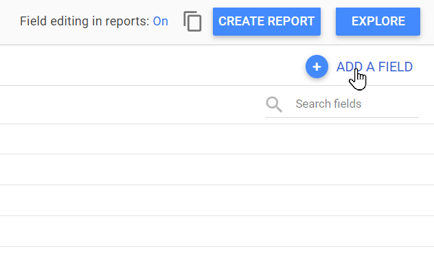
Then give it a name and enter the formula.
Here I have divided two metrics: Revenue by Users to come up with a new metric which we can call Revenue per User. We can also multiply metrics, sum them up, or subtract them.

An example of working with dimensions to create a custom field would be to return the value of another field in the uppercase or lowercase format.

From now on, this calculated field returns the value of Source/Medium in the uppercase format.
We can, likewise, append the values of two dimensions together. To do so, we can use the CONCAT function.
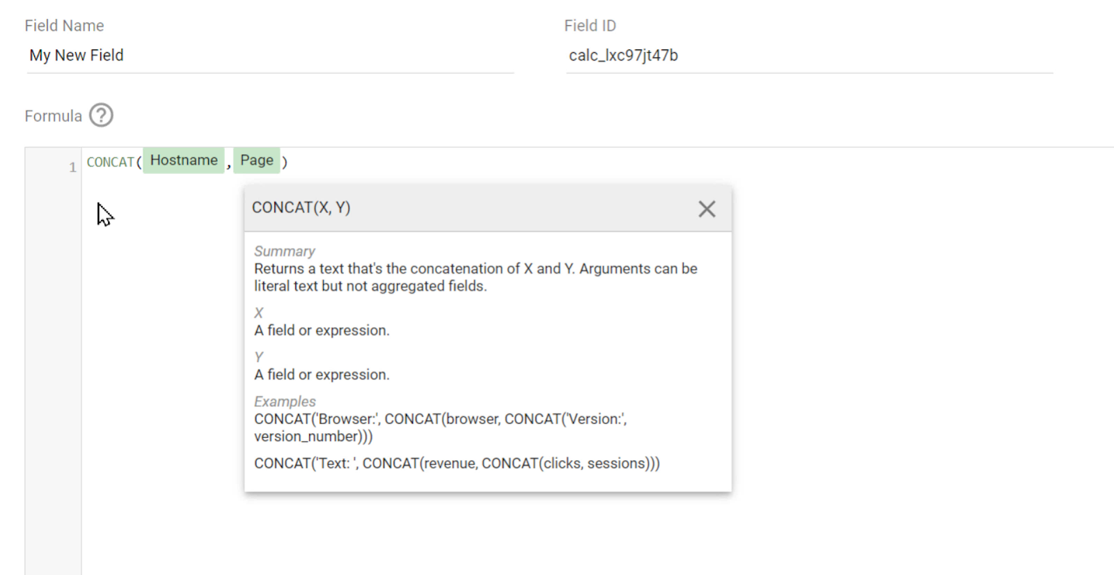
Once the formula is completed, click SAVE.

A complete list of these functions can be found in the Data Studio Documentations.
We can now see our newly created field in the data source. Our data source is available at the Data sources tab of Data Studio, and we can select it again whenever required to change the configurations.
Also, we can use this data source in any reports that we create in the future.
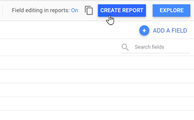
We can likewise create a new blank report connected to this data source directly by clicking CREATE REPORT from the top of this data source panel.
Now that we know how to connect to different tools and bring our data into Data Studio, let’s find out the options that we have for data visualization.
Section 3: Data and Style Properties
In the previous sections, we learned how to use Google Data Studio to connect to different marketing and analytics data sources and how to add different charts to the report canvas to visualize that data and create reports.
In this section, I am going to show you how to customize the data and style properties of charts in Data Studio to present data exactly the way you want.
3.1. The DATA Tab
We saw, in the previous lesson, that we can customize the data of charts from the DATA tab. Let’s take a closer look:

First off, we can define the data source that our chart is getting its data from.
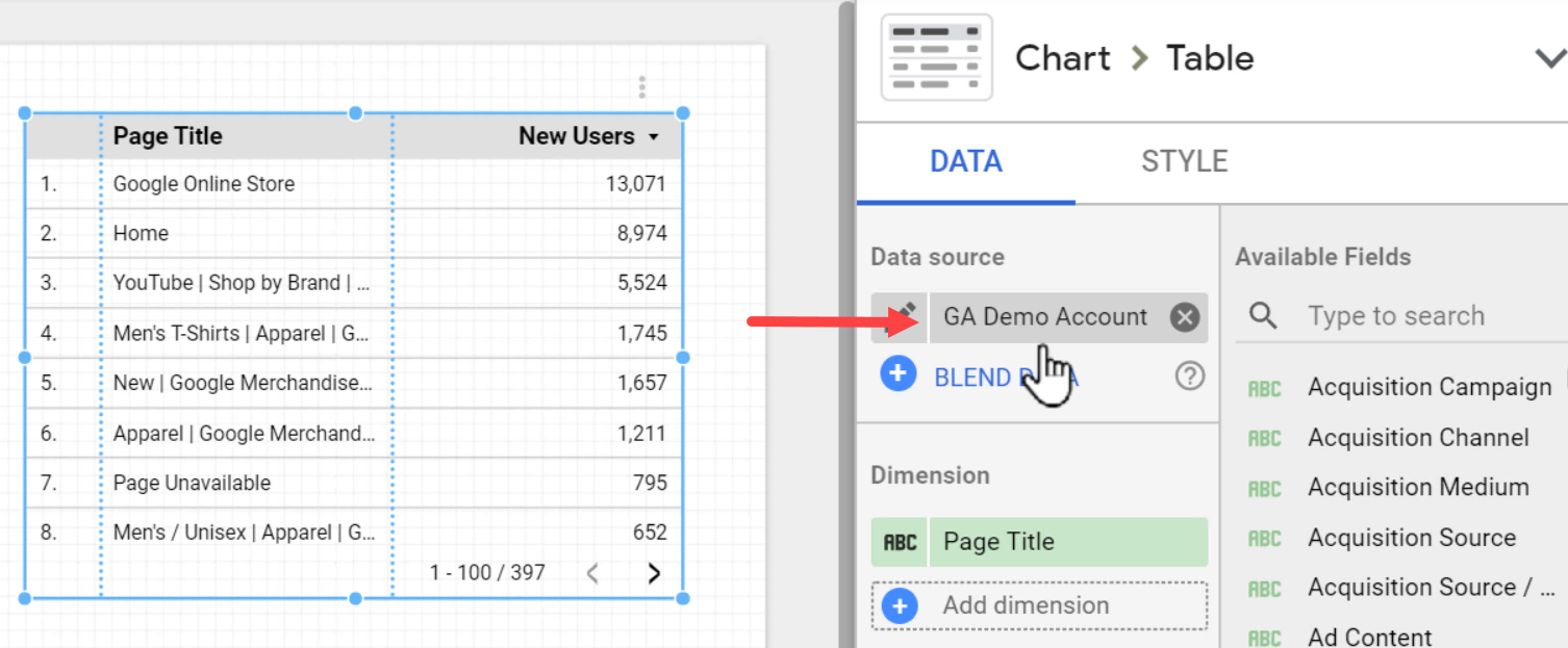
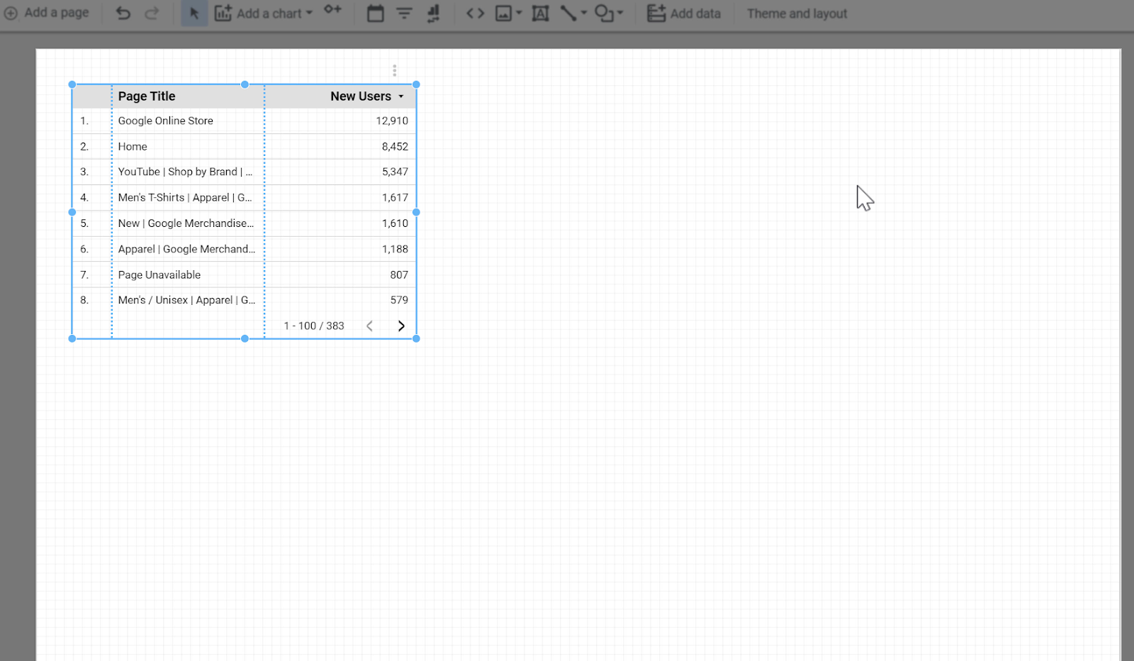
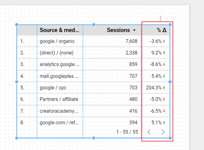
Below that, we can define the Dimensions and Metrics from that data source to be presented in our chart. Our sample table is currently showing the number of new users for each page title.
Let’s change it to show the number of sessions per Source/Medium by clicking Add dimension and searching for Source/Medium.

We can also search for the field that we need on the right side and then drag & drop it on the left. Here I have added Sessions to the Metric section in this way.

We can replace a field by either clicking on it and choosing another one, or dropping the desired field from the right panel on it.
On the left side of each dimension’s name, the type of the field is displayed, for a metric, the aggregation method is shown e.g. SUM, AUT (for Auto), or AVG.
By hovering the mouse cursor on the field type or aggregation type icon, the icon changes to a pencil, allowing us to change the properties of that field.

For example, here I have changed the name from the default value Source / Medium to Source & Medium.

Note that this change in the field name only affects the current chart. If we use the same field on another chart on this report, the original field title, i.e., Source / Medium, will be displayed there.
There are a few more data properties that can be configured in the Data tab. In order to access them, we should use the mouse’s wheel or the trackpad to scroll down the DATA tab, since there’s no scroll bar!
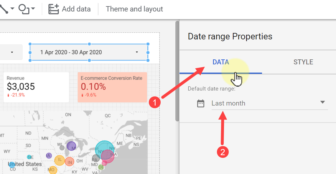
One of the most important settings on the DATA tab is the Default date range. It controls the timeframe by which we see our data in that chart. By default, it is set to Auto, which corresponds to the last 28 days, or whatever date range is set at the report or page level.
We can set it to Custom and select a different date range.
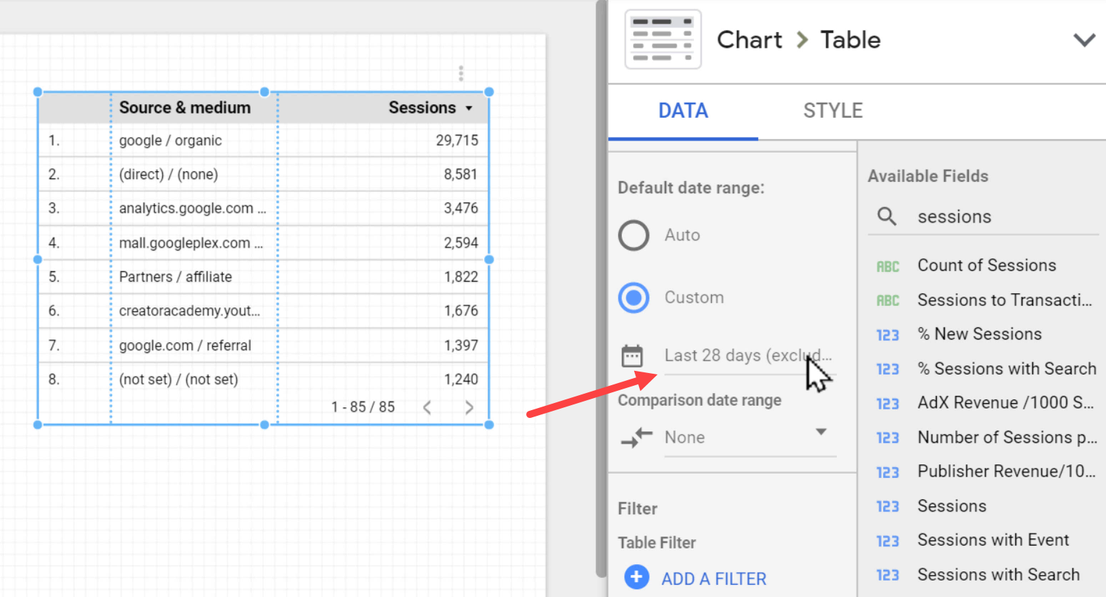
Here we are allowed to choose a fixed Start date and End date from the calendar.

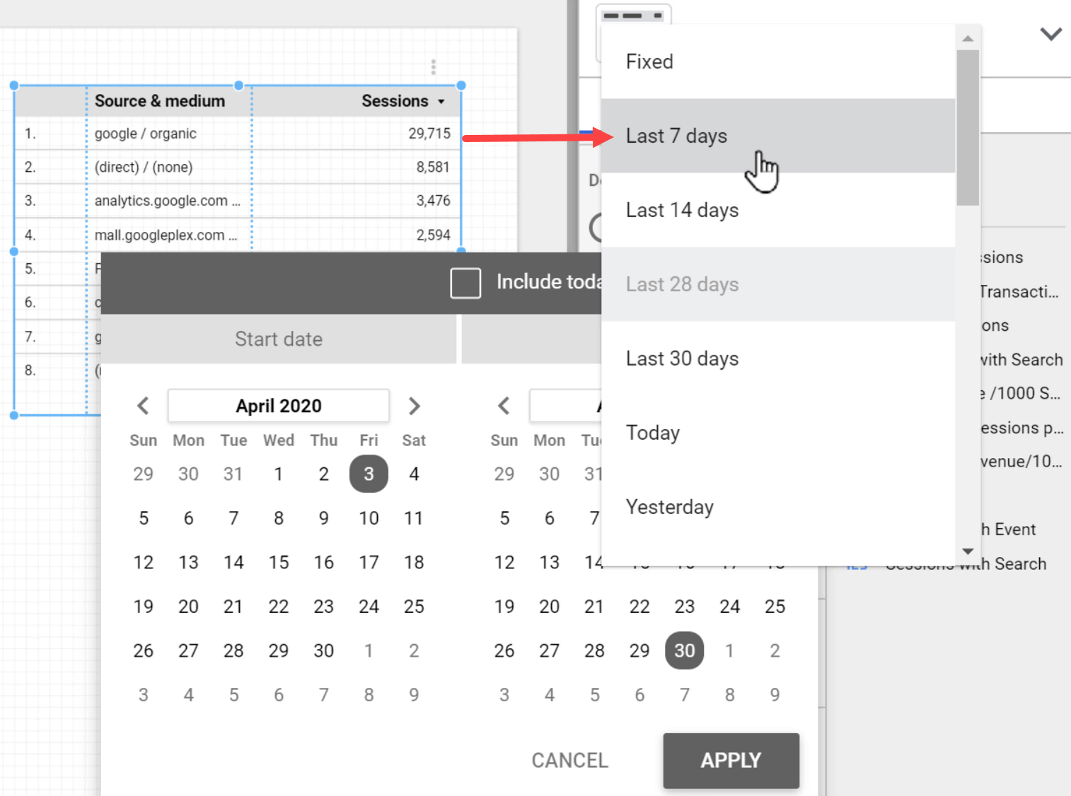
Otherwise, we can set dynamic dates by clicking the drop-down menu.
The dynamic dates are calculated based on the actual date that the report is being viewed. For example, if we select the Last 7 days option, every time that someone views the report, the table will show the data for the relative last 7 days to that date.
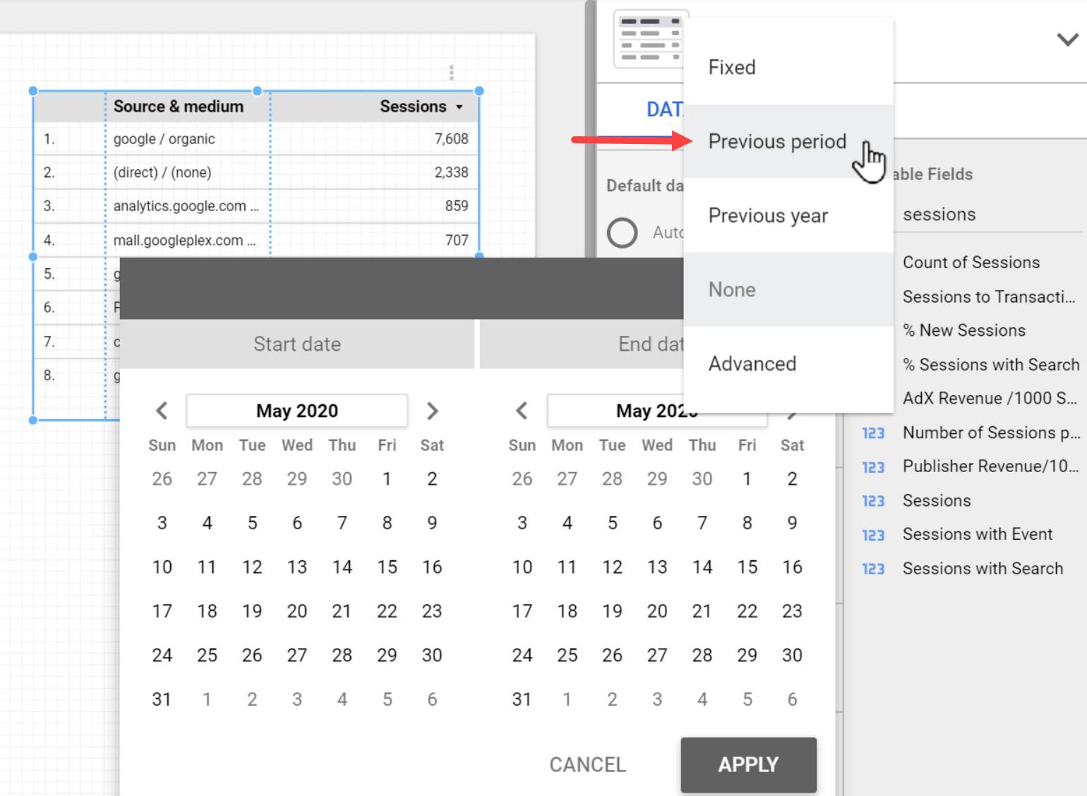
We can also compare the data in our chart to those of a different date range by using the Comparison Date Range drop-down menu.
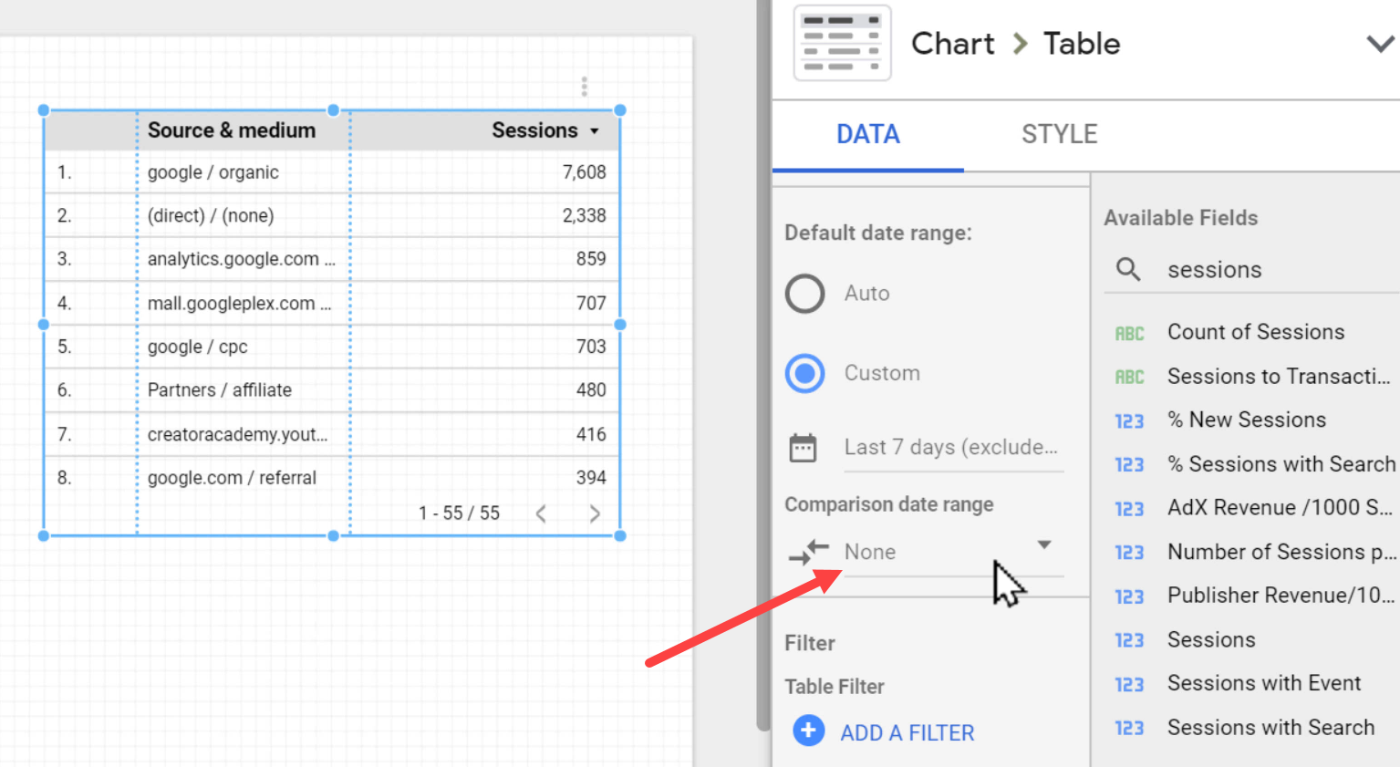
Here I have selected the Previous period.
Now the table will be updated accordingly to show how much the values have changed since the previous period.
Another important property of charts is the Filter, which allows us to limit the type of information presented on the chart.
For instance, we can make a filter to only display sessions from mobile devices. Let’s do this by clicking ADD A FILTER.
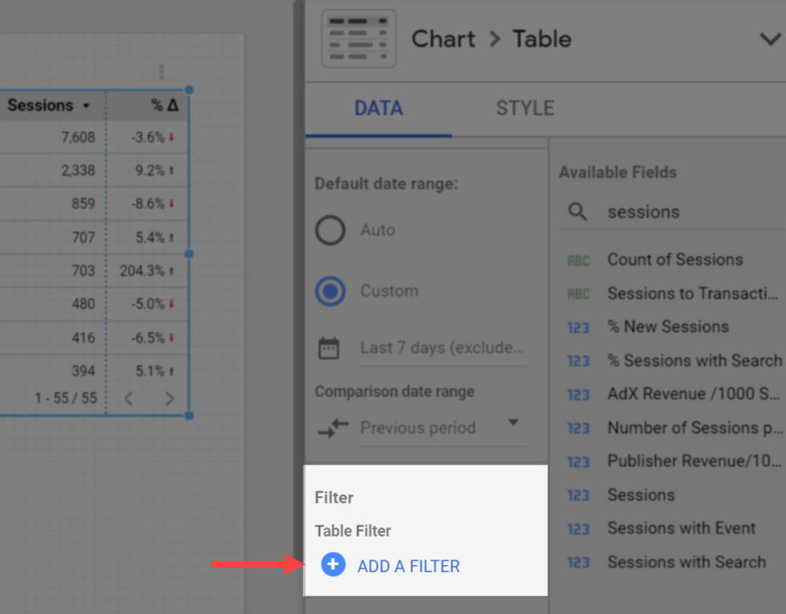
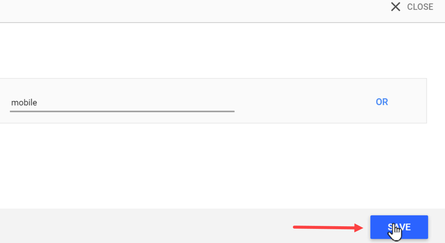
Now let’s give it a name, and then select Include > Device Category > Equals to (=) > mobile.

In the end, click SAVE.
The table will now be updated to only show sessions from mobile devices.
If we use Google Analytics data sources, we can also apply a Google Analytics segment. For example, we can select to show data only for returning users.
Let’s do this by clicking ADD A SEGMENT.
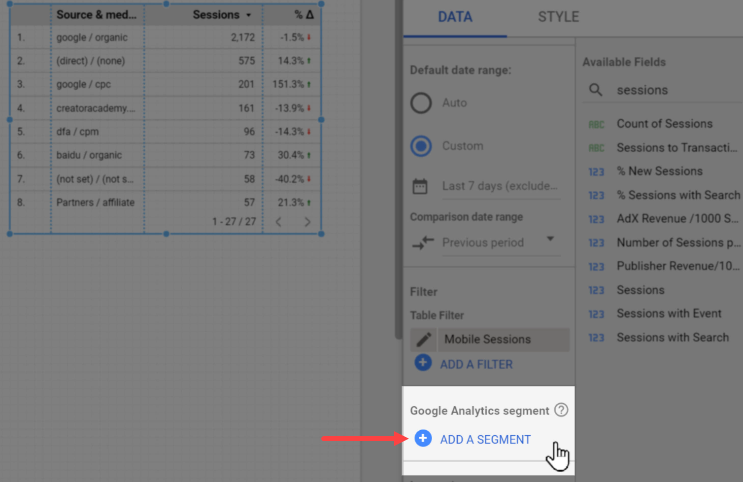
And then click System segments > Returning Users.
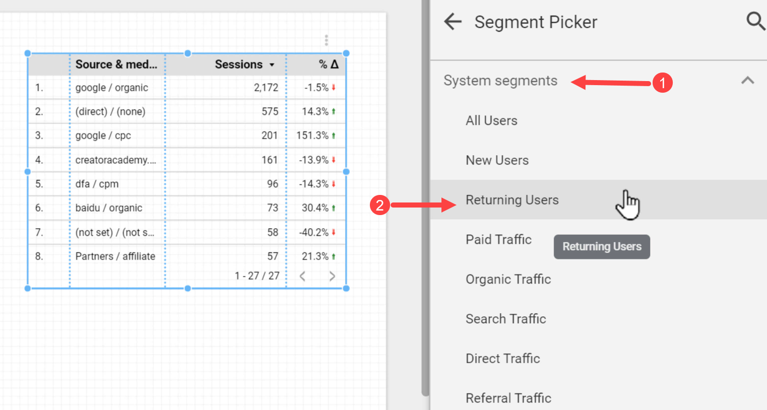
Just like the previous steps, the table is now updated to only show the data of returning users.
3.2. The STYLE Tab
Using the settings in the STYLE tab we can change the chart’s appearance. There are settings that are exclusive to each chart type, but some general items are available which apply to almost all chart types.
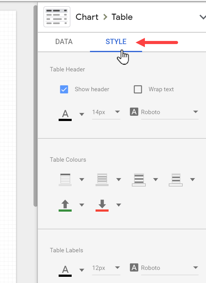
One of the common settings among all charts is the font. For example, for a table, we can set a specific font for the Table Header, and another one for the Table Labels. Font sizes and colors can be changed, too.

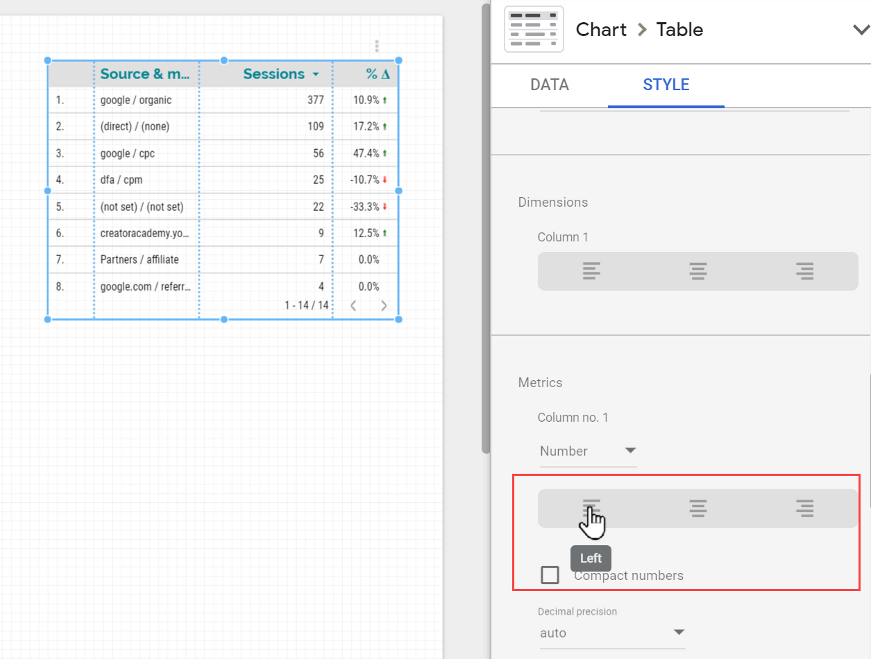
Additionally, for a table, we can change the text alignment to Left, Right, or Center.
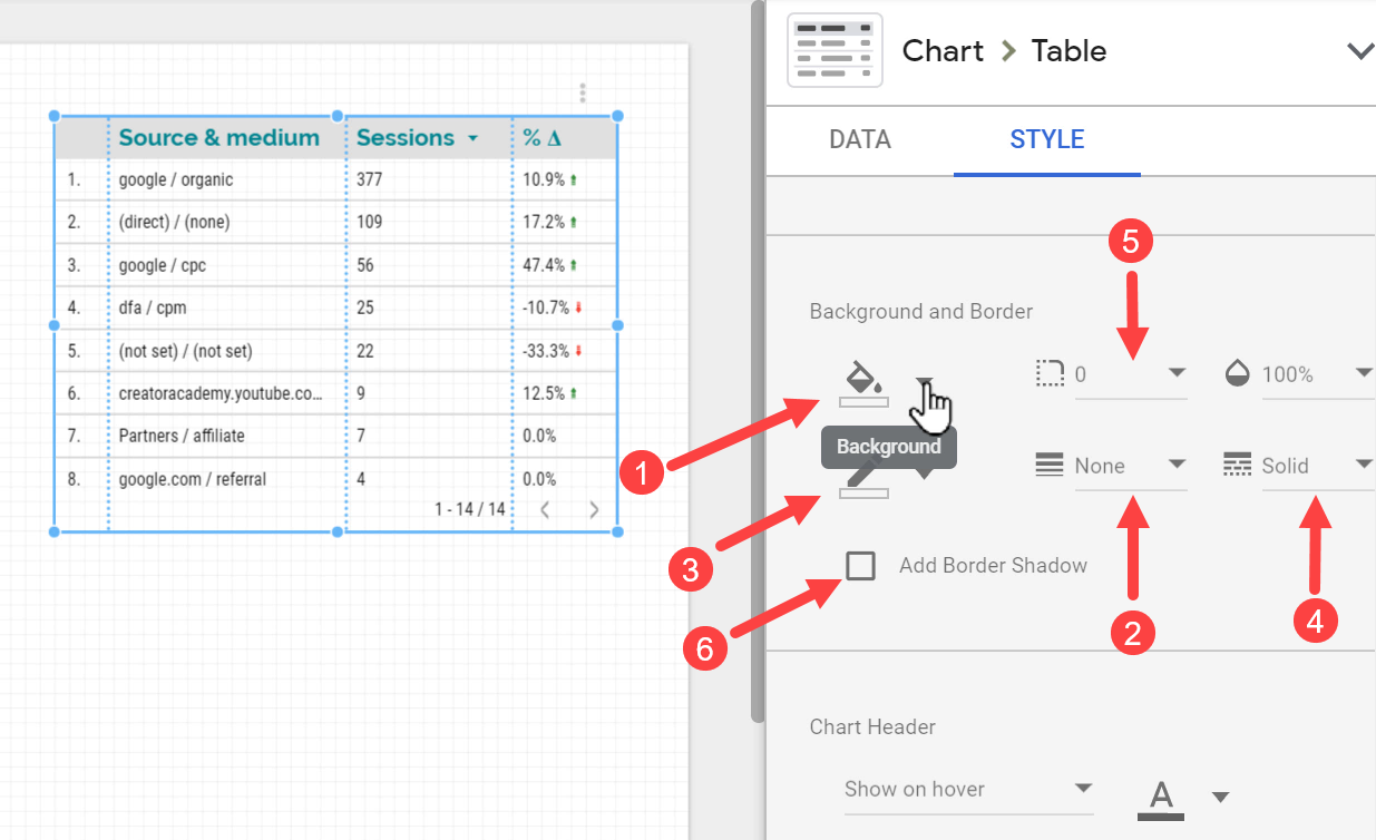
In order to automatically adjust the width of a table’s columns, we can double-click the column border.

For almost every chart, we can set the background color and adjust its border width, line weight, color, type (e.g., solid, dashed, dotted, etc.), border-radius, and also add a border shadow if needed.
In this section, we learned how to configure the data in our charts through the options available in the DATA tab and personalize the way our data appears from the STYLE tab.
The settings that we covered in this lesson are almost the same for all chart types, however, there are specific options available for each chart type which we couldn’t cover in this introductory tutorial, so feel free to explore them on your own.
Section 4: Standard Charts in Google Data Studio
In this section, we’re going to review different types of charts in Data Studio that can help us visualize data differently and tell different stories with our data.
I am not going to take a deep dive into the details of how to set up and configure each chart type since that would be out of the scope of this tutorial. Instead, we’re going to see the possibilities in Data Studio and the options we can use to better communicate data to the end-users.
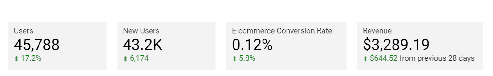
4.1. Scorecard
Let’s begin with Scorecards: the simplest types of charts in Google Data Studio.
Scorecards can be used to show metrics and KPIs (Key Performance Indicators) in the forms of normal and compact numbers, ratios (percentages), and currencies.
Also, we can use scorecards to compare current values with those of the previous periods to see how much our numbers and ratios have changed. We can either see the changes in absolute numbers or percentages.
Another useful feature of the Scorecard component is the ability to apply conditional formats.
For instance, here I have set the rule that if the E-commerce Conversion Rate is less than 2%, I want the scorecard’s background to become yellow, and if the Revenue is more than $2000, I want its background to become green.
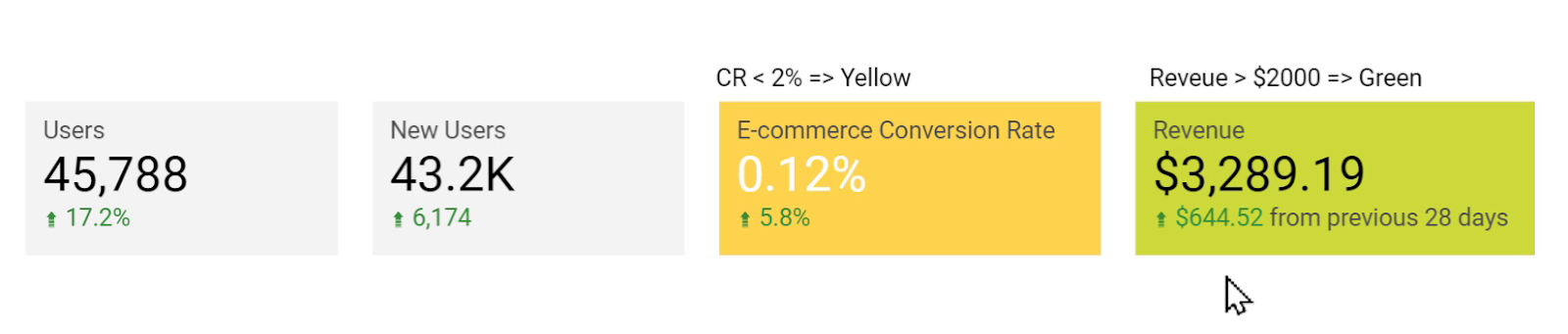
We can change the values and set multiple criteria for the conditional formatting of a single scorecard.
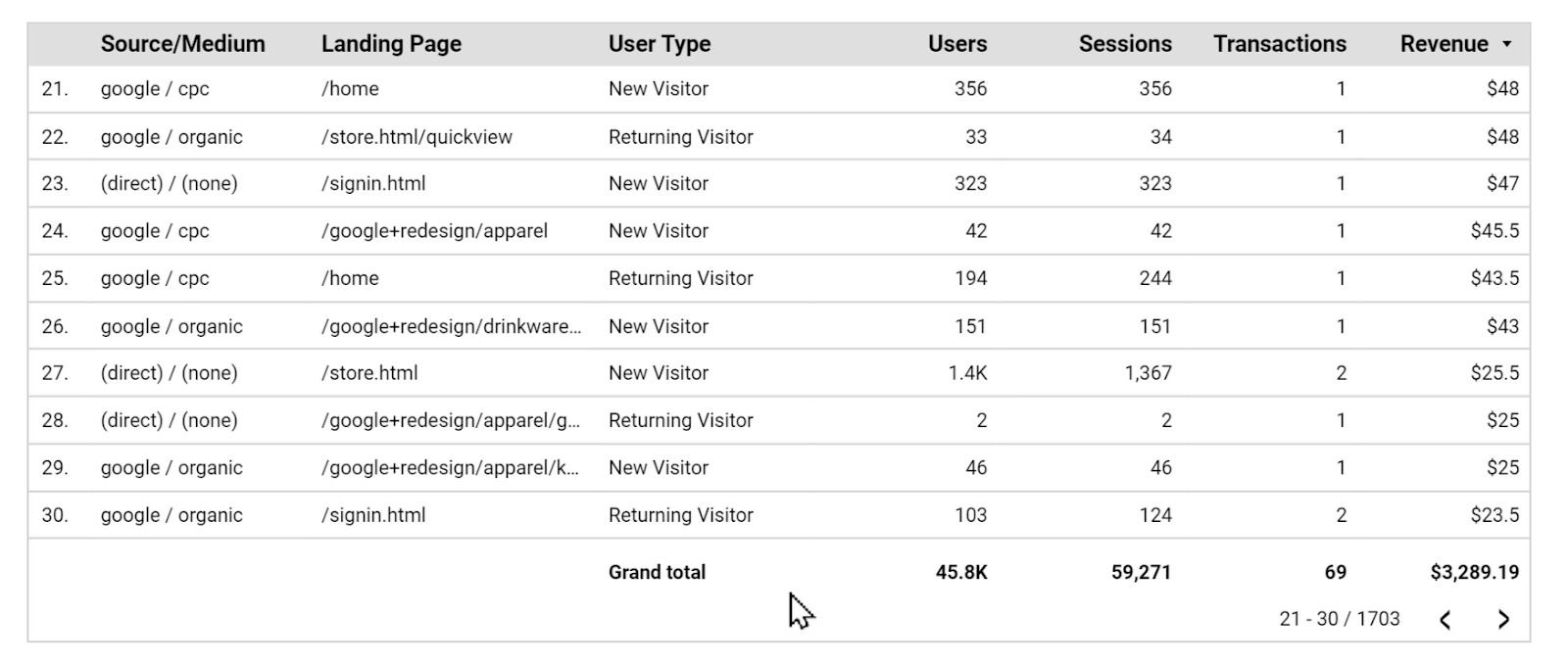
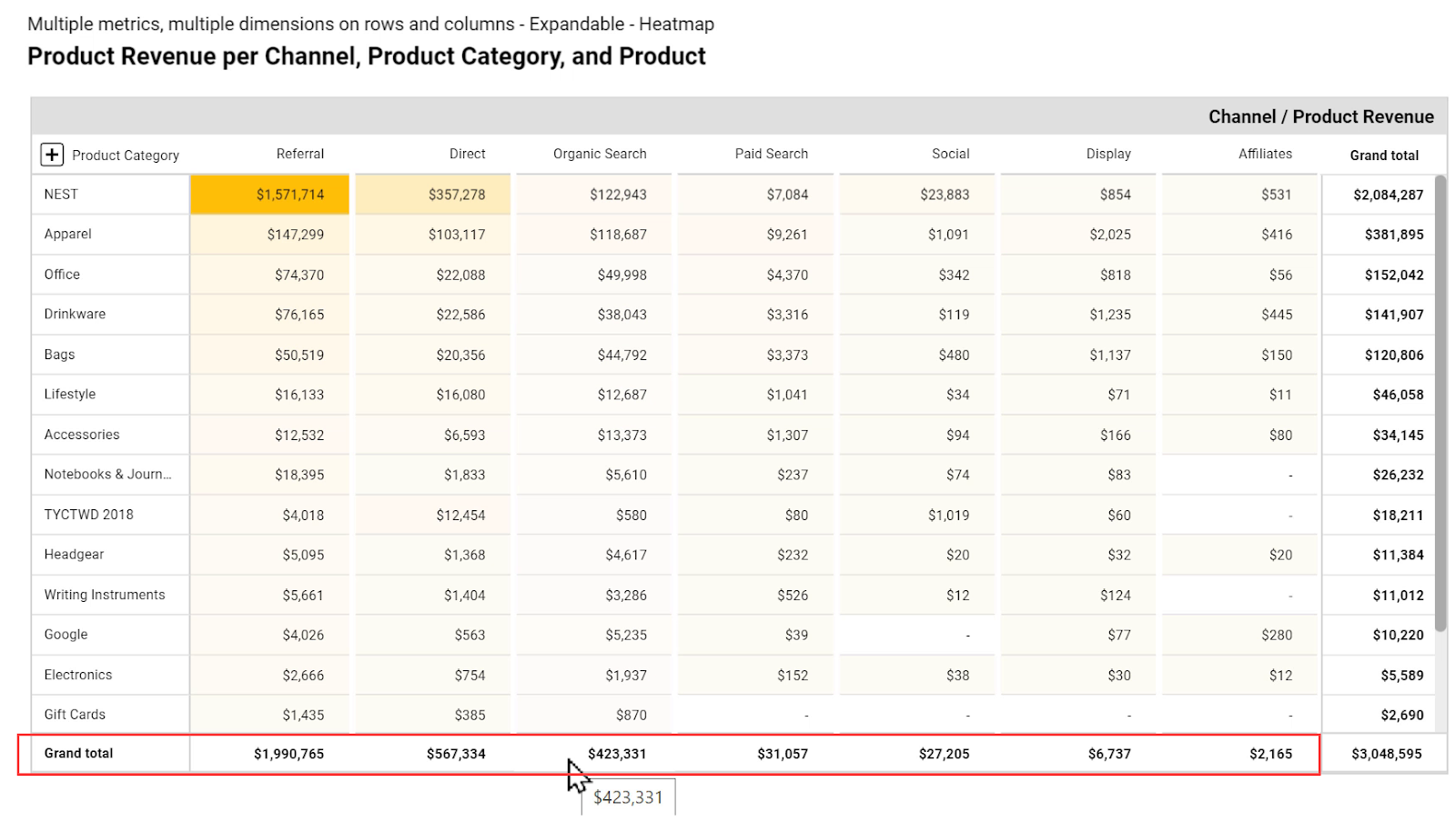
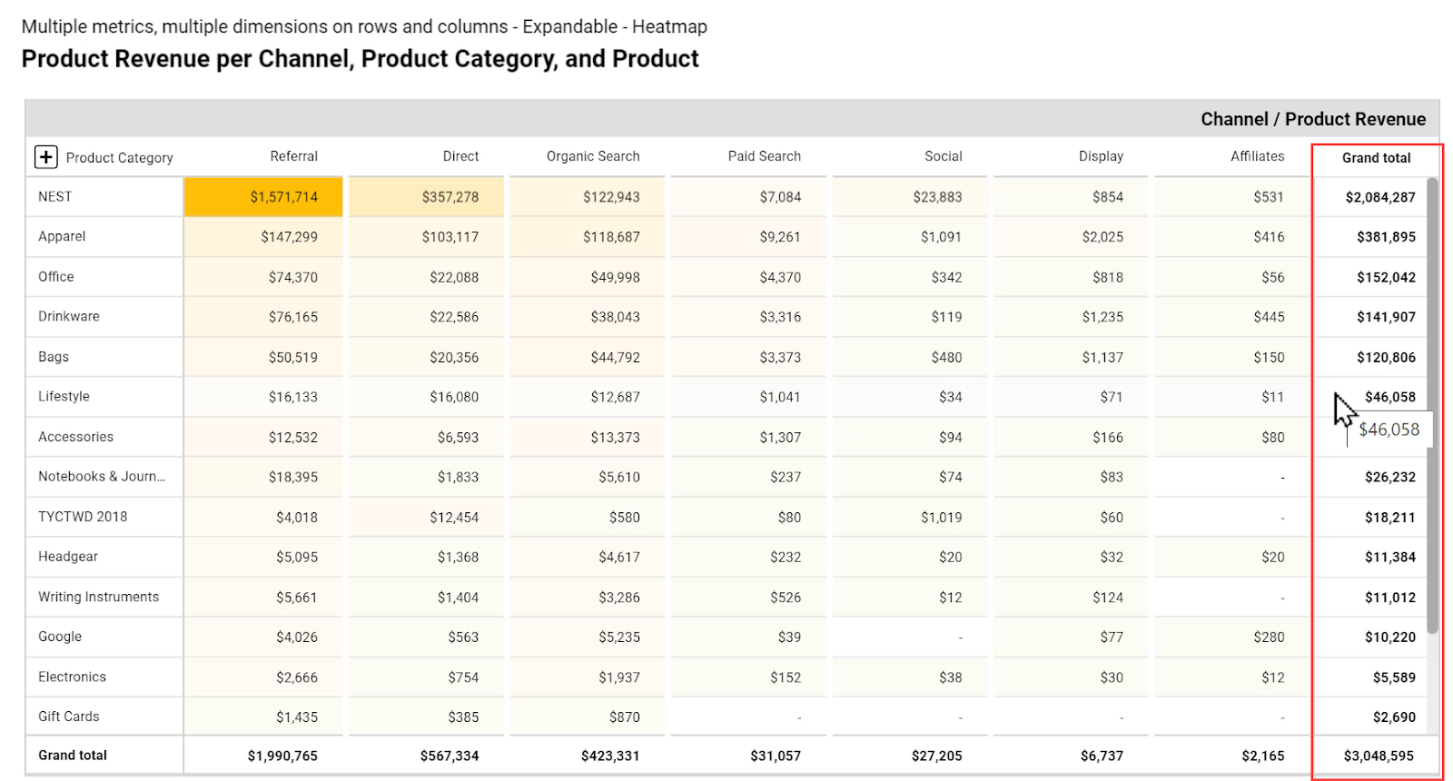
4.2. Table
Tables are great tools for summarizing data in rows and columns.
Dimensions appear in rows, and Metrics are displayed in columns.
We can also see the Grand total at the bottom and use the pagination to navigate to the next pages of the table.
Tables in Data Studio have other styling features as well that help us communicate better stories with our data.
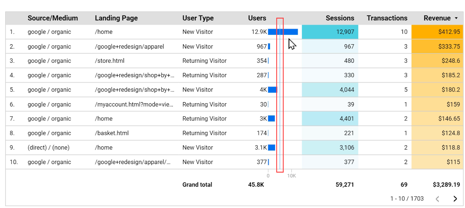
For instance, instead of showing the numbers in a simple format, we can apply a heat map to a column to easily spot the larger and smaller numbers.

Additionally, we can choose to display numbers in a column with small bars. It not only helps us see smaller and larger values but also allows us to compare them much easier.
For example, in the table above, we can not distinguish the largest number among the ones with blue shades. But by using bars, we can immediately see that the fifth row has the largest number amongst those 3 rows.
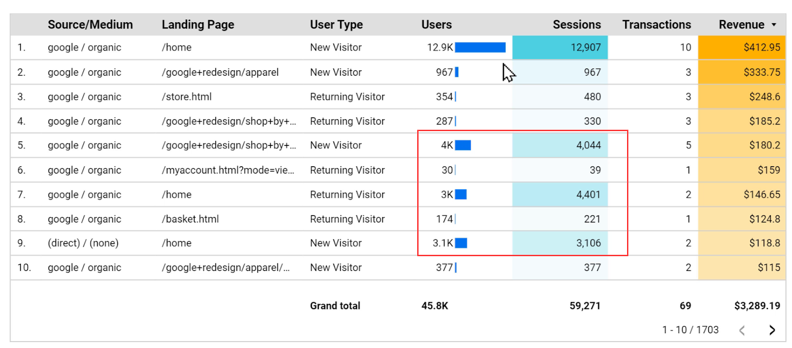
We can also add a target line to the bars to quickly see which rows are less than or more than the target.
Another practical feature of tables is conditional formatting. Here I have set criteria to change the background color of a row to light green if the value of the column User Type is New visitor, and change the font color of a whole row to green if the revenue is more than $300. Also, for the revenues below $200, only change the font color of the Revenue column to red.

4.3. Time Series
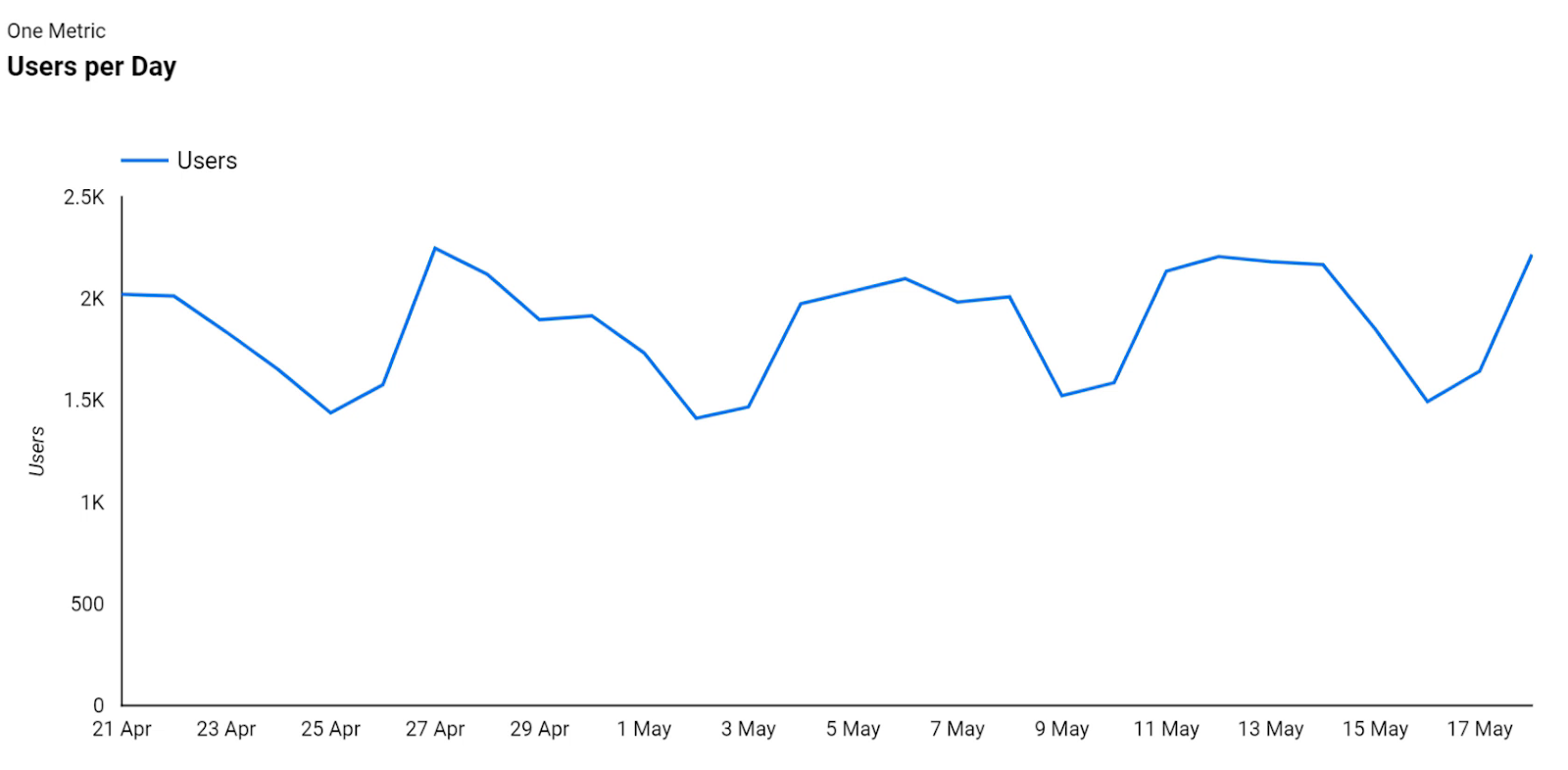
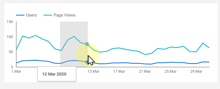
Time series charts are good to show the changes in metrics’ values over time and help us see the trends and patterns in the data. Here is a simple time series chart that shows the number of users over time.
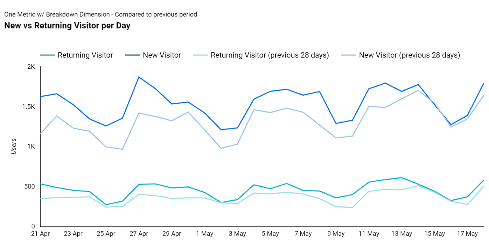
We can also break down the metric over different categories, such as the Returning Visitor vs. New Visitor, and compare the values to previous periods.
For example, the following chart shows that during the last 28 days, we had both more new visitors and returning ones compared to the 28 days before that.
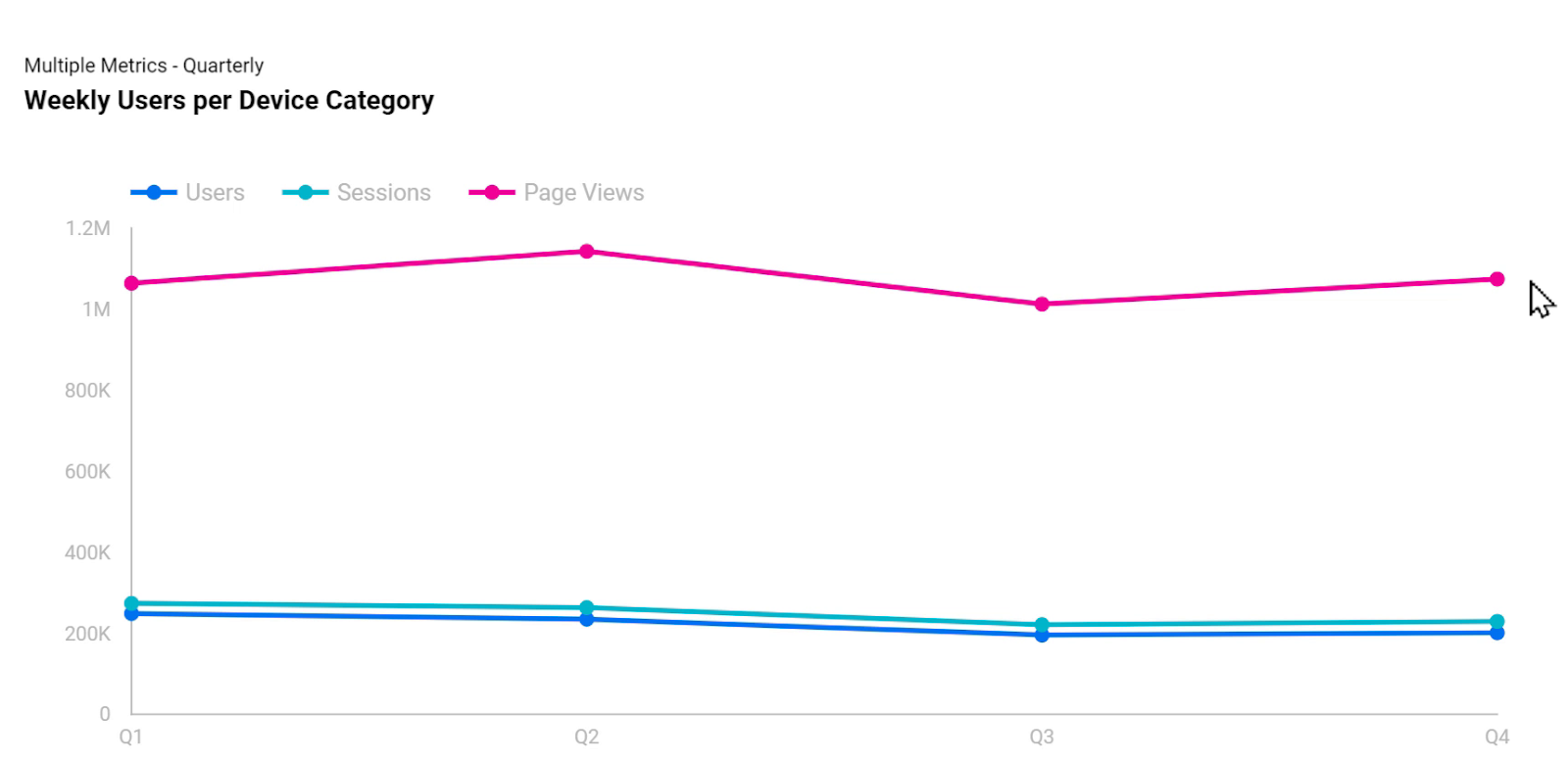
The next picture shows another time series chart that’s been used to plot the number of users over time, broken down per the device category. Therefore, we can see the number of users from desktop, mobile, and tablet, and instead of plotting it daily, in this case, we have set the chart to use Week of Year as the value of our date range.

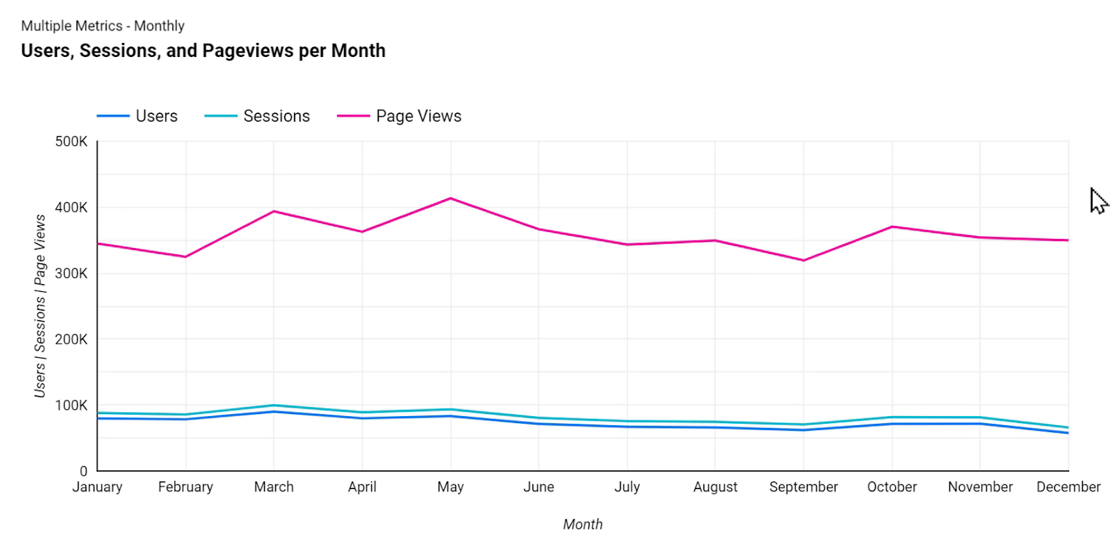
We are not limited to showing only one metric on a time series chart either, but if we do we lose the ability to apply a breakdown dimension. Here I have added three metrics; Users, Sessions, and Page Views. These values are displayed per quarter of the year.
Note: By hovering the mouse cursor over any of these points while in View mode, the viewers of the report can see the actual values of the metric for that point in time.
In another example, I have set Month as the dimension for the horizontal axis.
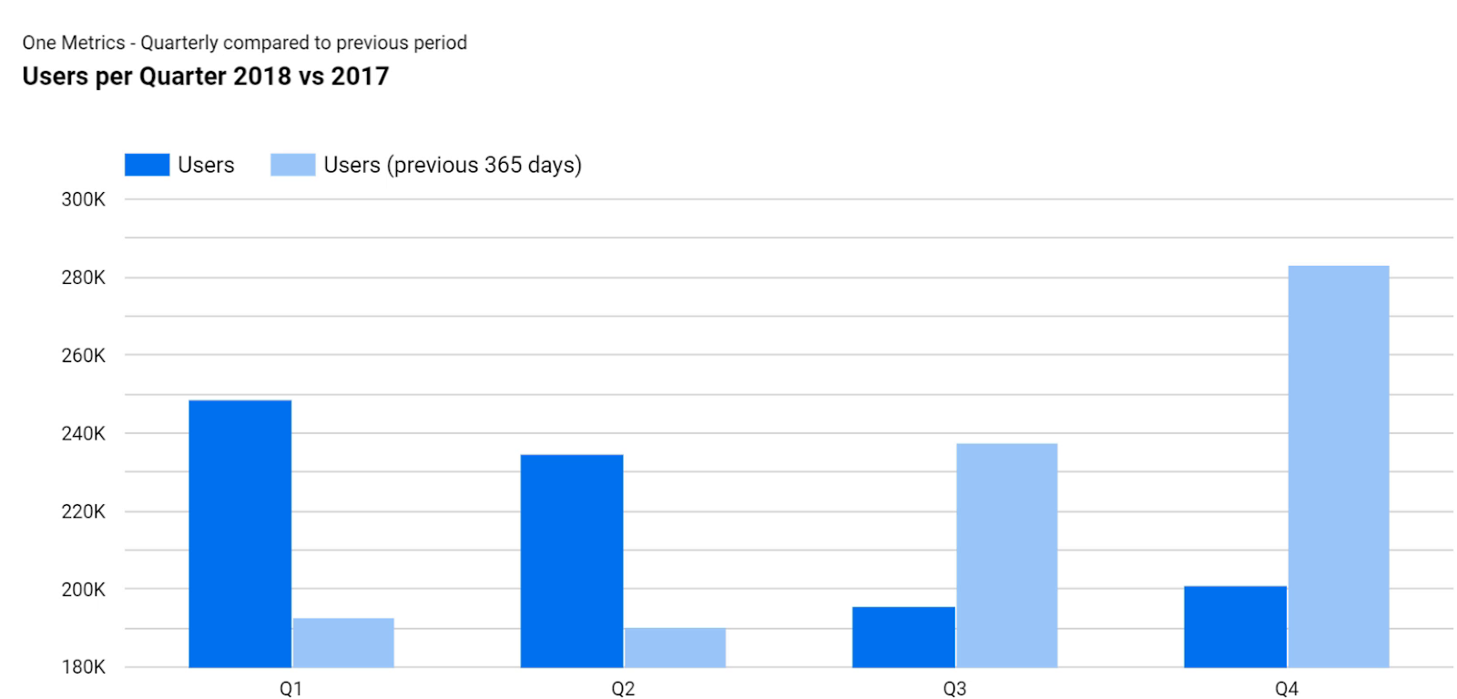
Note: A time series chart doesn’t necessarily have to be plotted using lines. Here I have used bars to compare the number of users in each quarter of 2018 with the same quarter in 2017.
4.4. Area Chart
Area charts are very similar to time series charts, with the difference that they apply shades of a color to the area underneath each series to show the volume of the data. Area charts can also be used to stack different series on top of each other.
For example in the following chart, when we see the value of Returning Visitors by hovering the mouse cursor over it, it doesn’t mean that we had more than two thousand returning visitors on that day. Instead, it shows that the total number of new and returning visitors for that given day was close to 2500.

The picture below shows another example of an area chart in which I have plotted revenue per month and broken it down per device category; mobile, desktop, and tablet. Just like the previous example, the values are stacked on top of each other.
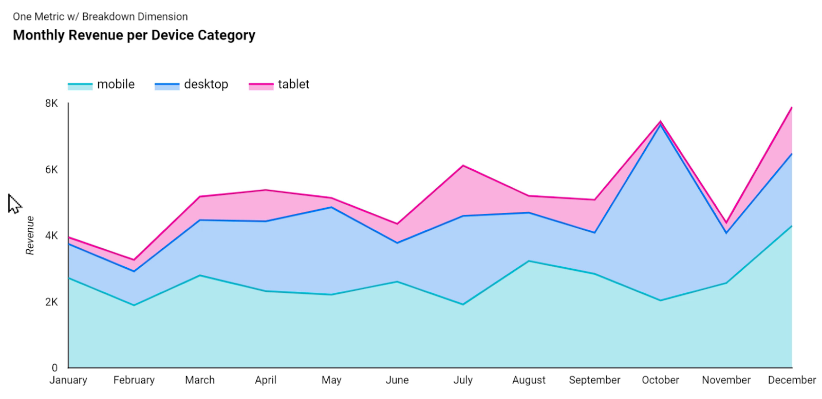
It shows a trend of Revenue that has started at about $4,000 in January and reached about $8,000 in December.
But what if we are not interested in seeing the trends, and instead, want to see the distribution of revenue between these different categories?
In other words, what if the total amounts and their trends are not important to us, but instead, we want to see which device category brings in more revenue as a % of total each month, and how this distribution changes over time?
To do so, we can use 100% stacking instead of stacking series on top of each other. This way, we are focusing on the distribution of revenue rather than the actual USD totals.
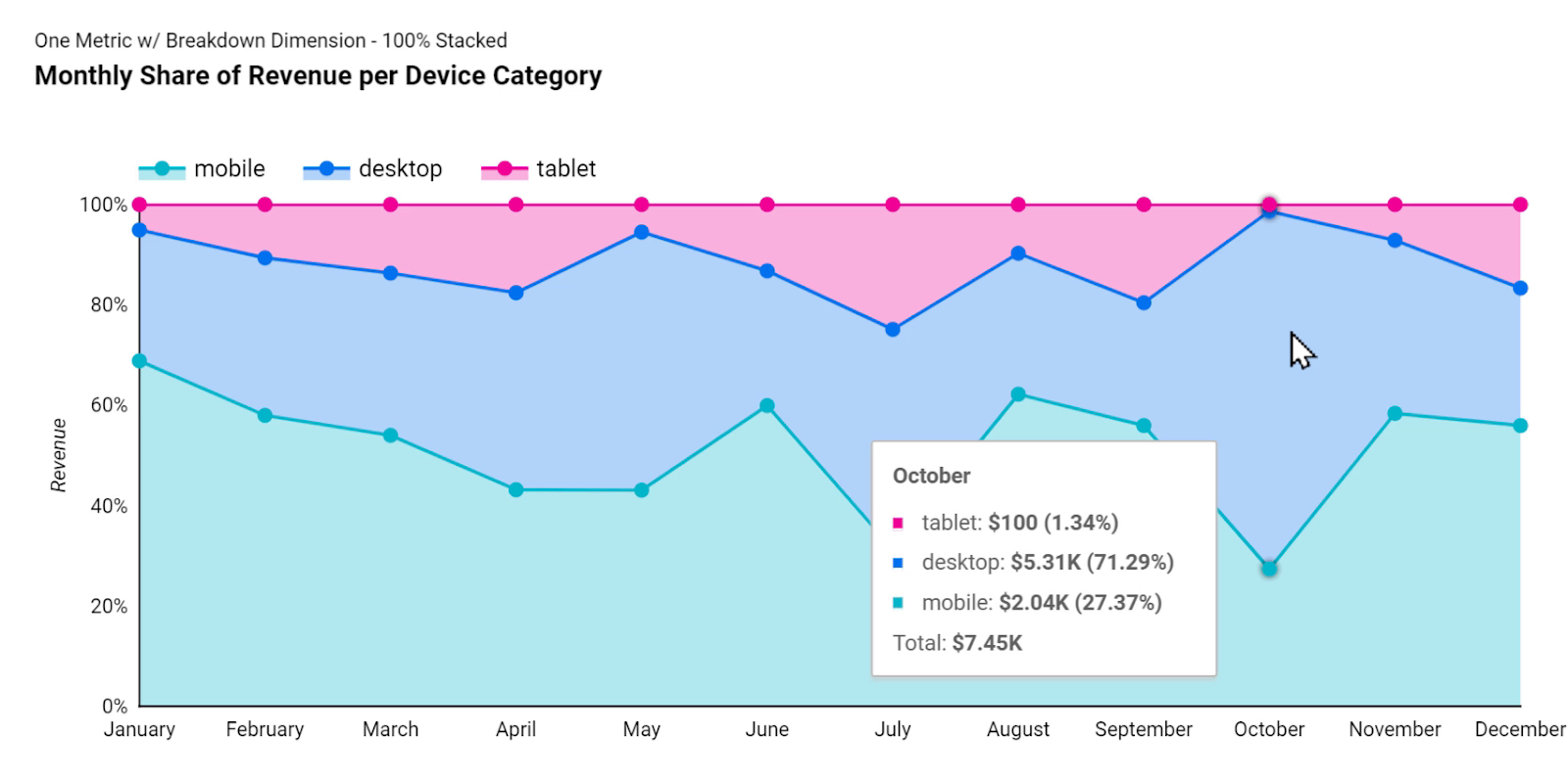
As it is shown above, in October, more than 70% of revenue was received from the desktop devices. By moving the mouse cursor around further, we can compare it with values in other months as well.
4.5. Line Chart
The line chart is very similar to time series, whereas in a time series chart we could only use a Date dimension for the values on the horizontal axis but with the line chart, we can plot any dimension with any type of category on the X-axis.
Here I have selected Country as the dimension for X-axis and plotted Users and Revenue on the vertical axes.
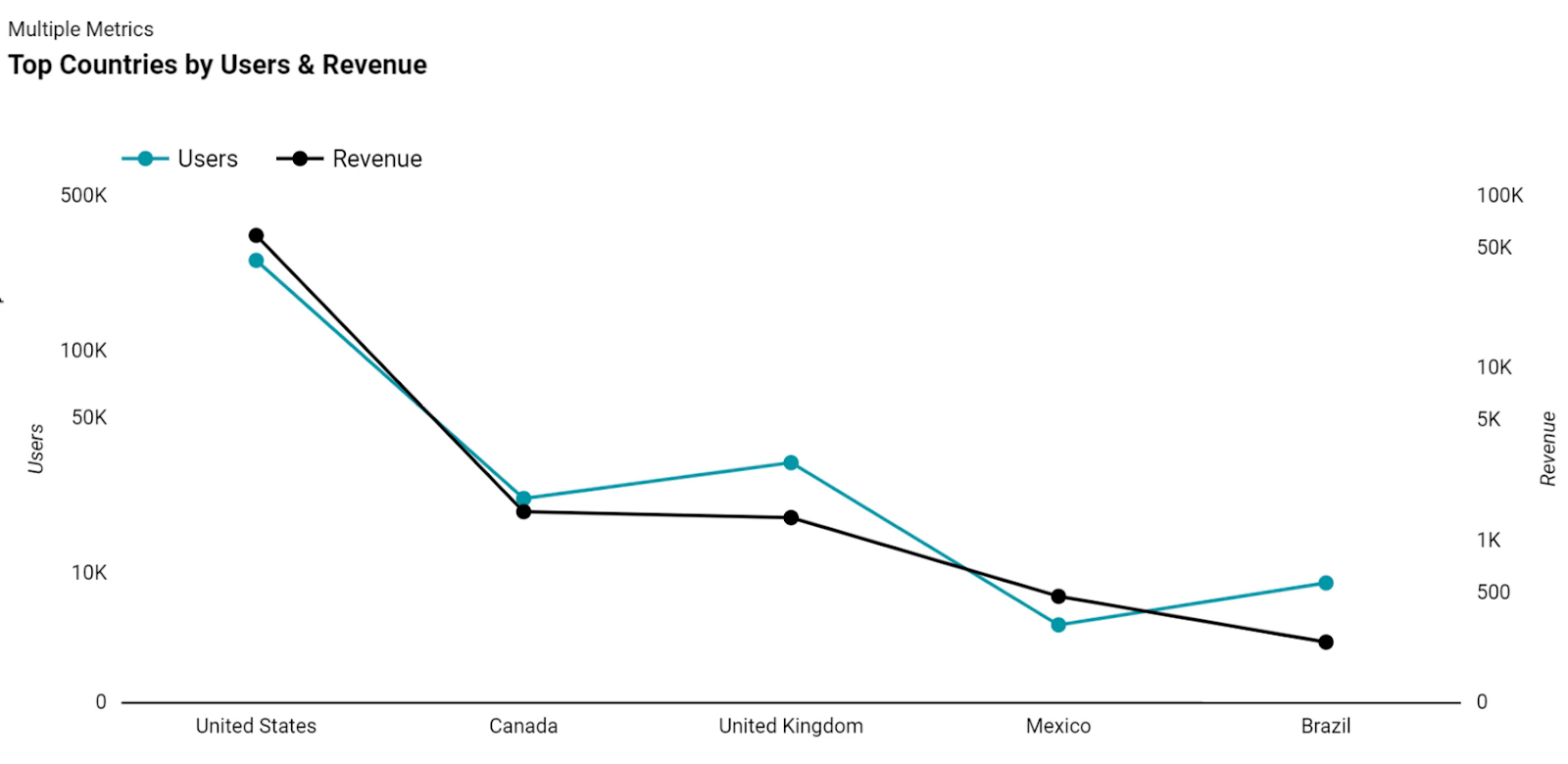
It’s important to note that the above chart is a poor data visualization example since it suggests continuity between the different points because they are connected to each other with a line. A better way of visualizing the same dataset would be using combo charts.
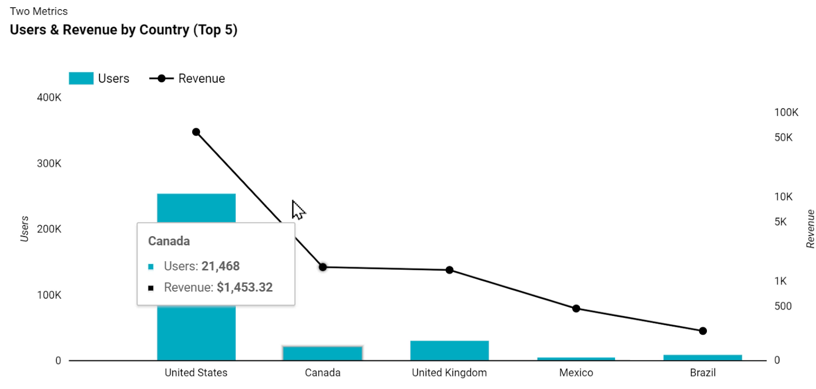
Using combo charts, we can have different series represented either as lines or bars. In the following chart, I have selected Users to be represented as bars and be plotted against the left axis, and Revenue to be represented as a black line against the right axis.
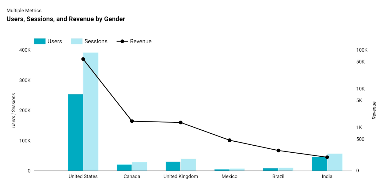
Adding multiple series and metrics is available with combo charts since we are not limited to using only two metrics. Here I have added Sessions as the third metric and set it to be represented by bars and plotted against the left axis.
4.6. Bar Chart
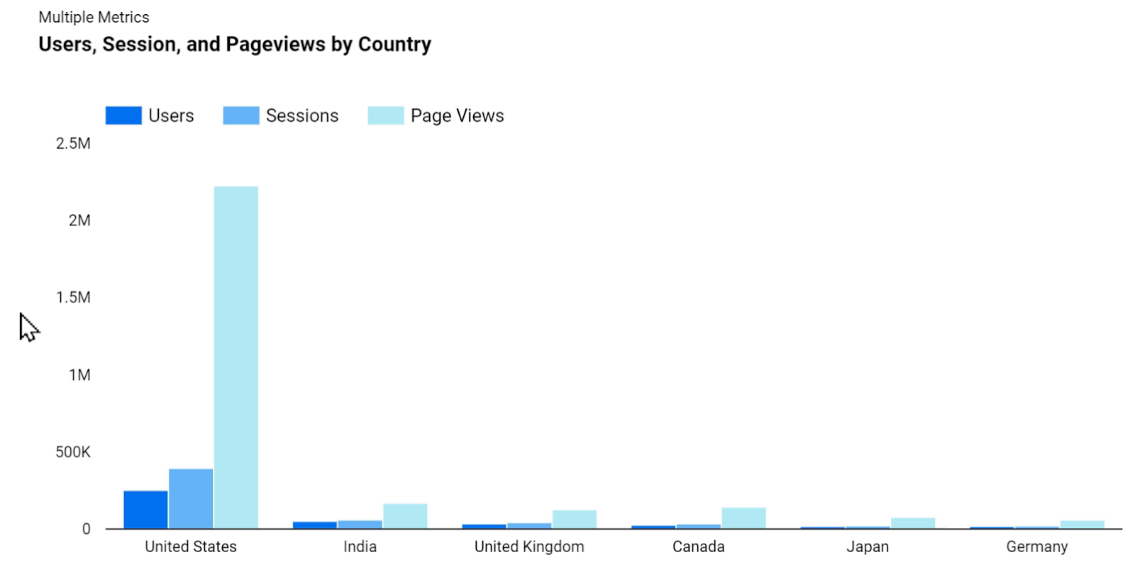
Bar charts are simple. They use bars to plot the values of one metric or multiple metrics on one axis, and we can have a category or dimension applied to the other.
Here I have Users, Sessions, and Page Views by country plotted against the vertical axis.
If we apply only one metric instead of multiple ones, then we can apply a breakdown dimension, too. Here I have the Users metric that is broken down by New Visitors vs. Returning Visitors.
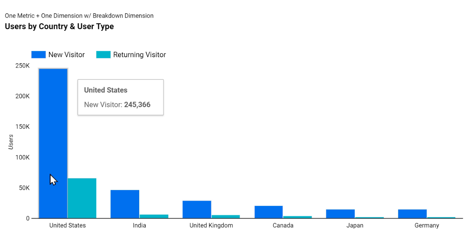
In order to see the total value of each category in this case for each country, we should use the stacked bar chart. Now, instead of a side-by-side display of a breakdown dimension that shows new visitors vs. the returning ones, the bars are stacked on top of each other and we can see the total for each category.

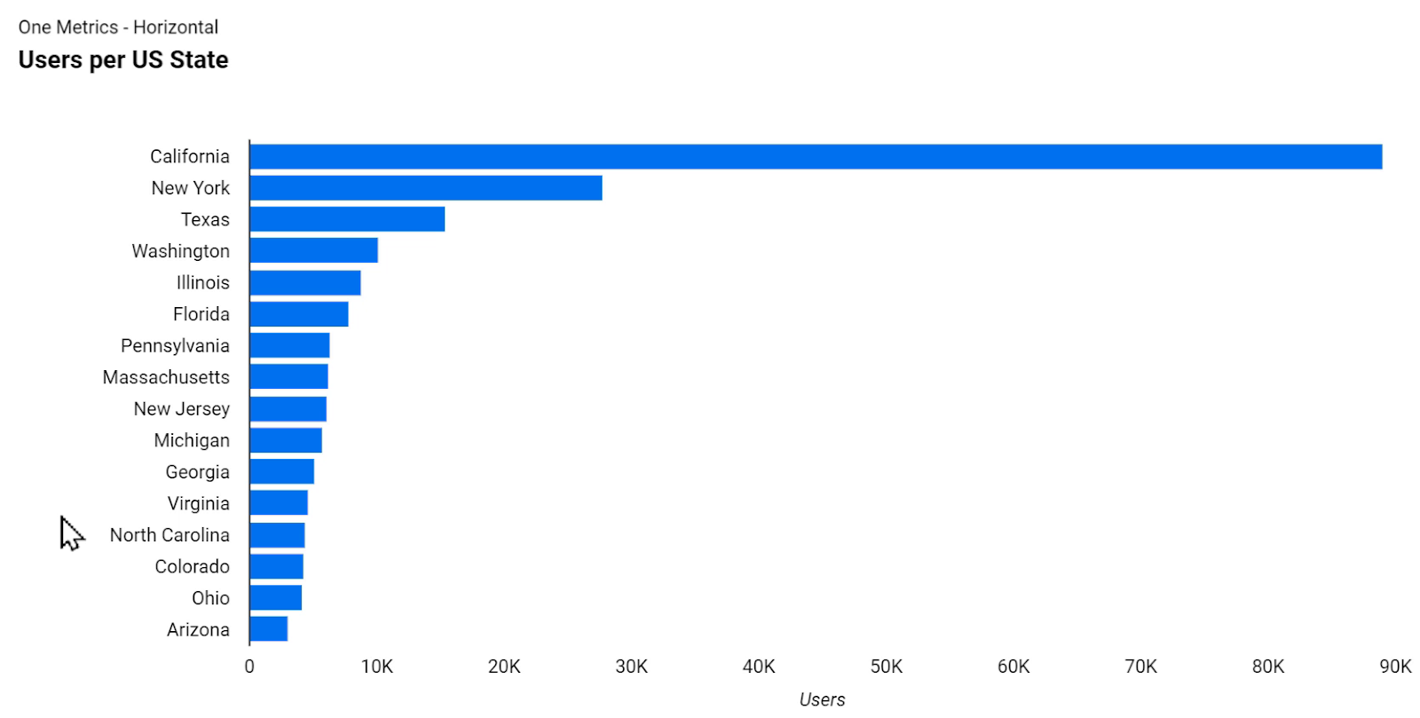
Horizontal bar charts are another category of bar charts that are ideal for displaying several categories.
For example, in the chart below, we can see 16 categories, whereas plotting the same amount of categories against the horizontal x-axis would have resulted in hard to read labels.
Since we are only using the Users metric, we have the option to apply a breakdown dimension to this chart as well. The following chart shows the same values, broken down by the age range of the users.
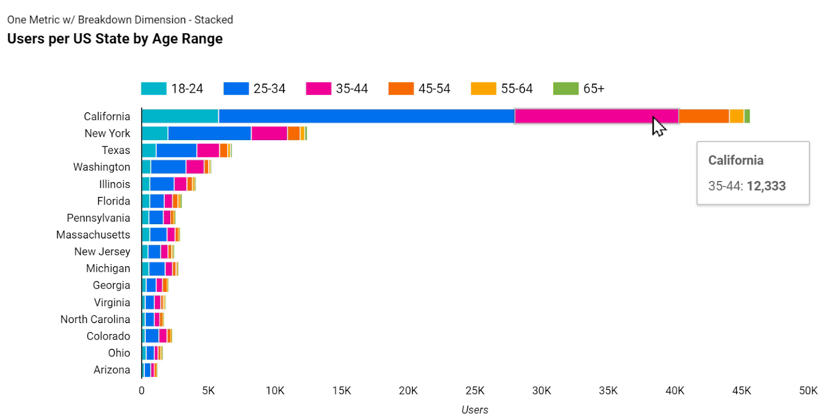
As we can see, the length of the horizontal bars is the same as before, but for example, we can now understand how many users did we have from each age range bucket. This is called a horizontal, stacked bar chart.
Similar to what we discussed in the Area Chart section, if we don’t want to see the trend of Users, and the distribution of the age range is more important to us than the total amounts, we can use a 100% stacked bar chart.

The above chart doesn’t show us the totals, and instead, displays percentages that help us easily see the differences of the distribution of age ranges across the different states.
4.7. Map
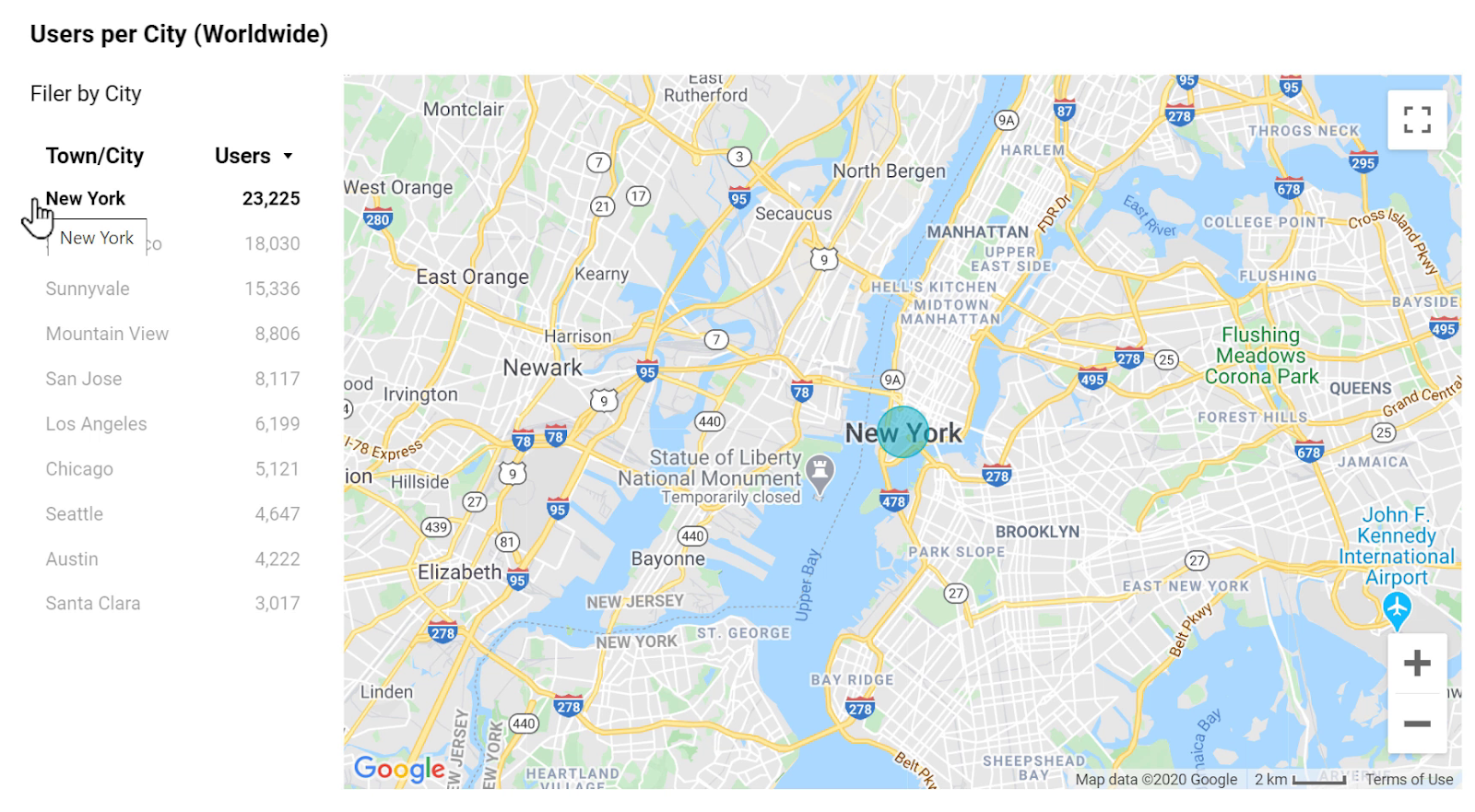
Maps are more visual compared to the previous charts. Using maps, we can visualize the difference of a metric across geographical locations. There are two types of map visualizations in Google Data Studio: the Geo Map, and the more recent Google Map.
For instance, in the following Geo Map visualization, the darker shades of color indicate higher values for a metric, in this case: more users.

By taking a quick look at the above map chart, we can understand that this website gets most of its audience from the US. With that in mind, we can zoom in to see the exact number of users in different states across the US.

We can now see that California has the largest number of users among the other states.
Above was the old version of maps in Google Data Studio, called Geo Maps.
Recently, a new map chart has been introduced that uses Google Maps.
Thanks to this update, we can now plot spatial metrics not only based on countries and regions, but also based on cities, addresses, postcode and zip codes, and even based on latitude/longitude pairs.
Plus, the numbers can be plotted either as bubbles or shaded regions.
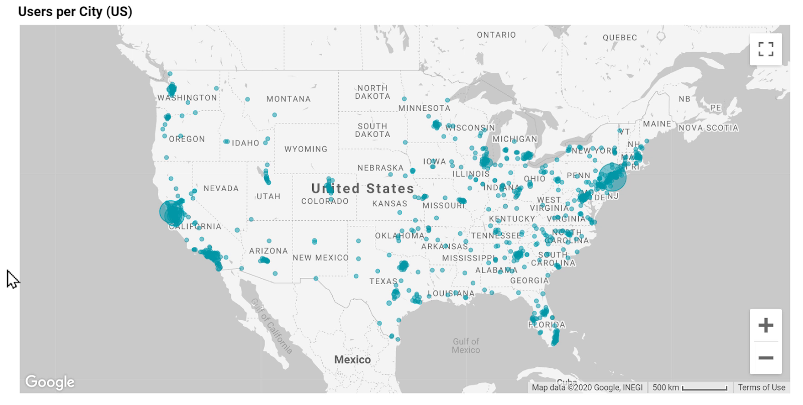
In the above map, each bubble represents a city, and the size of the bubble represents the number of users we’ve had from that city. Google Maps also allows us to pan around and zoom in to see more details.
The following picture is another example that shows Users and Revenue metrics per city, all around the world.
Here, same as before, the size of the bubble indicates the number of users, but the colors represent the amount of revenue.
White means the lowest amount or no revenue, and orange means the largest amount of revenue within the dataset. Of course, all these colors are customizable.

Filters and chart interactions work with maps, too. Clicking on the provided filters on the left results in the Google Map automatically, zooming in to the selected country to only show data from the cities of that country.
The next picture is a different style of map visualization using Google Maps

Here, if we filter the map for a city, it automatically zooms in that city to show the data accordingly.
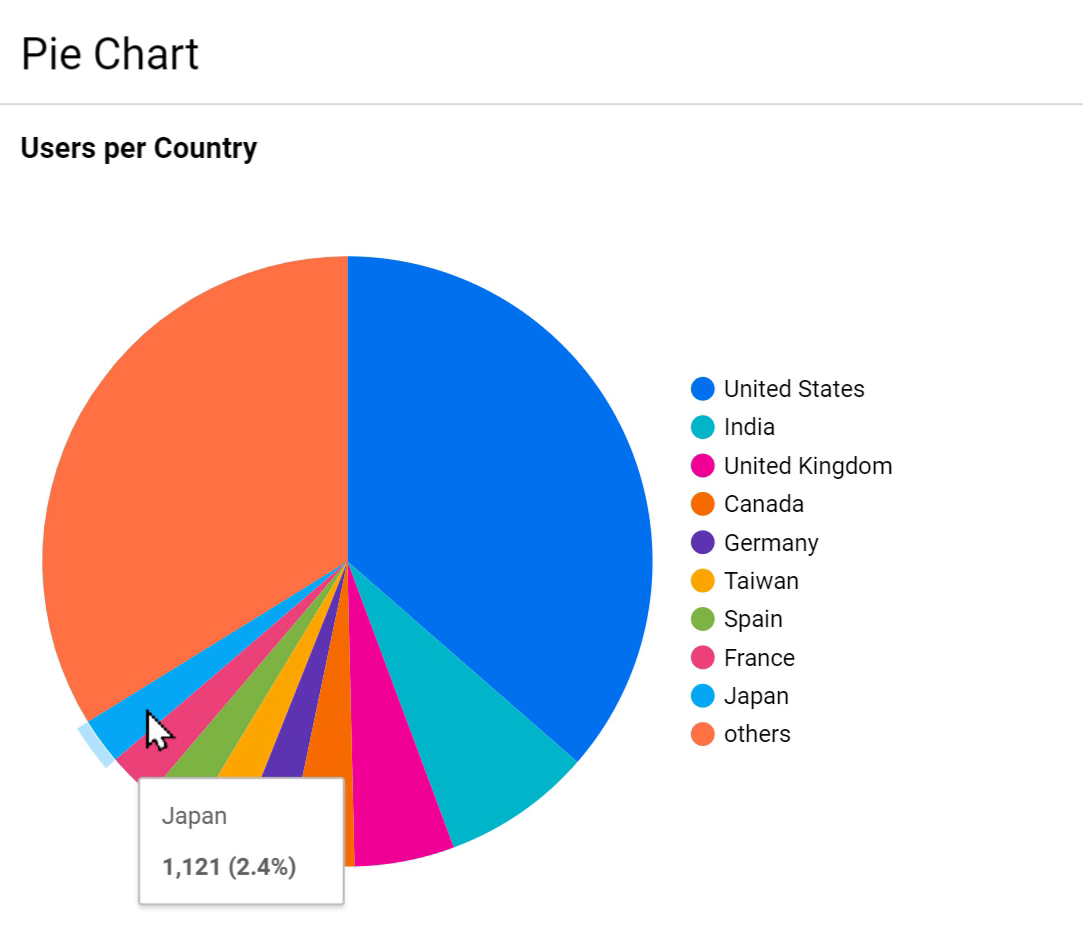
4.8. Pie Chart
Pie charts are interesting, but by many data visualization experts are rightfully against using them in general, and for two good reasons:
1. Pie charts take up a lot of unnecessary space.
2. The human brain is not very good at comparing the length of curved lines or the difference in angles.
These make it hard for the viewers of the report to extract data and form insights just by taking a look at the pie charts.
If the user wants to see and compare the values of different slices, they have no other option but to hover the mouse cursor over the sections of the chart one by one.
But similar to other types of charts, Pie Charts can be used correctly or incorrectly.
Personally, I prefer to use other charts instead of Pie Charts if possible. But in case we have to use them, there are some guidelines to follow so that the viewers of the report can understand it easier.
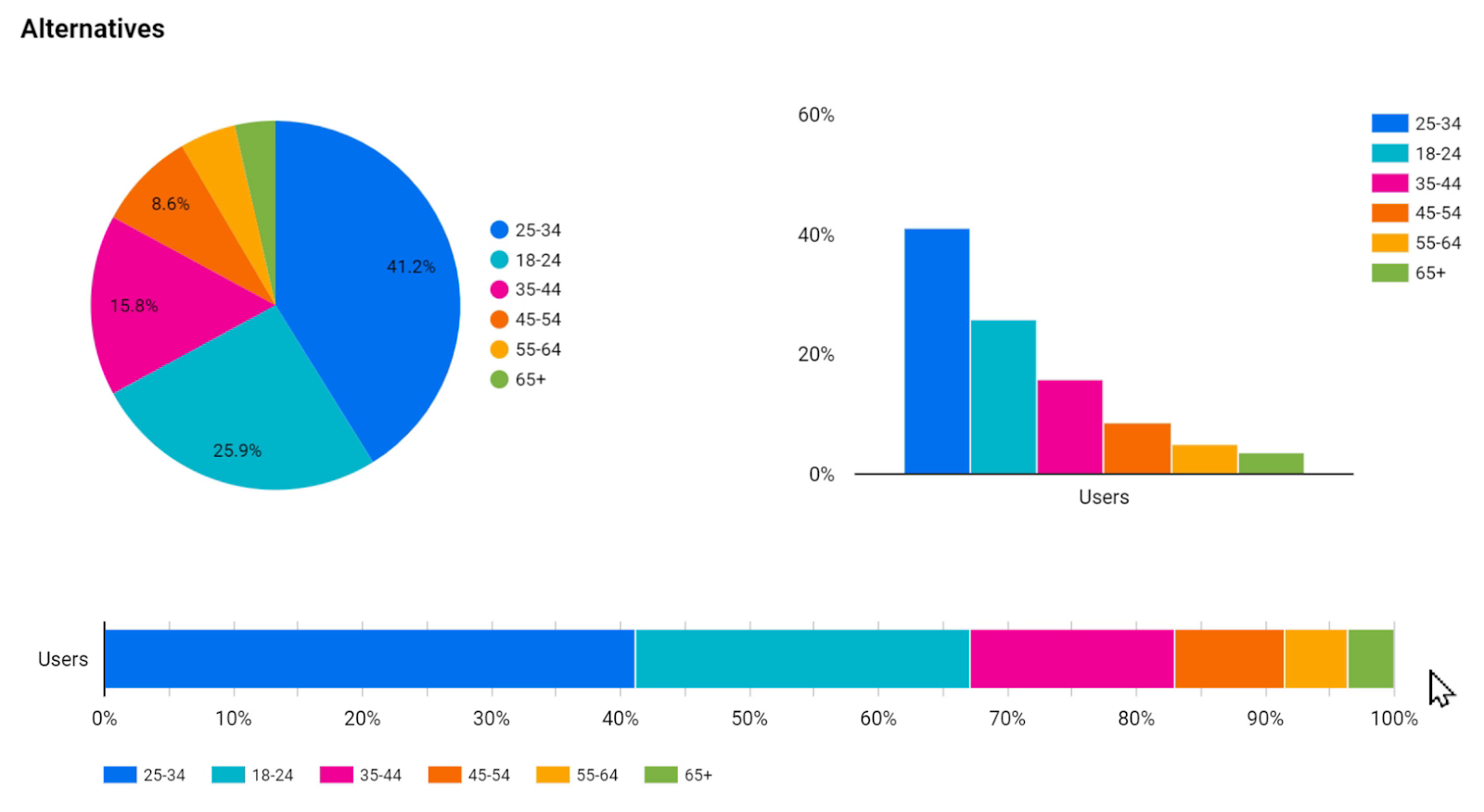
First of all, the fewer the categories, the better. The following picture shows four examples of a Pie chart in which the categories have been decreased level by level. The last chart displays only two categories, which are easier to read and understand.
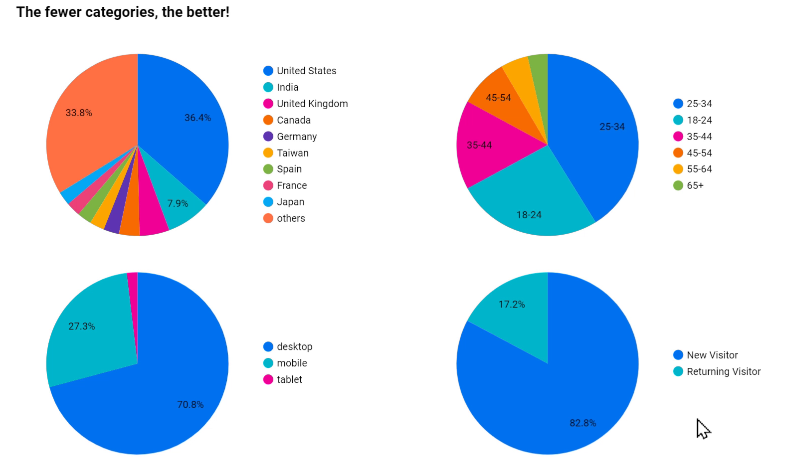
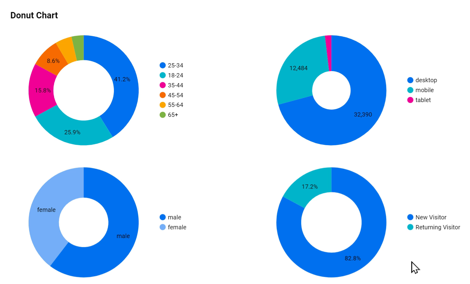
Some may not fancy the Pie Charts and prefer to use Donut Charts. They are exactly the same and there is no difference between them.
However, what should we do if we have more than a few categories?
What are the alternatives to a Pie chart?
In most cases, we can use a Bar Chart instead of a Pie Chart. The human brain can see and compare the difference of length in straight lines much easier. If we want to save space, we can also use a 100% stacked bar chart.
4.9. Scatter & Bubble Chart
This type of chart is usually more complicated and difficult to understand for the viewers of the report.
We should always keep our audience in mind and stay away from using complex charts unless we know that they are familiar with this type of data, or they are ready to spend some more time to understand it.
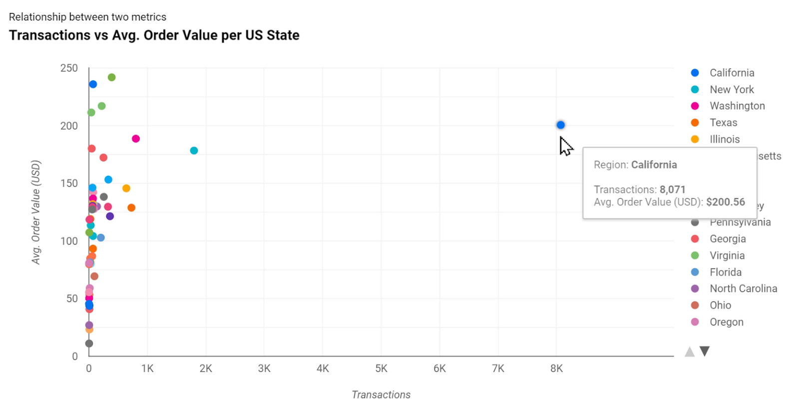
This chart type can best be used to show a relationship between two metrics with a dimension as the breakdown.
In the above picture, we can see Transactions and Avg. Order Value (USD) on the x and y-axis and the US states as the breakdown dimension which is represented using the color of the dot.
We can immediately see that the state of California has the largest number of transactions for this store, and has a fairly high average order value too compared to the others.
We can make it more complicated by adding a third dimension. The picture below shows the same values, but they are broken down based on the browser, and Bubble Size is used to show E-Commerce Conv. Rate.
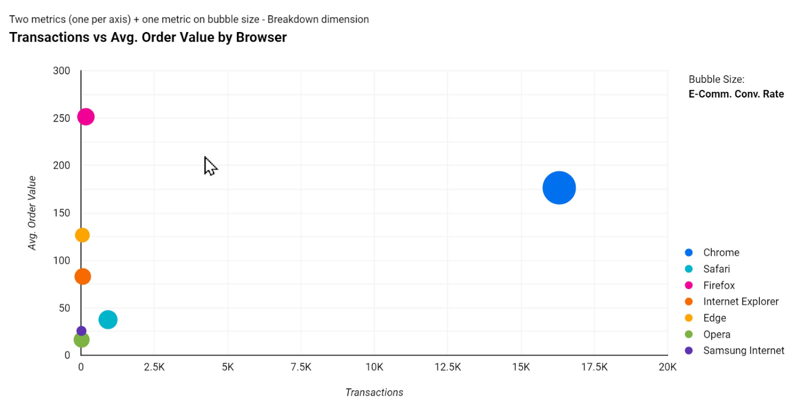
We can see that Google Chrome has the largest number of transactions and a fairly high average order value and the largest E-commerce conversion rate.
Looking at the chart above, the owner of this website can immediately understand where to allocate resources if they want to optimize their website for different browsers.
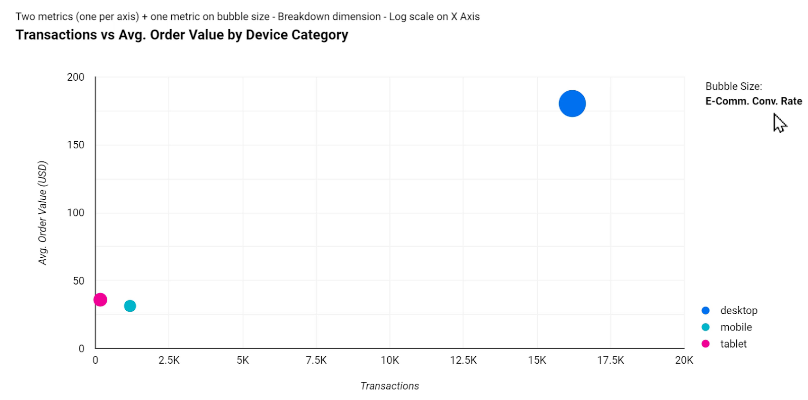
As another example, the same values as before have been applied to the following chart, but with the difference that it’s now broken down by the device category.
The next picture shows a different example. It shows us which channel brings more revenue and traffic. Since the amount of Revenue for this data set had a wide range, from a thousand dollars to over a million, here I have used the logarithmic scale for the horizontal axis. It means that each step on the x-axis is ten times more than the previous one.
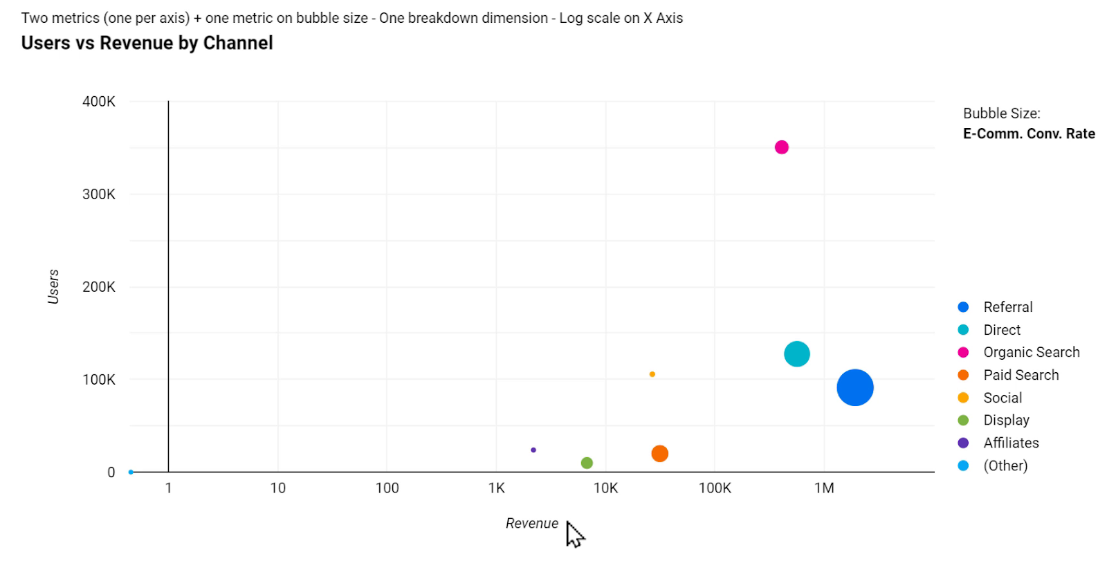
It shows us that Referral has about 100K users and has brought in more than a million in revenue.
4.10. Tree Map
Tree Map allows us to compare the value of one metric across the categories of one or more dimensions. The higher values are displayed with a darker shade of color and also span a larger area.
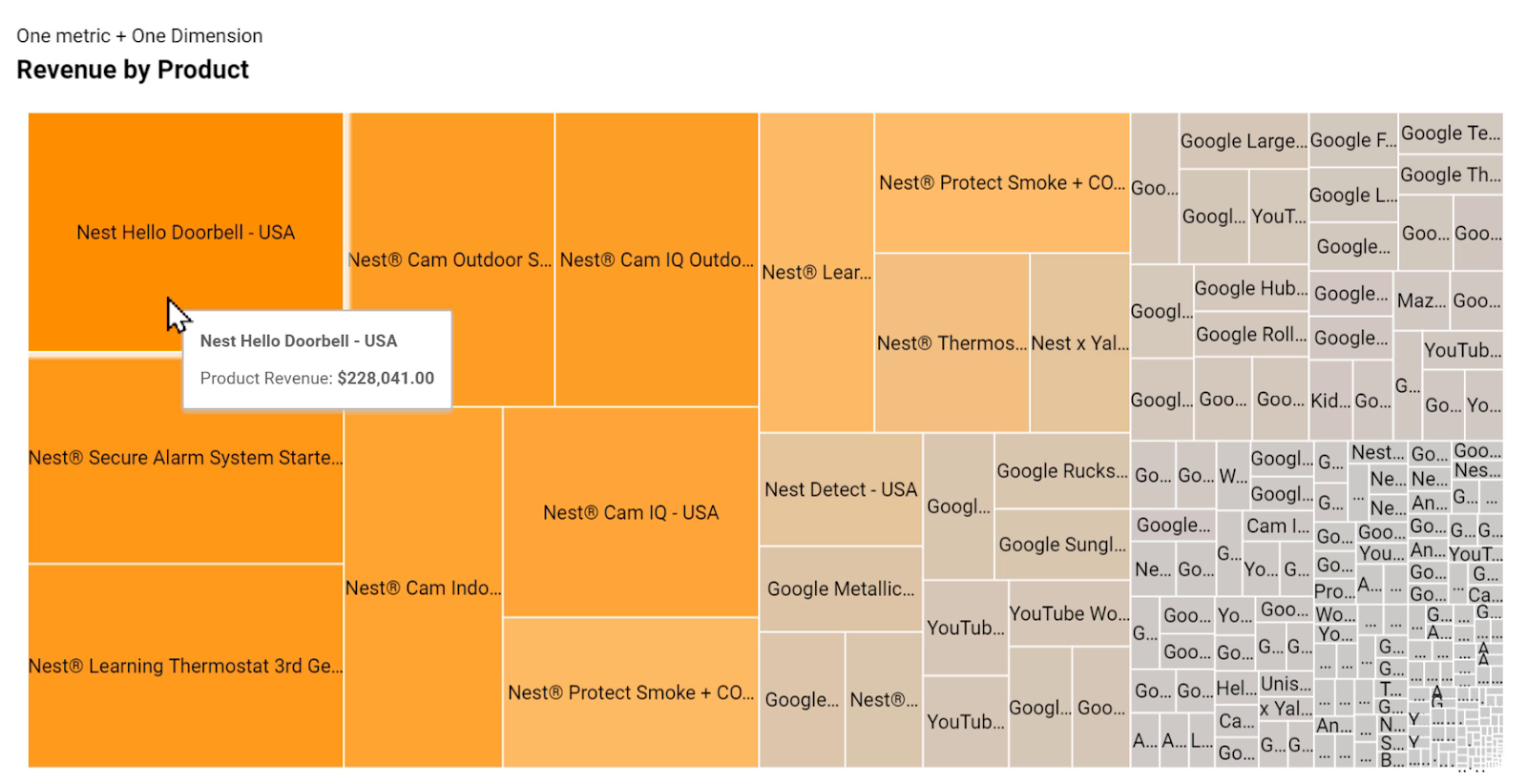
The above chart shows Revenue by Product for Google Merchandise Store and we can see that Nest Hello Doorbell has had the largest amount of revenue across all products.
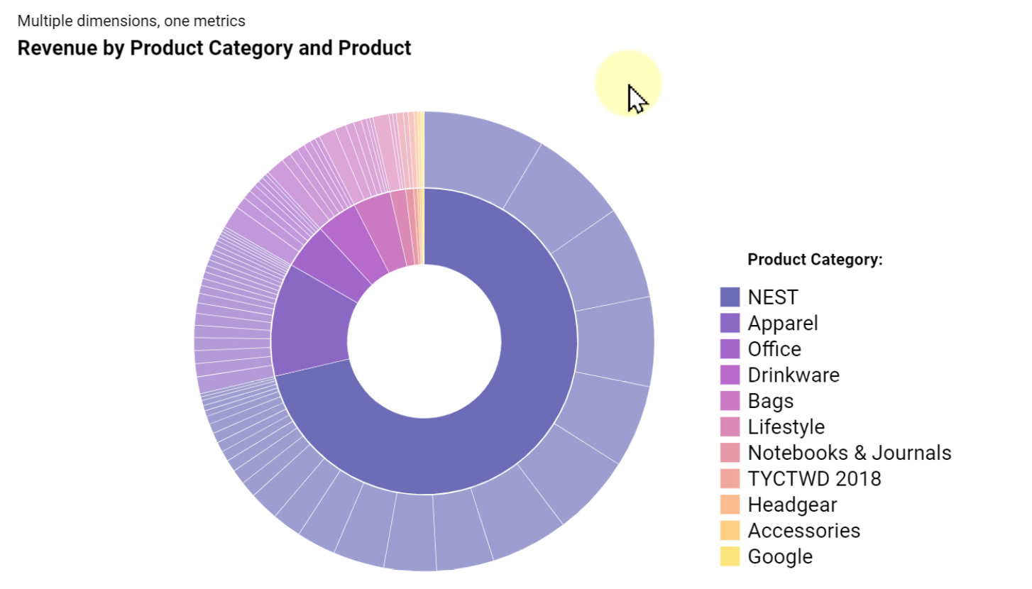
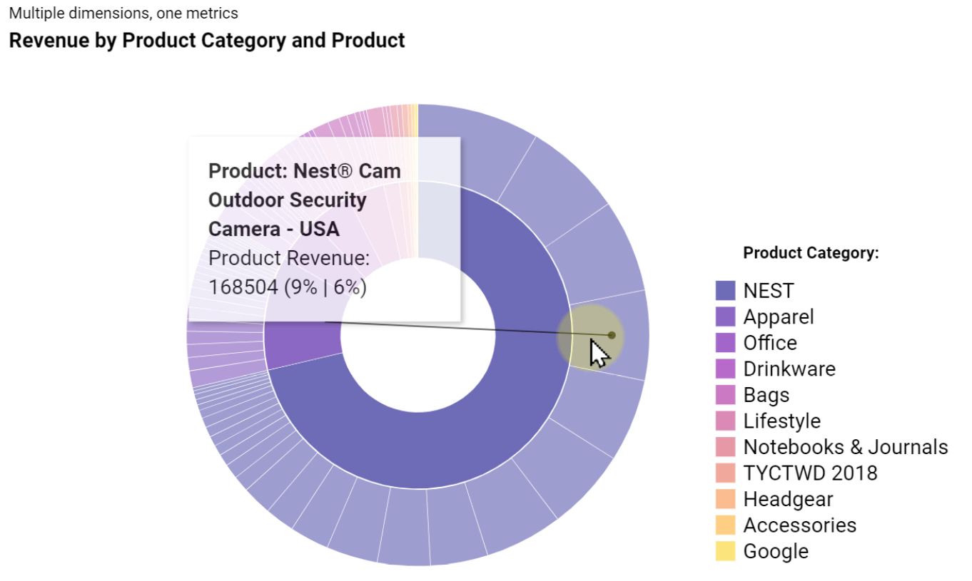
We can also use this chart in a different format. In the next picture, I have applied two dimensions to the Tree Map; Product and Product Category.
Now instead of seeing the NEST products scattered all around the chart, they are all organized inside a rectangle next to each other. The same applies to other products as well.
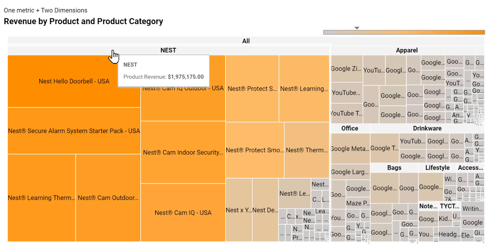
However, the way we display data seems to be complicated since there are so many categories displayed.
A good practice for using Tree Maps, like with Pie Charts, is to use a dimension that has fewer categories in it. The following picture shows the chart with only the Product Category.
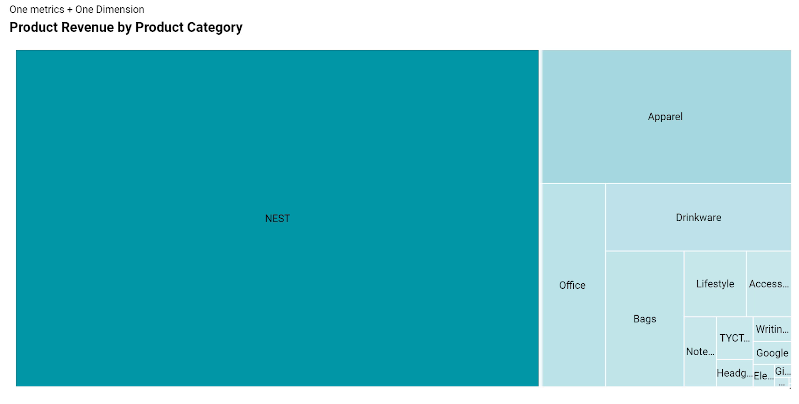
Now we can immediately see that NEST as a category has the largest amount of revenue across all different categories for this chart.
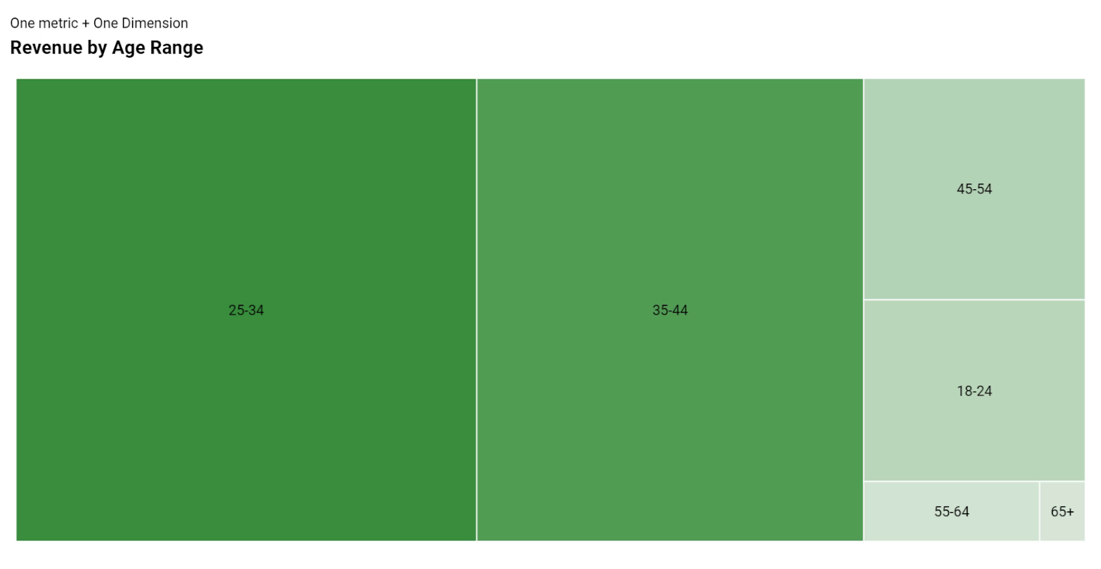
Similarly, the next picture shows another example of using a dimension with fewer categories of Age Range category to see which one has the largest revenue.
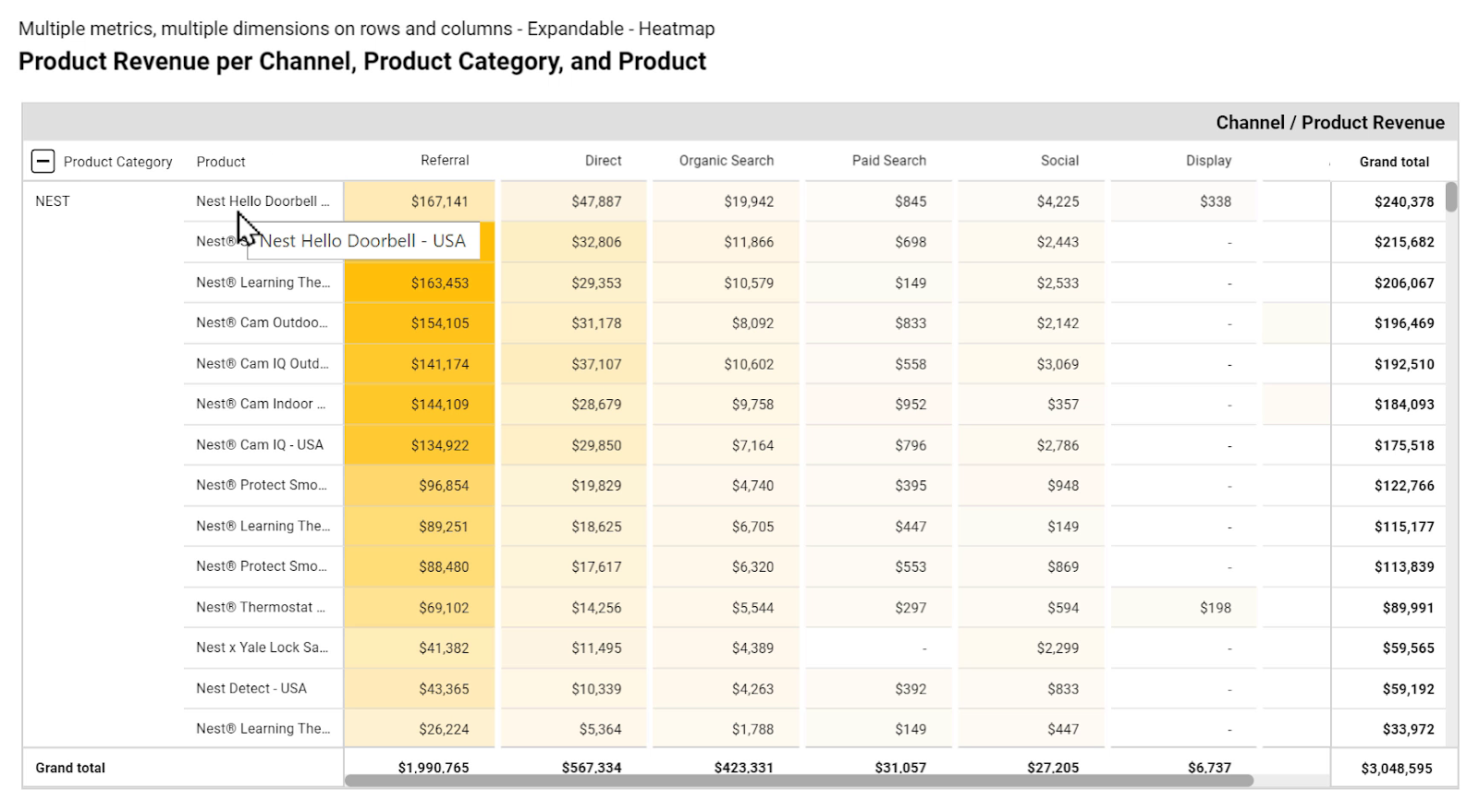
4.11. Pivot Table
Pivot tables are good for summarizing large tables with several dimensions and metrics in a cleaner and simpler way.
Below I have displayed Product Revenue & Quantity by Product and Product Category, and I have used bars to show a quick comparison of the numbers.

A pivot table, unlike a normal table, highlights the rows and columns as we move our cursor across different categories.
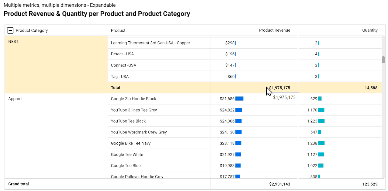
Also, there’s a plus(+) icon next to the Product Category that expands the pivot table to list all the products within each category and their associated revenue and quantities.
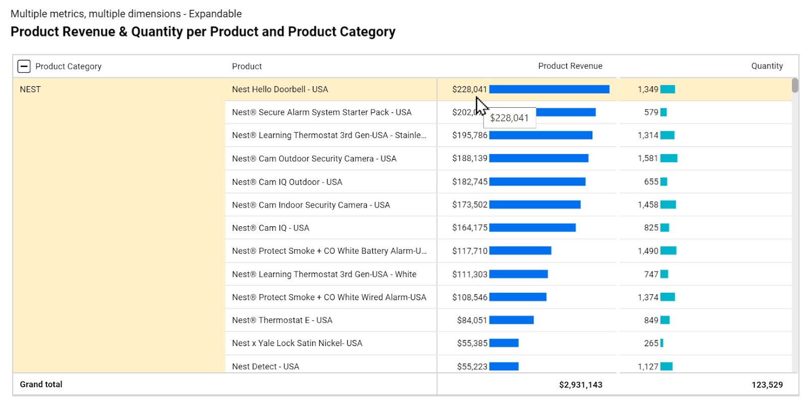
Additionally, we can see a subtotal of each category by scrolling down the list of rows and reaching the end of each section.
We can also see the Grand total value at the bottom of the pivot table.
The next picture shows a different Pivot table. Instead of having dimensions represented as rows and metrics represented in columns, we have shown the Product Category dimension in rows.
Here we also have another dimension: Channel, represented in columns.
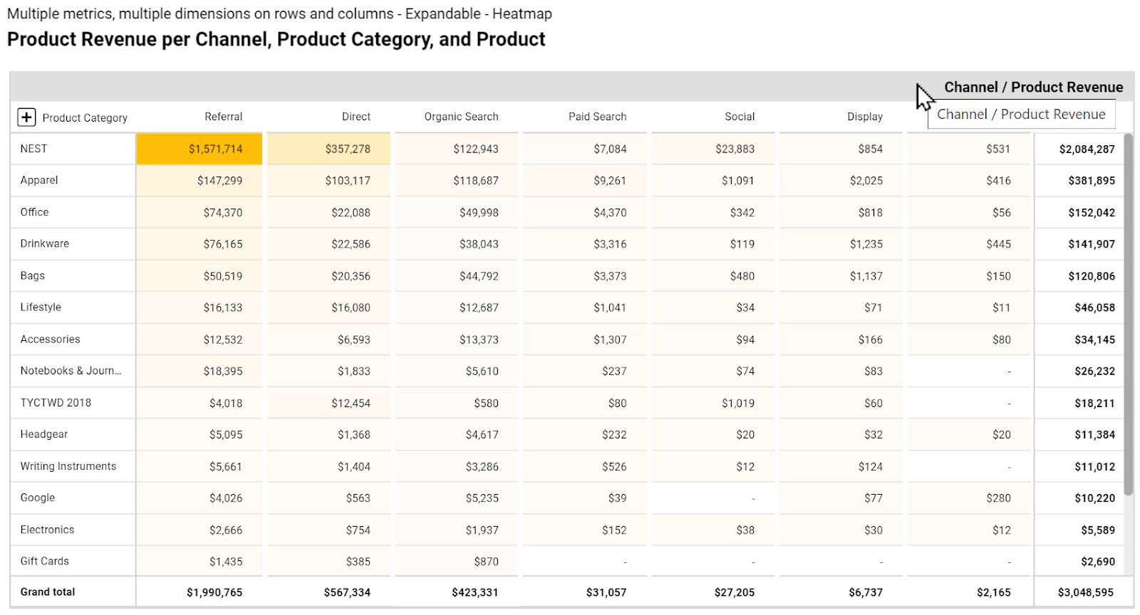
Therefore, for each Product Category, we can see how much revenue we make from each channel: Referral, Direct, Organic Search, and so on. Also, for each of these categories, we can see how much money we have made in total.
On the right, we can see how much we have made from each product category in total, regardless of channel.
Just like the previous example, we can also click the plus(+) icon next to Product Category to expand the list.
4.12. Bullet Chart
Bullet charts show the performance of one metric compared to a target. Plus, we can set three different ranges: Low, Mid, and High using shades of a color.
The picture below shows the amount of E-Commerce Conversion Rate which is between 1.5% and 2%.
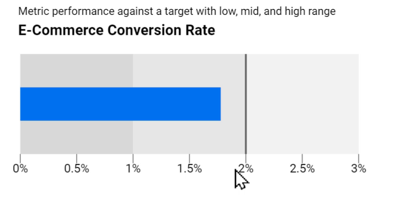
As we can see, the target has been set to 2%. We can change it and choose whatever number we want.
Also, we can see the three ranges of low, mid, and high. We can either choose to show just one bar for this time period or add another one to compare it with the previous periods.
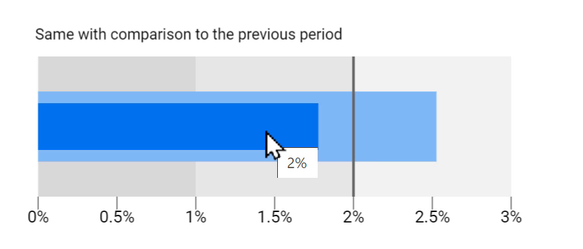
The above chart shows that in the previous period, the E-Commerce Conversion Rate was in the good range, about 2.5%. But in this time period, it’s less than the target, but still in the acceptable range.
We can have the same for Revenue. The following picture shows a target of $2M. Anything less than $1.5 is considered bad, between $1.5 and $2.5 is acceptable, and above that is good.
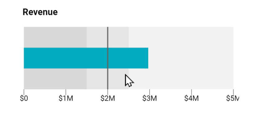
We can also compare this Revenue with the previous period.
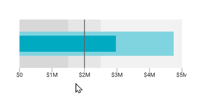
Based on this data, business owners can decide to move the target for the next periods, for example somewhere between $3M and $4M.
In this section, we went through an overview of all charts available in Google Data Studio at the time this tutorial was being written. Now we know what options we have in this tool in order to visualize data and communicate insights to the viewers of our reports.
Section 5: Community Visualizations and Components
In the previous lessons, we learned about different chart types that we can use in Google Data Studio. However, sometimes we need a chart that is not covered in the default options of this platform. What should we do if we want a different data visualization?
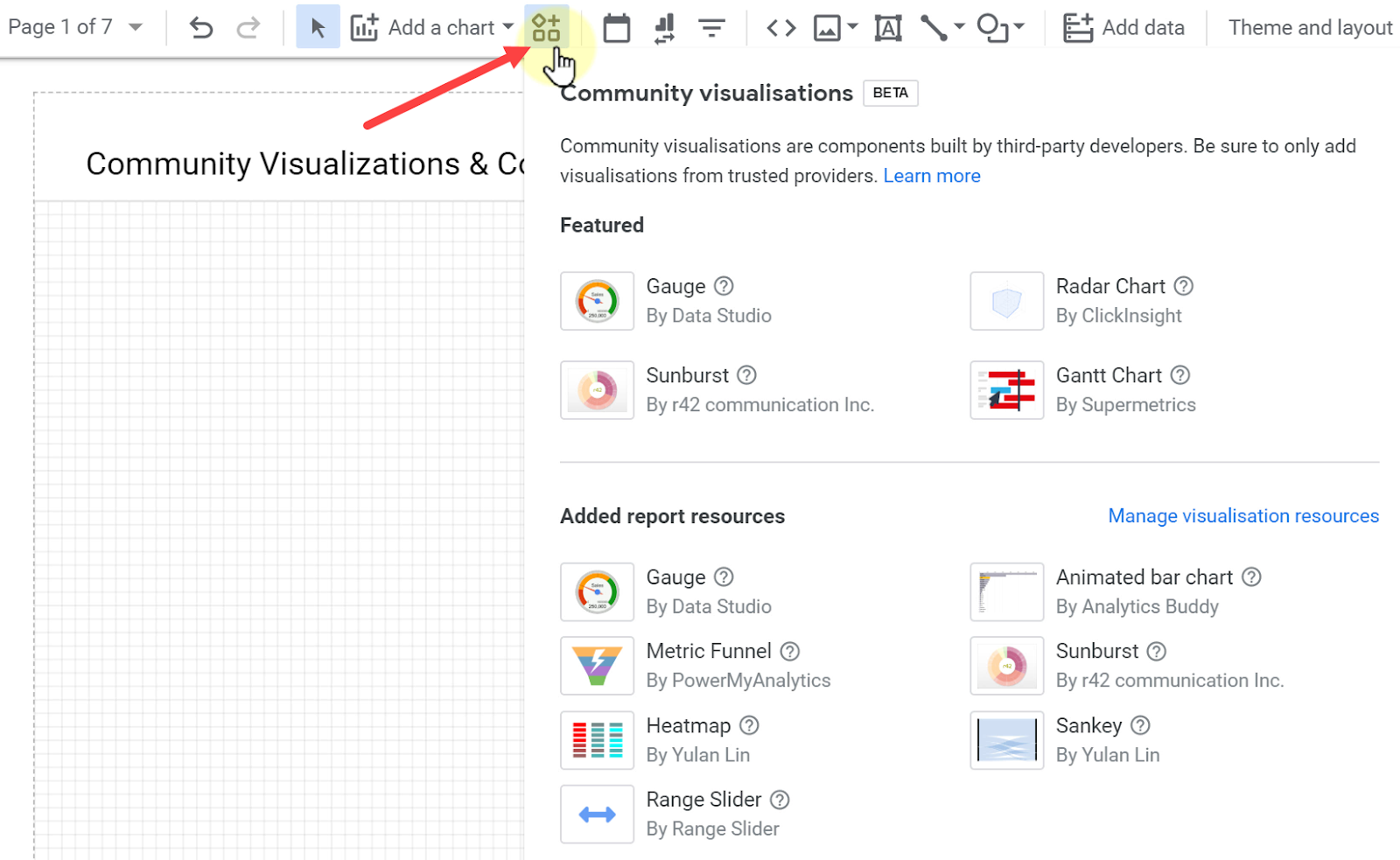
Luckily, it is possible to create custom data visualizations within Google Data Studio. They are called Community Visualizations, and here I am going to show the way we can use them.
Creating Community Visualizations
First of all, we should know that this feature is still in the development stage and we can find out more about the project at developers.google.com/datastudio/visualization.

As we can see, it allows us to use different libraries, custom JavaScript and CSS to create visualizations. We can define how to style the elements with some knowledge of coding, but it is not necessary since everyone can create one and share it with others.
There are people and companies who create community visualizations and we can use them to our benefit.
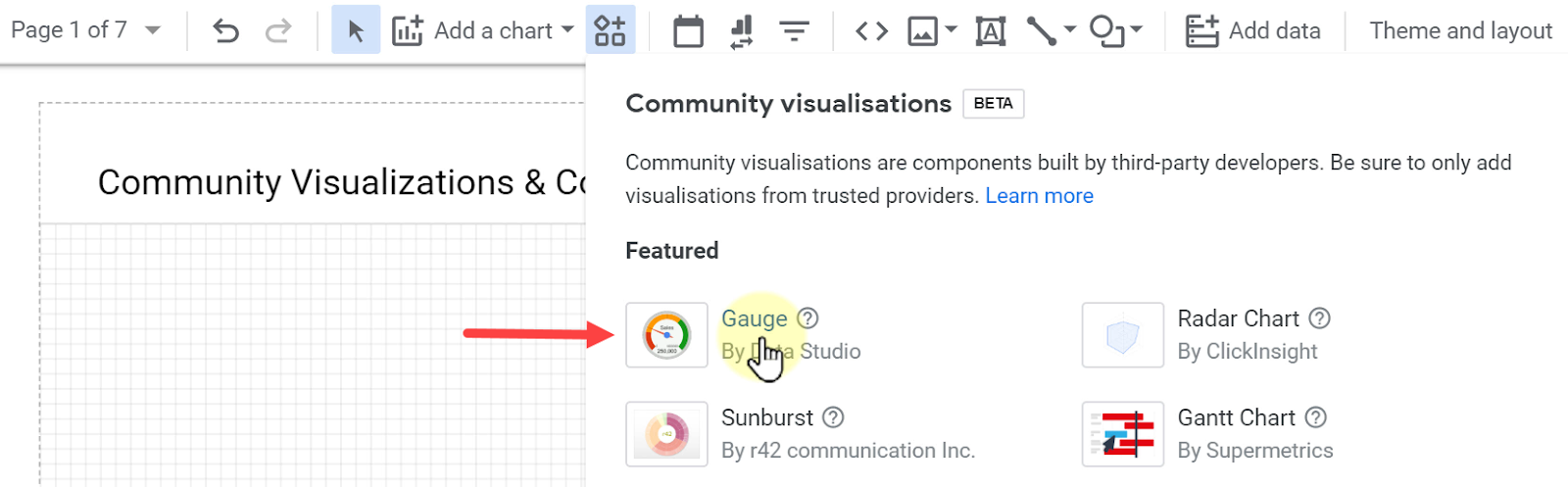
In order to see the list of available items that have been approved by Google, click Community visualizations.
These options work similarly to the default options of Google Data Studio. For instance, here I have added Gauge to my report.
Just like the other charts in Google Data Studio, we can change the values from the DATA and STYLE tabs.
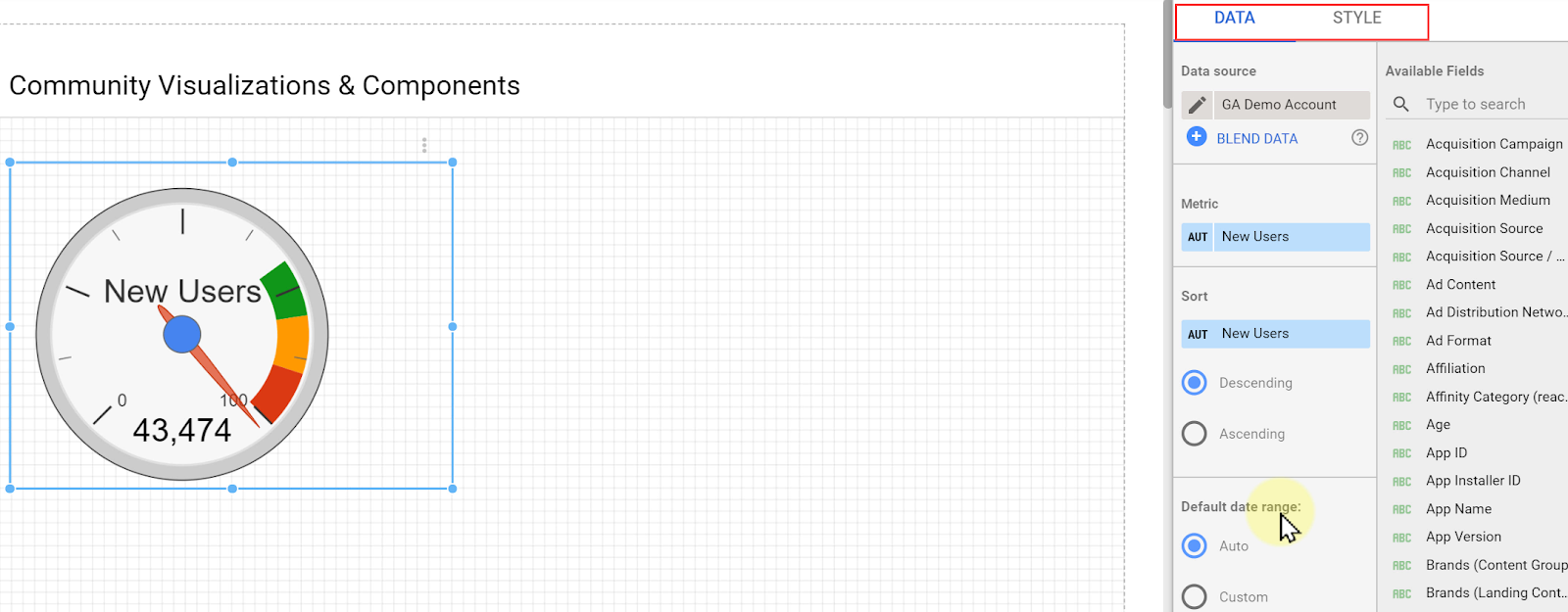
As we can see, there are more than 43,000 New Users and the maximum number of the gauge is set to 100. Let’s change it to 50,000.
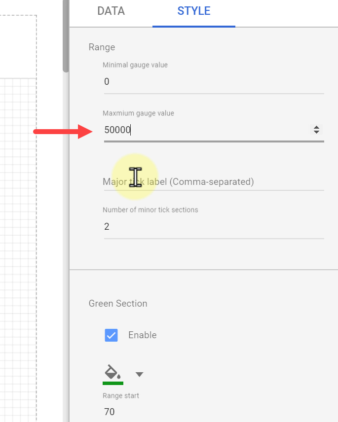
We can also define three sections for our gauge; green, yellow, and red. Let’s set the range of the Green Section to 40,000 - 50,000, Orange Section to 25,000 - 40,000, and Red Section to 0 - 25,000.
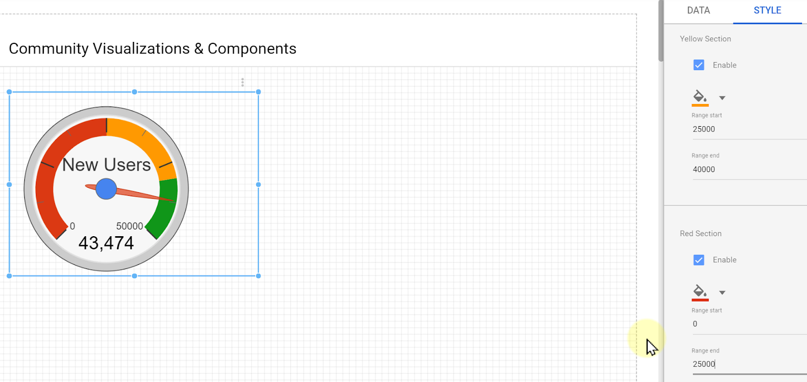
We can keep on changing the values and make it more personalized in the way we want it to be.
Practical Community Visualizations
Now let’s take a look at some community visualizations that can be useful for our reports.
5.1. Sunburst
The Sunburst chart shows one metric over multiple dimensions and uses rings to show the distribution of that metric across different categories within that dimension.
In the above picture, I have added Revenue by Product Category and Product. It is quite similar to the Tree Map chart we saw in previous tutorials.
By hovering the mouse cursor over the chart, we can see the share of that revenue compared to others.
The next picture is another example in which we have one metric, Sessions, and three dimensions, Landing Page, Second Page, and Exit Page. It somehow tells us the story of how people enter our website, which pages they land on, what is the second page they see, and in the end, which page they exit from.

For example, we can see that our homepage was responsible for 57% of the sessions. Don’t forget that there might be other pages as well between the second page and exit page.
5.2. Animated Bar Chart
This tool is an interesting visualization chart that uses cool animations to show how the data changes over time.

Here I have chosen to highlight New York, San Francisco, and Mountain View among the cities with the most revenue from 2017 up to date.
Depending on the story we want to tell, we set different categories and values to be highlighted.
5.3. Heat map
Heat-map visualization is straightforward. We can apply two dimensions and one metric. Here I have User by Day of the Week and Hour of Day. This type of visualization uses different shades of a color to show the highest and lowest values of the selected metric for the different combinations of those two categories.
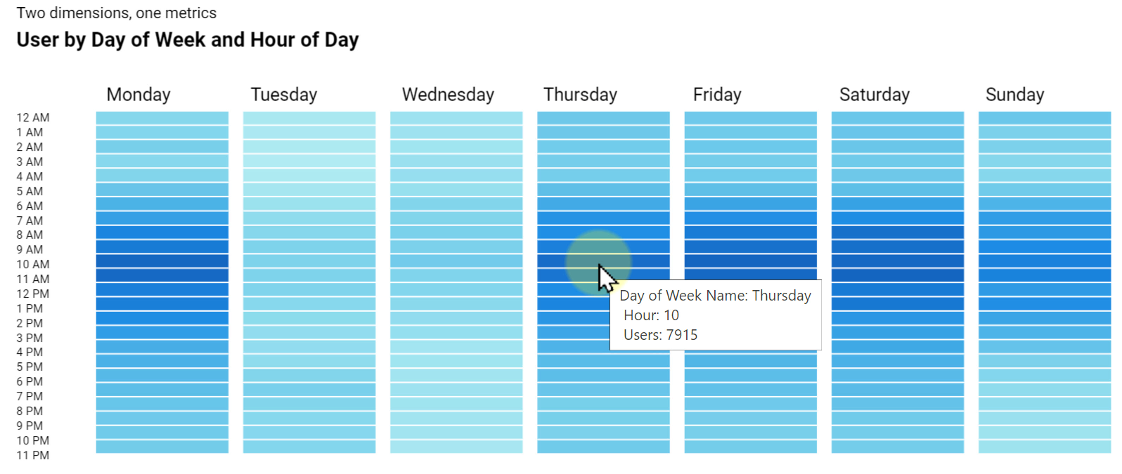
We can hover the mouse cursor over the columns and see the data for various dimensions.
5.4. Funnel
Funnels are exciting for many people. Not a long time ago, those who wanted to display funnels on Google Data Studio had no other option but to use a static background and then overlay some scorecards on it. The introduction of the Funnel Diagram has made it easier than ever to create this kind of visualization.
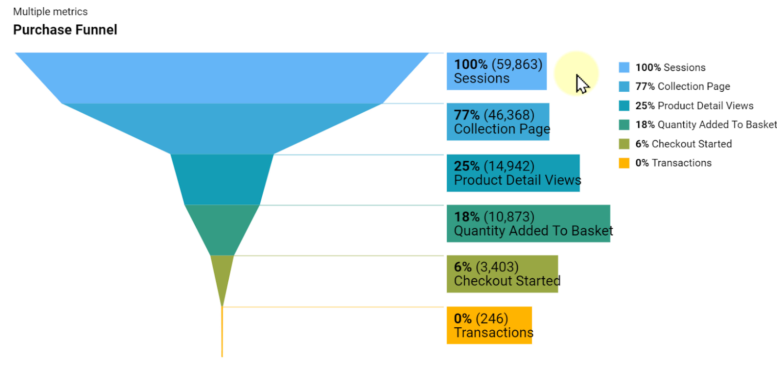
All you need to do is pick your metrics and then place them in order. The chart will take care of the rest.
The above picture shows how people go through the purchase process on this website. We can see exactly the number of Sessions, Collection Page, Product Detail Views, and so on. It also shows us a bottleneck between the second and third metrics that needs to be addressed.
5.5. Range Filter
This one is not a visualization tool since it is a community component. It’s a filter menu that allows us to select the range between a minimum and maximum number to filter the rest of the charts and components on the page.
We can use the filter to limit or increase the amount of data that is presented on the chart.
5.6. Sankey Chart
A Sankey chart is good to show the relationship between categories of two or more dimensions. In the next picture, I have Gender, Device Category, and Age Range.
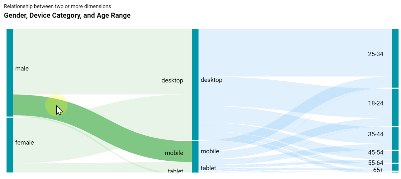
We can move the mouse cursor to each of these sections and highlight the relationship between each pair of categories.
In this section, we learned how to create custom visualizations and components other than the ones provided by Google Data Studio. We also found out about six useful tools and the way we can use them for our data visualizations. Using these assets, we can make more interesting and appealing reports about our activities for our readers.
Section 6: Report Interactions
In previous sections, we learned how to connect to different data sources and bring data into Google Data Studio. We also learned about the built-in chart types and community visualizations.
In the final section of this Data Studio tutorial, I am going to show you how to enable report interactions in Google Data Studio.
Static Reports
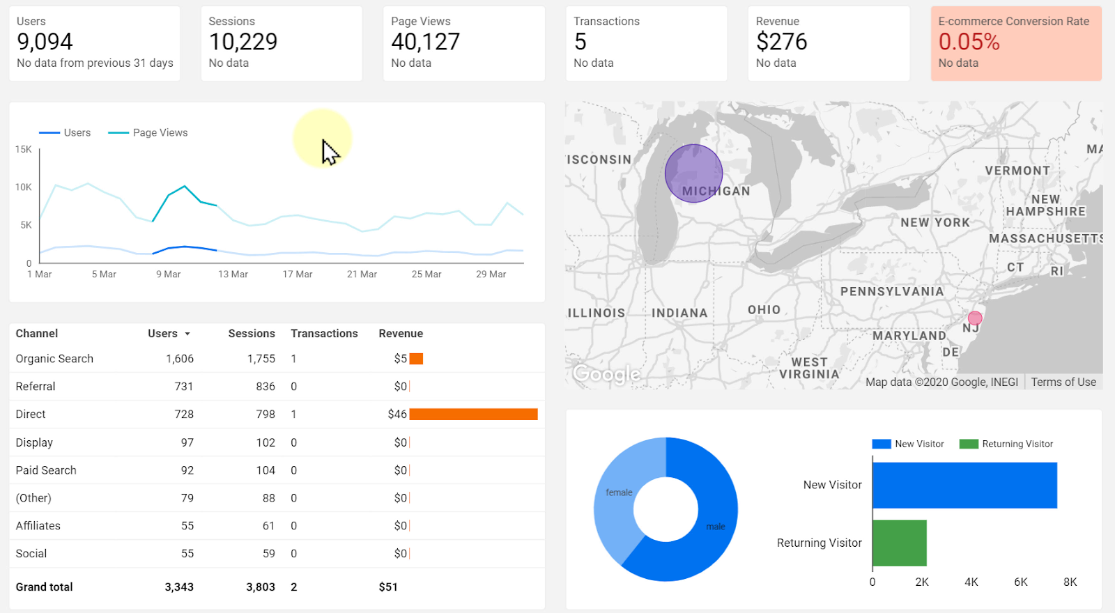
Considering what we have already learned, we should be able to create a report that includes Scorecards, Google Map, Table, Pie Chart, etc. similar to the below picture.
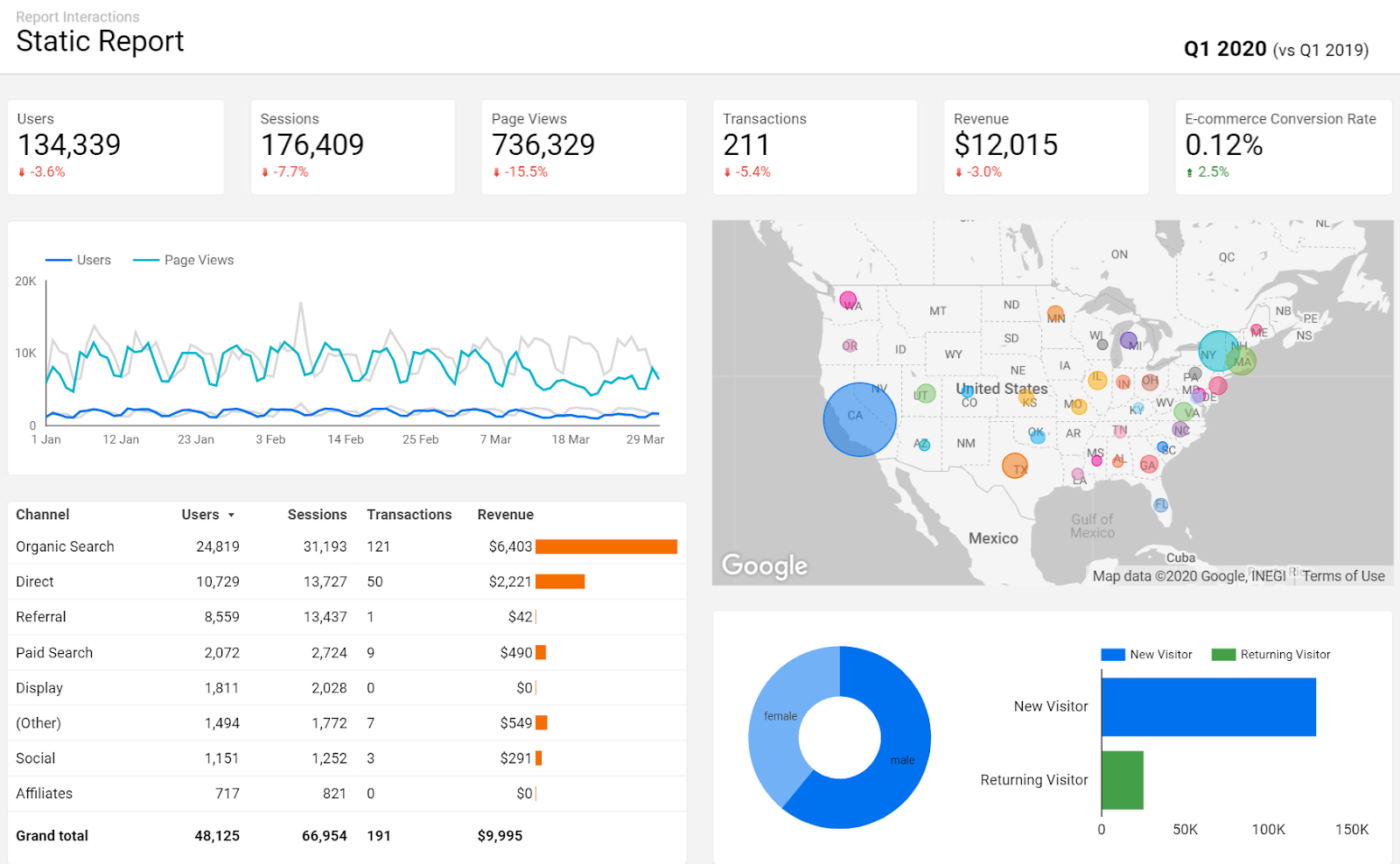
Now let’s see as a business owner, how we and our team members can use this report.
Although we can read the numbers, see changes over time, and also find out from the top of the page that this report is related to the first quarter of 2020, there are more things we can do with it as well.
As the owner of this business, we want to know more about the numbers appearing in the report. What if we need more detailed information about revenue in different states, know more information about the male or female audience, want to compare the way new visitors perform compared to the returning ones, or most importantly, want to compare the available data with the same period before.
These options are only available in interactive reports.
Interactive Reports
There are four ways to use interactive reports in Google Data Studio.
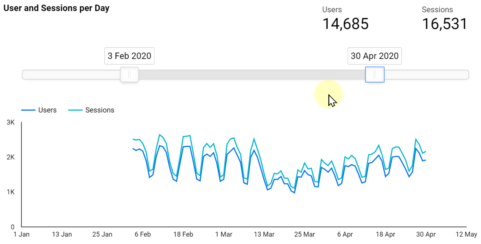
6.1. Date Range Selector
The following picture shows the same table as the last section but in an interactive format. It is capable of being transformed into different reports by using the provided filters on top.

By clicking the date range filter, we can change the time period of the report and select the required Start date and End date to be applied.
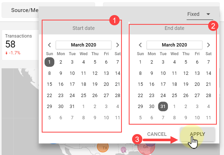
Doing so will update the report accordingly and makes our clients happier since they can change the data for any time period they need on their own.
6.2. Chart Interactions
The second way of adding interactivity to the chart is by enabling the interactive filtration of charts. First of all, let’s see how it works.
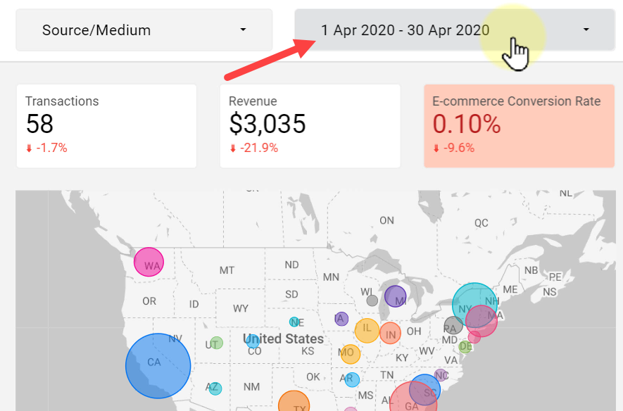
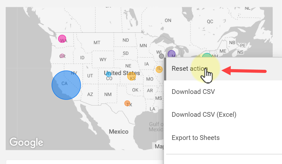
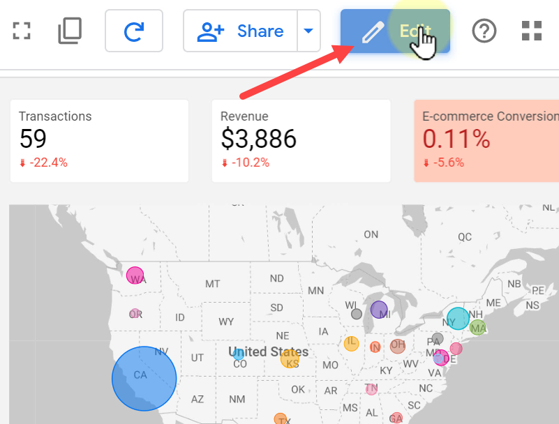
I have already activated the filtration for all the charts of this report. Here I am going to filter the whole report to just show data of California on the map. We can do it by just clicking the California area on the map.

Now the report is updated and only shows the data related to California. We can do the same for other states on the map as well.
In order to reset the report to default values, right-click on the map, and choose Reset action.
Now let’s change the report according to the values of our Pie chart.
Clicking the female section updates the values accordingly and we see that most female users are from WASHINGTON and CALIFORNIA and we cannot expect a high E-commerce Conversion Rate value.
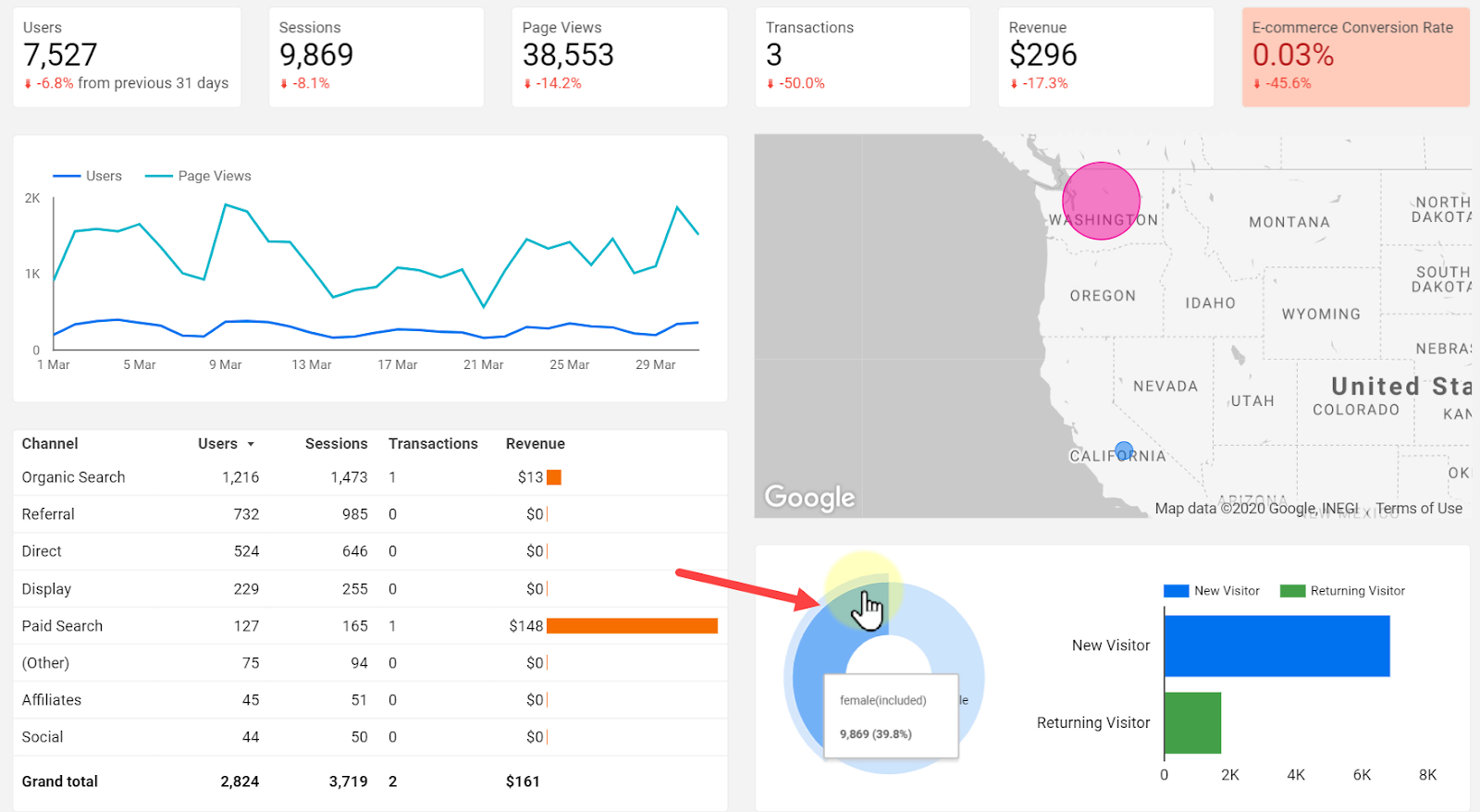
Clicking again on the Pie chart resets the report to its default values.
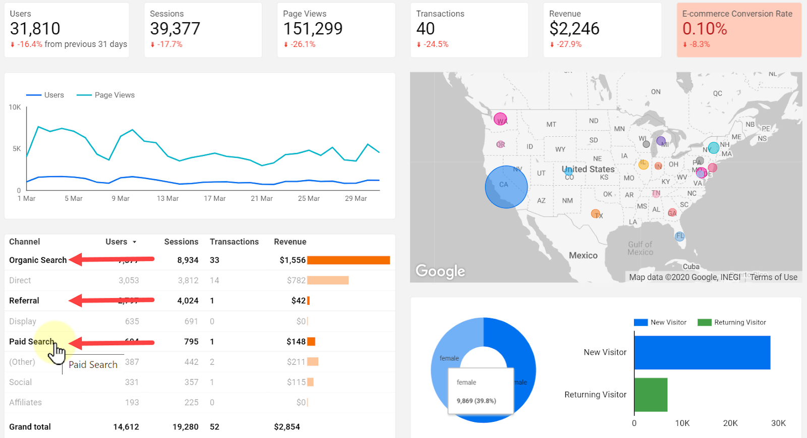
We can also use the table to cross-filter the rest of the report. For example, let’s click on Organic Search. Meanwhile, we can hold down the Ctrl or Cmd key on the keyboard and add other values to our selection.
Now let’s how we can use thread lines to update the report.
The process is called brushing. Start by clicking on the first date, hold down the mouse button, and drag to the right as much as needed.
It’s done. We can now see the values in the report for the selected duration of time.
In order to create interactive charts in a report, click Edit to enter the edit mode.
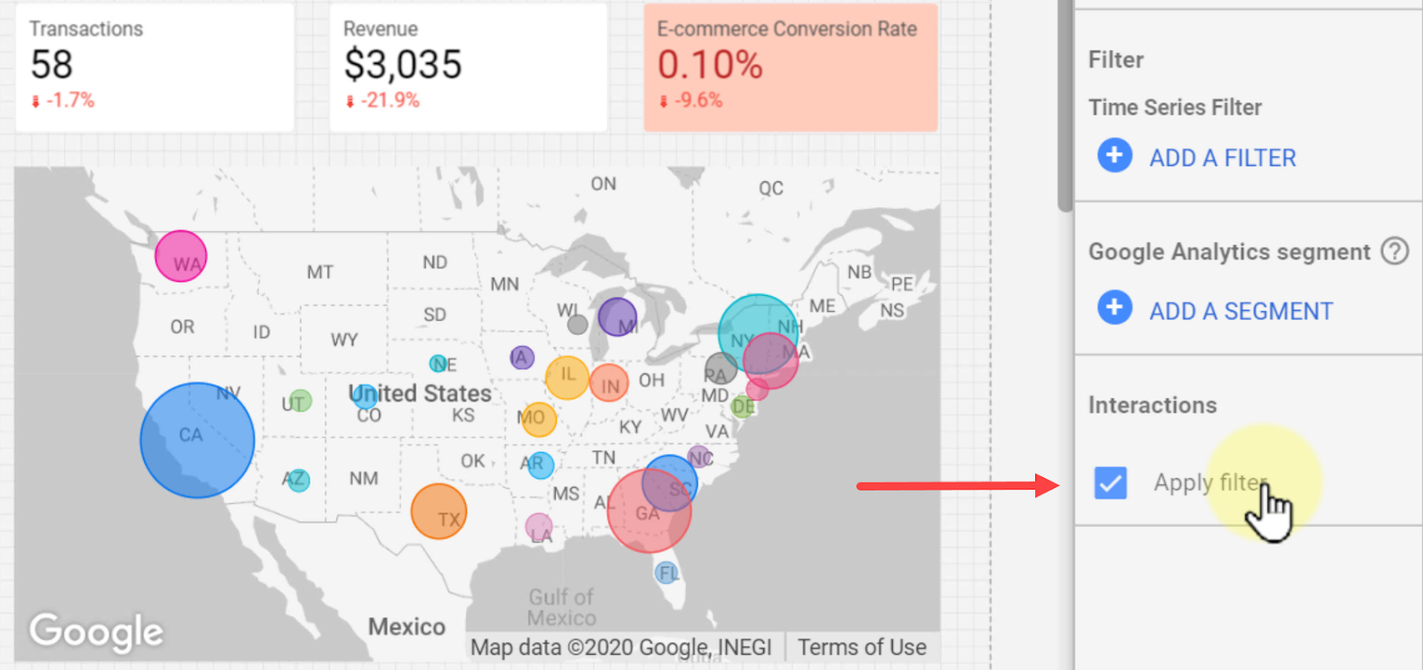
For any chart type in Google Data Studio, when we click on it, we can see the Interactions tab at the bottom of the DATA section. Enabling it allows users to use that chart for cross-filtering the report.
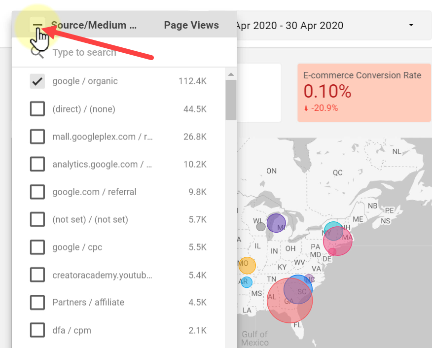
6.3. Filter Control
Filter controls allow users to filter the report by selecting different categories of a dimension.
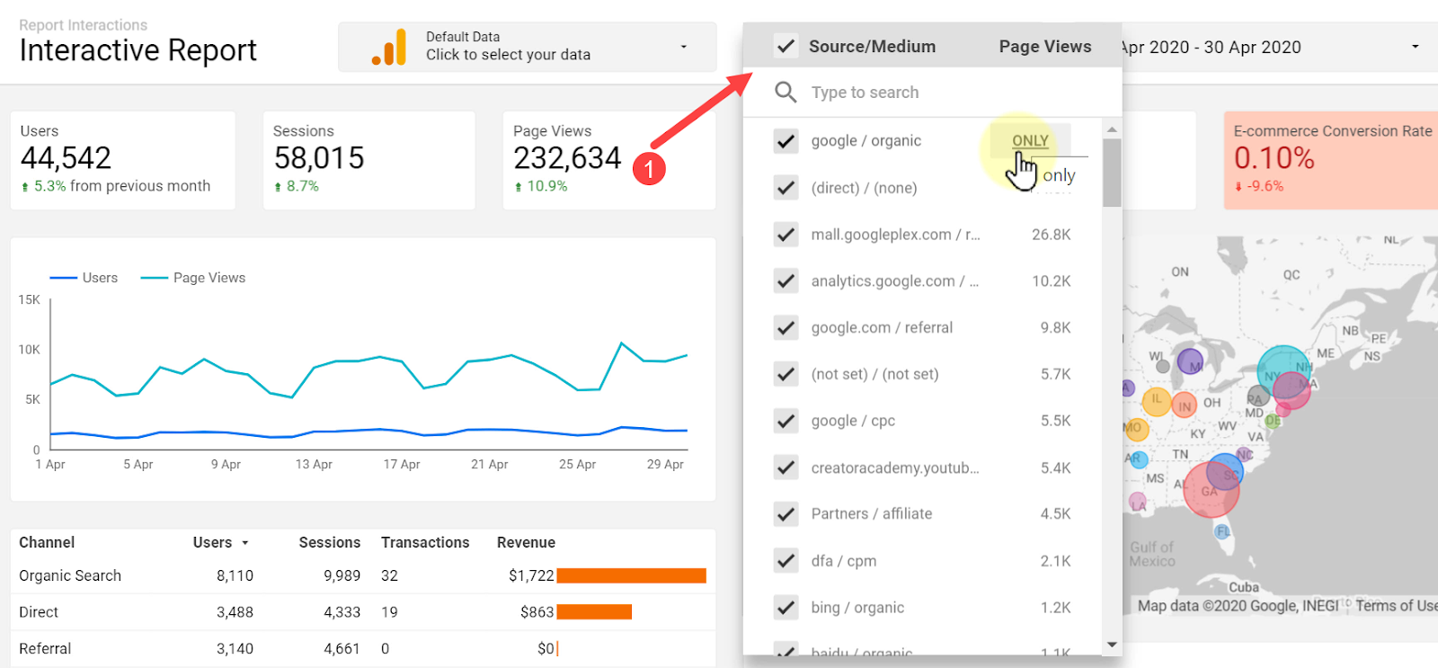
You can either select the item from the list or search for it. Clicking ONLY next to each item filters the report to only show values for that Source/Medium.
We can also select or deselect all values by clicking the little square on the left side of Source/Medium.
Don’t forget we can add multiple filters of all types to our report at the same time and update the report based on all of them.
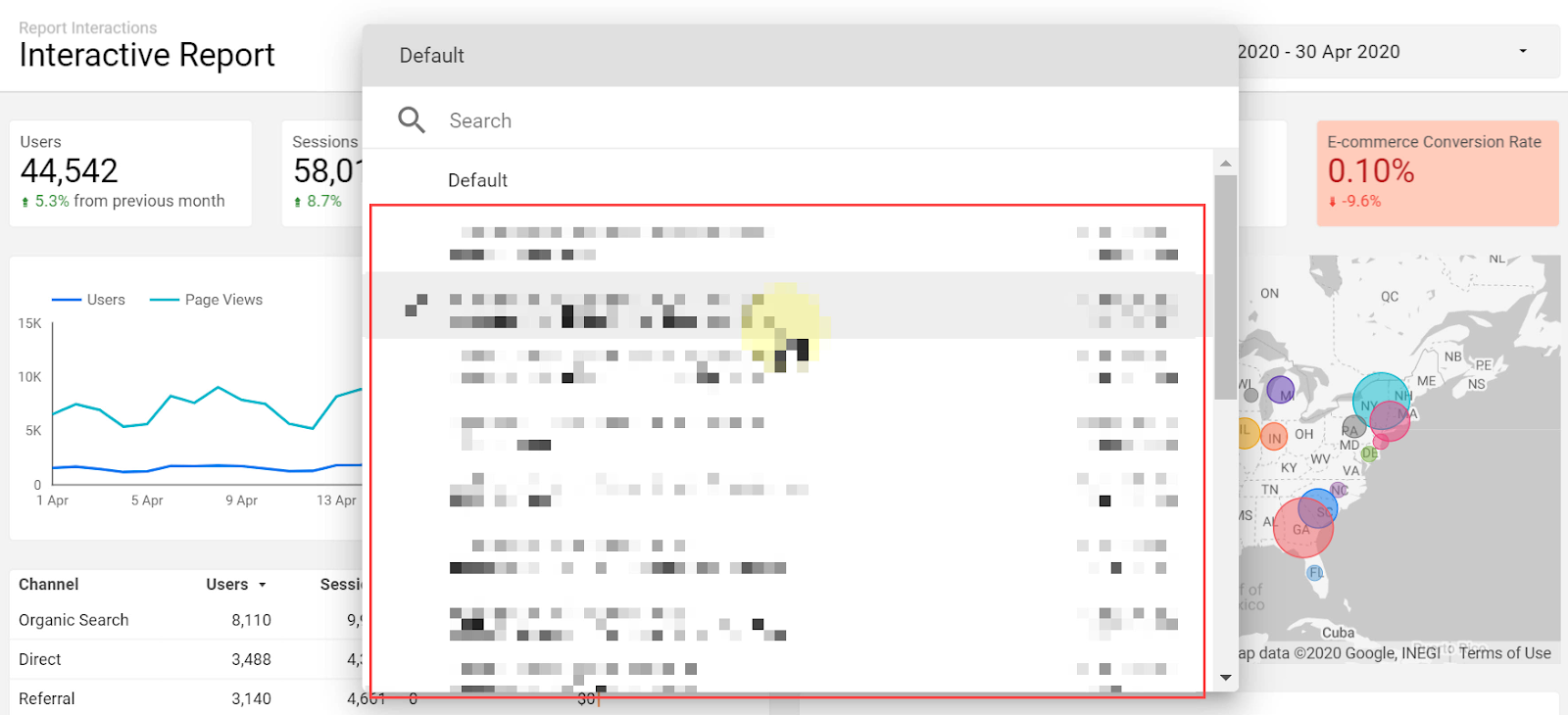
6.4. Data Control
A data control component allows the viewer of the report to change the data source for the report. Consider that we own several eCommerce stores and need the same report with the same data for each of them.
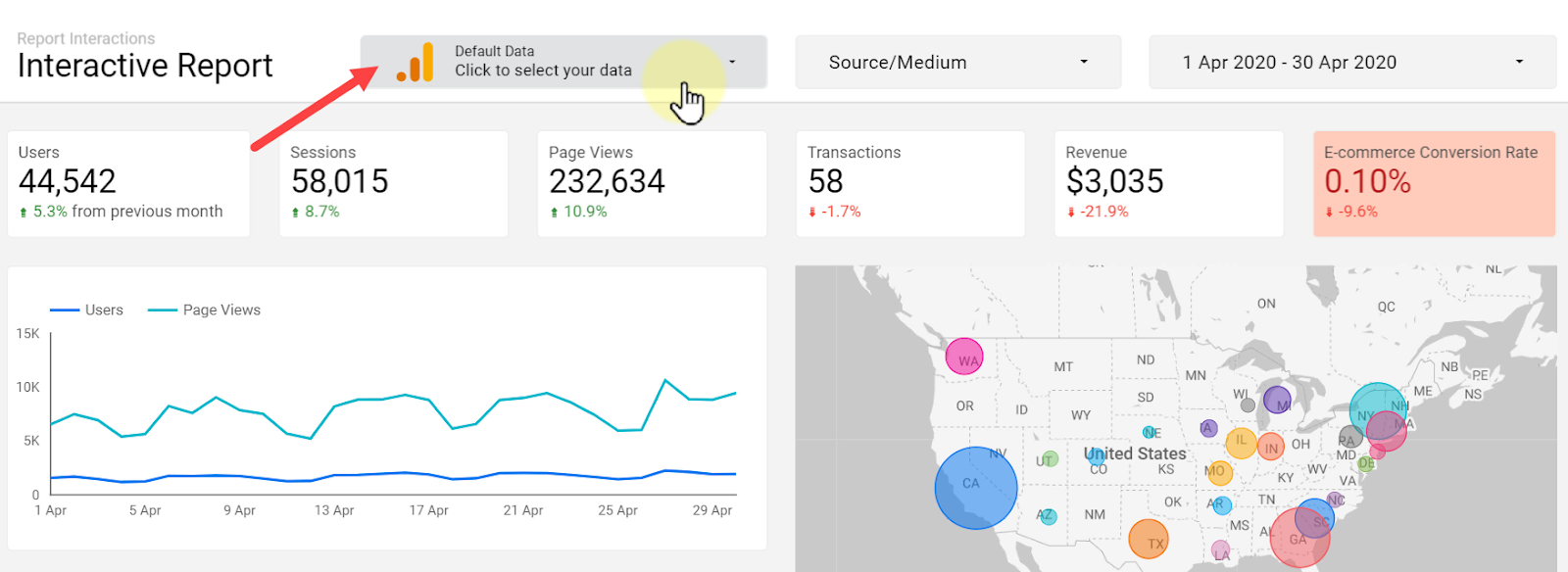
We can change the Google Analytics account that this report is connected to. Search for the required account from the list and select it to connect.
Now our report is refreshed based on the new selection to show the updates.
6.5. Adding Interactive Components to a Report
To add a date range control, enter edit mode, click Date range, and place it wherever required.

We can now set the Default date range from the DATA tab.
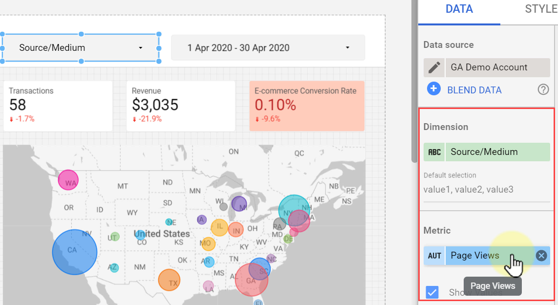
To add a filter control, click Filter control and drop it on the canvas.
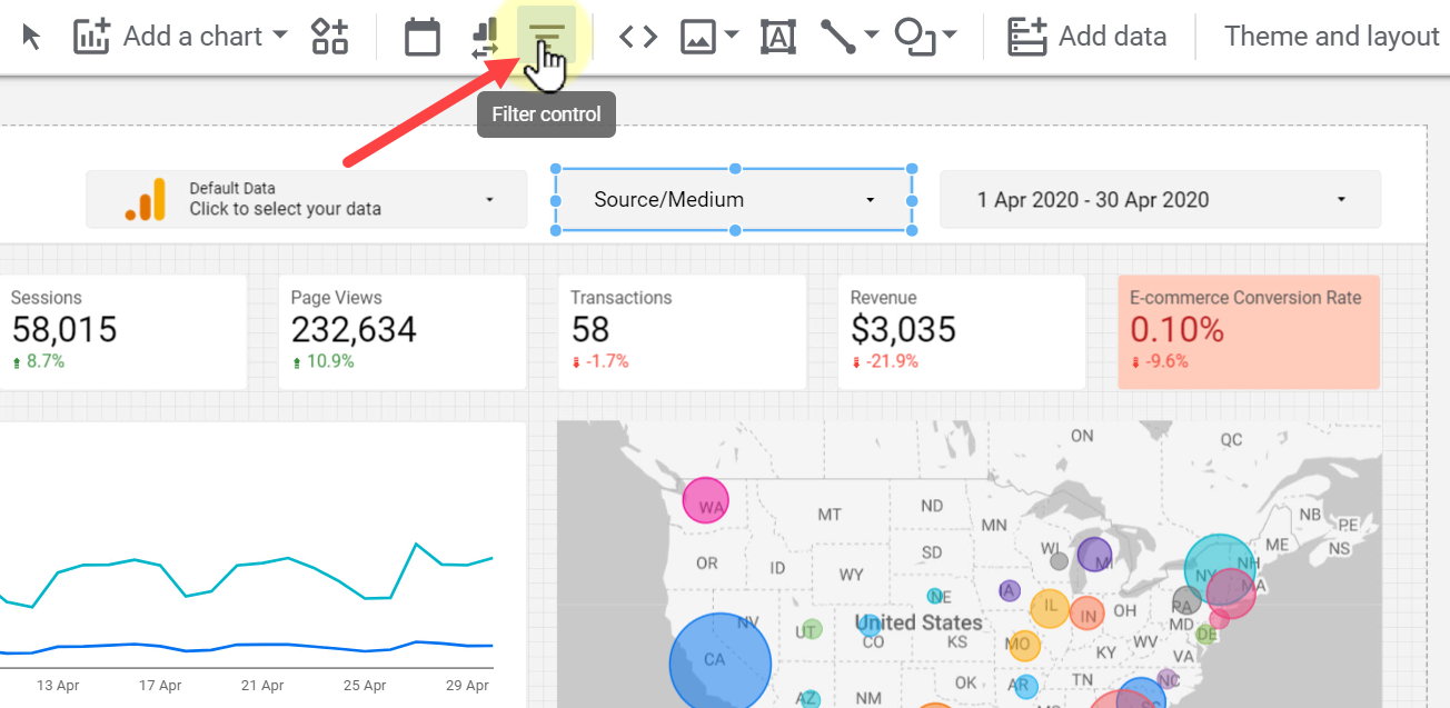
Once added, you can add a Dimension and Metric from the DATA tab.
To add a data control component, click Data control, and place it where needed.
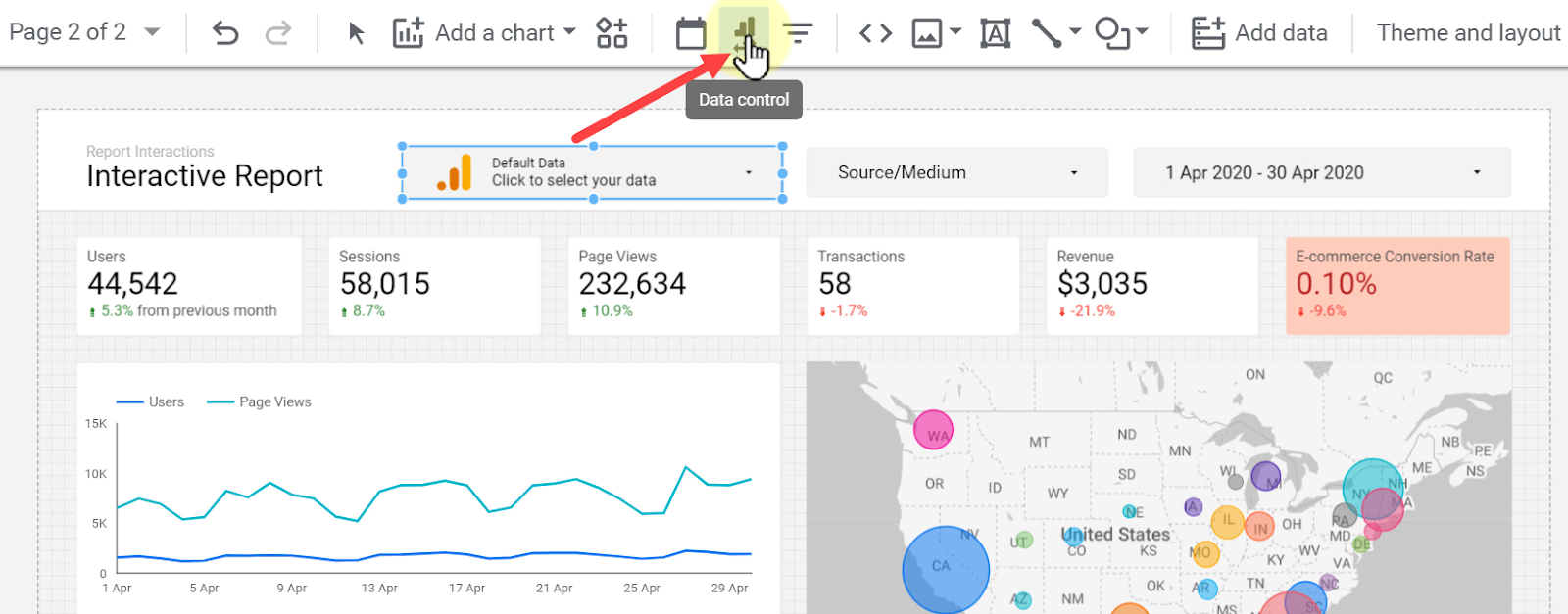
Click Connector Type from the DATA tab and select the required item from the list.

In this section, we learned the ways we can add interactivity to reports to make them more practical. By adding these elements to a report, we provide users with a wider range of capabilities to use reports and compare different data related to the business.
Join Newsletter
Community
Tools
Learn Analytics & CRO


